10/10 easy. the only thing i'd say is to use photobucket so any blocked images will show, like on your stats counter its impossible for me to click on the images to see your stats. not sure if that's just me or not but oh well.
Images such as a stats counter cannot be re-hosted onto Photobucket and still work. The image is generated by statscounter.com, the count is logged everytime the image URL is called and the count is updated by one from there I get a weekly email about it. Such as this one from Feb 11th - Feb 17th: http://pastebin.com/b0WkBGnF
Oh, whoa!
I've never seen a profile like that before, it's unique, I love it. 10/10
It's really simple and it's not hard on the eyes either!
Haha, well thanks. Visually it looks simple anyway, but the actual CSS behind it is far from simple. xd
Edit: you need to remove the CSS applied to your navigation. You're not allowed to remove the navigation or any part thereof, and you're not allowed to reposition it.
Ah, pardon, for the edit?
What're you talking about?
I didn't make my profile from scratch... I got it off a really old website D:
Well that explains it, many profiles created and submitted to those sites do not follow the rules set for profiles here in the PD. Find and remove the following lines
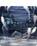
Nice avatar theme but I feel kinda confused dunno why. x.x There could be the opacity go over effect on the pictures from the right. Or no... not sure how it will looks like with it. x__x
Well 9/10 3nodding
I like it so far. The colors and theme is really nice. Then I don't know is it just my screen that shows everything up on the left corner. That bothers me just a little bit. But overall everything looks mighty good. emotion_dealwithit
6/10
A few thoughts- I really like the black/grey & red theme- it suits your avatar really well. The font that you've picked is quite challenging to read, perhaps just having that in your headers for some decoration & picking something a bit simpler for your body font would be better?
I don't like the fact that I can't turn off your music. Aside from loading time for people with a slower connection, it's frustrating if you already have your own music playing. I love hearing someone's favourite/hand-picked song when I'm in the right mood, so some sort of controls for your player would be good.
I like the information that you've put in about yourself (I was wondering where your username was familiar from, but then I realised you won the Niji I was bidding on in Bidblast).
to be edited. @Chrick2010
No offence but your profile is horrible. This basically is a starter profile where everything compiles for you and is readily available as a 'nice' profile to some. To me, it basically shouts 'noob'.
Since your profile isn't even customized, there is nothing to rate or comment on so I am not giving you a number.
6/0. Concept is nice, but the inclusion of modern actresses doesn't quite go with the "old timey" background music you have.