Welcome to Gaia! ::


Generous Millionaire

Yep. Much appreciated, thank you. biggrin heart

holyvulpes
Alright you want more detail, here is more detail.

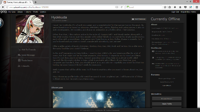
Your background art image is behind your profile and is hard to make out, so it takes away from the profile itself. Plus one side has a red tent while the other is black, so there is a gap in flow. The gaming images are cool, but they are just too much. But that's your tastes. Your profile seems to just have to much going on. But i'll say that to anyone with visible comment section. No one cares what other people commented on your profile, imo. Same with the visitors panel. It looks like an old tektek profile that is lacking a focal point. Here is what your profile looks to me:

User Image


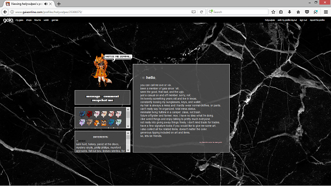
You could call my profile minimalist. It's simple and plain but gets right to the point. As you said about resolution, I'm running off a res of 1366x738, which is standard for a 15" laptop. All my panels (besides media, still working that one out) are nice and neat. The end all at the same level as well. So to me my profile looks as such:
User Image


is my review of yours better now?

Familiar Friend

Hyokkuda


i also took some of your advice. if you'd take another look.

Generous Millionaire

Not too bad, but for the bubble, that's not really what I meant. More like;

#details_title:after {
content: '';
background: url(https://78.media.tumblr.com/1296037431107fc9a55df7c26aaa749d/tumblr_oy1d1t1Nl51rap9sbo1_540.gif);
background-repeat: no-repeat;
background-size: 100%;
width: 100px;
height: 34px;
position: absolute;
top: 30px;
right: 0px;
display: block;
}


As for the media, you should give it some vertical padding because it just look weird compared to all the other panels. And same goes for the interests panel with your scrollbar.

div[id*='id_media'] {
padding: 10px 0 10px 0 !important;
}

#id_custom_10241 {
overflow-y: hidden;
}

#id_custom_10241:hover {
overflow-y: auto;
}


Overall, it will look like that.

User Image - Blocked by "Display Image" Settings. Click to show.


holyvulpes
i also took some of your advice. if you'd take another look.

Familiar Friend

Hyokkuda


oh wow, i never knew of that little trick! thank you so much!

Anxious Fairy

23,700 Points
  • Budding Witch 250
  • Conventioneer 300
  • Magical Girl 50
I'm not sure who to rate, so I guess I'll rate both.

@Hyokukuda, I really like that sleek blog look, and I could tell by the side menu that you were a gamer before I read your text. ^^ Definitely gives me a Steam/Discord feeling.

I would say it's an 8/10 or 8.5/10 because it's a bit too dark and lonely-feeling for my personal taste, and like holyvulpes mentioned, the background is cut off and the face overlaps in the background weirdly with the icon in front. I personally would either make that column opaque or change the background image. Also not a fan of the blue borders on the avatars in the comment section; it's a really nice color but it stands out too much for me among all the monochrome.

Would really love to see your profile when it's completed! I really like your artwork btw.

@holyvulpes I would give this a 4/10 because it's adequate and gets the job done but is simple for my tastes and makes me feel lonely. The marble background gives a kinda grungy look but it takes up too much space, and it contrasts with the sleekness of the boxes, especially with that solid border and grey fill. Also, the whole clump of boxes are noticeably not centered on the page (about 1 in / 100px off), and it leaves a lot of empty space on the right. The text in the box underneath your avatar is cool, but it's eye-straining for me personally with the black rectangle behind it.

I noticed everything in your wishlist is fox-related like your avatar, and you wrote that your favorite color is rose gold, so maybe if you were to ever completely revamp your profile, you could work with those as your theme. Maybe work to fill up more space on the page, by expanding or adding boxes, or by using a livelier background.

btw I like P!ATD and Noragami too. :3 I used to watch OUAT and loved it but I got too exhausted from all the mess the characters kept getting thrown into.

- -

@rater: My profile is a work in progress so I would appreciate constructive criticism and tips/suggestions to improve it. I'm planning on changing the text links under my avatar into icons/buttons and adding one of my artworks somewhere, as well as changing the fonts I'm using (these fonts were from my previous layout). Thanks!

Saxy Coder

Artisti
      I just have to start off with saying it's a pet peeve of mine when people put "best viewed in <browser> with <screen dimensions>" on their page. emotion_sweatdrop
      You really just... don't need it:
      All major updated browsers render web pages almost exactly the same.
      Screen resolution shouldn't matter, unless you used bad positioning codes which cause things to break on smaller/larger screens
      (in which case you should really look into fixing your code because people aren't going to buy a larger monitor just to enjoy your page)
      // sorry for the mini rant

      Good Points:
      • Uniform color scheme which matches with both your avi and the wallpaper
      • Pretty wallpaper
      • Functioning Gaia nav header (another pet peeve is when people hide this or make it hard to see)
      • Nice detailing on some things -- comments heads, wishlist item effects, etc.

      Areas for improvement:
      • Your profile actually is "broken" because you used fixed positioning on your panels, which means I can't scroll over to view them on my tiny screen User Image - Blocked by "Display Image" Settings. Click to show.
        (use absolute positioning in order to avoid this)
      • The stretched image of the water/rain dripping in the background feel messy (?)
      • Cursor doesn't feel like it matches well. I'd suggest either recoloring it or picking something else
      • If you don't mind, I cleaned up your code: clicky here
        (I also changed your panel positioning to absolute with that as well as changed the background coding a little so the rain wasn't stretched -- I'd recommend making a back-up of your current code before applying that version, in case you don't like it)

      Edit: I realized I completely forgot to give a numerical rate X'D
      // is really bad at quantifying things
      Uhhh... I'd say 7/10 or so?

      @Rater: Looking for a rate on this profile, please and thank you User Image - Blocked by "Display Image" Settings. Click to show.
      (it's a mule account, so pardon the lorem ipsum)

/* ♫ Formatted by Gaia Upgrade */
<3 berry niceee!! 10 10

Naughty Fairy

9,325 Points
  • Signature Look 250
  • Full closet 200
  • Dressed Up 200
8/10 Great potential but extremely bare. I understand minimal but that's a bit much

Mine's generic but works for me. Feel free to bash it xp

Man-Hungry Bloodsucker

8,675 Points
  • Elysium's Gatekeeper 100
  • Friend of the Goat 100
  • First step to fame 200
6 / 10 . ME!ME!ME!'s a good song and all, but it's a little busy for my taste. maybe try having a solid background (or maybe a gradient of the me!me!me! color scheme) and then use gifs with transparent backgrounds of just like,,,character bodies to make it look more clean-cut and a bit less hard to look at? ^^

Cub

6 or 7 out of 10. I adore the girly things, but the background is plain. The music is nice! The panel names are so cute lol.

Quick Reply

Submit
Manage Your Items
Other Stuff
Get GCash
Offers
Get Items
More Items
Where Everyone Hangs Out
Other Community Areas
Virtual Spaces
Fun Stuff
Gaia's Games
Mini-Games
Play with GCash
Play with Platinum