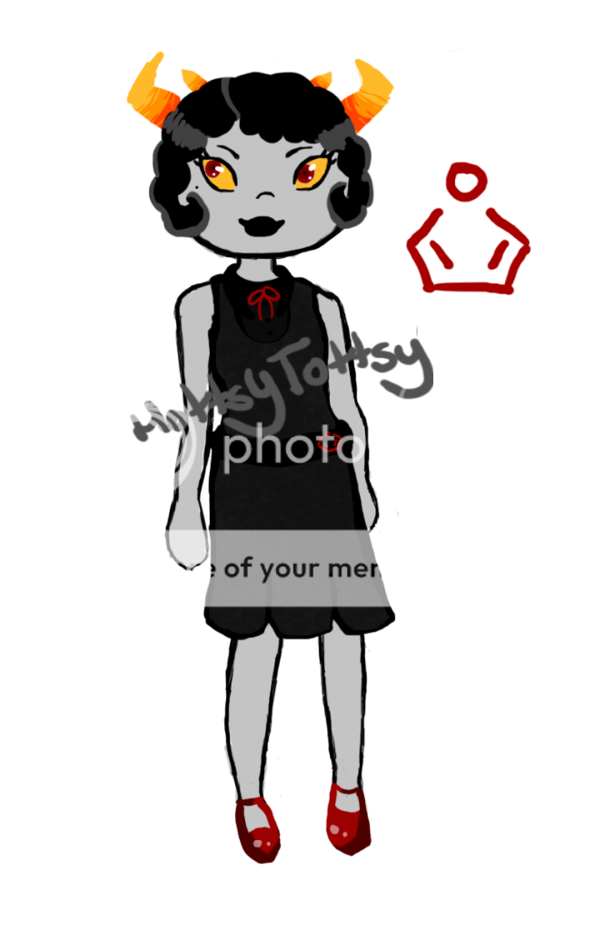
Would it be alright if I posted something for critique? I'd love some opinions of what I'm working on right now.
If so, uh
WIP.
I just need to do some post-processing and cleaning-up, and then it'll be done.
I'd particularly like to know about the colours, since I used them sort of experimentally. And if I can get away with leaving the hand and body floating...hah.
Any suggestions are appreciated.
i just wanna say that, if the flame is blue, then shouldn't the light on her face be blue?
and then the blues should be red, since it's a red off light?
Please be gentle xD
(sorry it's not in color or shaded--- I'll post a few when I'm done drawing them.)
EDIT:
Did a bit of shading and coloring-- just not sure how to deal with the hair sweatdrop
ʕ•ᴥ•ʔ
Hi there!
The body structure is very on-point; however, I would recommend that you bring the bra down just a tad. If one of our critics named "a busted radio" critiques this, she might do redlines for you.
1. The head is too short and the facial features are disproportionate to it. The eyes are placed correctly but are weirdly shaped and too big. The fact that the nose points up makes her look a little pig-like, and her lips shouldn't be so... pointy.
2. As far as hair goes, curls don't really look like that. Here is a more realistic example of curls. You want your curls to look full and thick. Also, as you know, hair is made up of thousands of individual hairs, and when drawing and coloring it, you should treat it as so. Make streaks with your pen/pencil - long, tapering lines that flow in the direction of the hair. Even a basic example like this makes the hair look more realistic (pink hair). Hair should be darker in shading at the roots and possibly the ends, depending on the look, and light where the light source is hitting it.
Could I get a price for my pixels, please? I was asking around CB while taking freebies for samples, and I got responses ranging from 50m to 50b so I'm kind of lost.
They take about an hour each, if that helps!
it's basically a style where you draw cute characters with large eyes and tiny mouths and nose.
anime like K-On is an example of moe.
for guy eyes, there really isn't much of a difference.
just draw them without eyelashes hahaha
well, if you want to make them more masculine,
generally you should make their eyes thinner, smaller, and boxier or triangular.
you can also give them thicker eyebrows.
here are some of my examples:
feminine: 12345
masculine: 12345
overall, the eye shape between each gender doesn't really matter.
what matters are how the head shape is built and how their body is built.
No xD I haven't heard of it before xDD
Ohh I see haha.
Hmmm..well for me it would just be practice in drawing guy eyes then; cause everything you pointed out, I've noticed or a friend has told me > w <
Practice makes perfect c:
Your art * u * it's so cute haha ; u ;
I really like the way you draw eyes^^;;
Ah yes, head shape..I only know that there's a difference but when it comes down to drawing it, nope doesn't happen haha.
But thank you so much for your tips, redlines, and your own examples c:
Name/what should we call you?: Hysterhex. Call me: Hyst, Hex Why should I put you on the list?: LET ME REPHRASE... because other applicants have taught me something. 1) I know lots of free art programs and am very willing to try them out / give feedback on them. 2) I know a lot about the human body, proportions, anatomy (except for shoulders) and how to exaggerate these proportions. Am very open to giving tips / short tutorials. Anything else I should know?: I'm a girl. I don't price.
I abide to the Constructive Criticism rules and promise to be kind to everyone.
I'm embarrassed to say this, but I did read the rules... err, the first half of them. My brain skipped over the second half. I'm soooorrryy.
Thanks much for the critique! In general, I don't... bother with light sources? I understand that's kindof awful, and almost childish, but I mostly care about what makes my art look good. Because a great artist once told me, "Who the hell cares if you have a light source when your OC is in the middle of nothingness or on a transparent background" hahaha.
ʕ•ᴥ•ʔ
xD You were supposed to PM this but it's fine since the first time you submitted, it was supposed to be by post. I changed it due to being flooded by posts in four different threads. I'll put you on the list. And that's fine about the lighting, it's about what makes your art look good c:
Ahaha, mb mb. I can understand though. Apparently this thread blew up! burning_eyes
((P.S. I'm reading through the thread now, and I wouldn't really judge Comic Sans. While looking a little silly, it is one of the least-confusing and most easily read font by dyslexic children. Though I would only use it for material meant for reading by children.
If anyone wants to use text in their drawings/comics, Blambot.com has a lot of free for commercial and non-commercial use!))
hey so I'm gonna get a scanner later this week. What's the best thing to do after I've scanned it? Like how do I put it on a white background? Bleh I feel like it's gonna be messy
I have PS CS6 and Adobe Illustrator but AI isn't working
Isn't AI more of a program meant for vectors? I would use that program probably to vector a piece, but not to change the background. Actually, you could very well use AI if you wanted to give a piece lineart. I think AI has layers? If so, keep your initial drawing on the lowest layer. Make a new layer and line your piece.
... buuut if you did not want to spend an hour fiddling with lineart, there's an easy way to make your sketches look like a (rough) lineart: levels and curves!
FOR PEOPLE WITH ONLY CS6: Adobe dot com has a guide for that. NOTE: This is a very basic tutorial and would require experimenting to specifically get what you want.
FOR THOSE WITH GIMP... and if you want a more specific, catered, answer... look at this quick video I made with an old drawing of mine!
I tried to color, I don't think it worked
??? i suck. I have no idea what I'm doing besides "add lots of layers" and "multiply". so i left the base sketch there. idek. help. It looks reaally awful but don't worry about the sketch. just the color itself.
I tried to color, I don't think it worked
??? i suck. I have no idea what I'm doing besides "add lots of layers" and "multiply". so i left the base sketch there. idek. help. It looks reaally awful but don't worry about the sketch. just the color itself.
First recommendation: darken your shading on the skin. Bit of contrast never did any wrong.
Second: the more blending you do on your shading, the more gray/de-saturated it gets. And that's BORING. Be careful.
IF YOU INTENDED TO HAVE LINEART SEE FOLLOWING:
I'm confused! What exactly did you do wrong? Besides getting a bit outside the lines, I don't really see what went wrong here? It looks good! I would think your shading in the face needs to be a bit darker, if anything?
Have a quickie tutorial I whipped up for someone a few days ago. It pretty much shows that what you are doing is fine. smile I recommend, however, only 1 layer with all your colors, or 1 layer for each color.
If you only go with 1 layer colors, you can either 1) paint on that very same layer or 2) make one or as many layers as you like with shading.
For more complex shading like, say... this... I normally have the following layers:
Lineart
--Hair highlights
--Hair darker/more specific shading
--Hair base shading
Hair base color
--Skin highlights
--Skin shading
Skin base color
The "--" indicates clipped layers, meaning what's on those layers can only be seen when it's covering something of the layer its "clipped" on. For example, whatever is on the hair highlights layer can only be seen when it highlights something of the hair base color.
Do you have any other specific questions?
IF YOU DID NOT, SEE FOLLOWING:
Painting is really hard. Traditional and digital painting are the same in that it is easier to paint when there is a background. It can be a single color background (maybe a dark orange or whatnot to contrast the blue hair and compliment the eyes?) but it makes painting easier. Why? Because you can bring in colors from your background into your drawing (e.g. having orangeier shading or even backlighting.)
HOWEVER. I hate painting. H a t e. So here's a painting tutorial by a very talented artist: here.
I will also link you to the best and most helpful tutorial I have ever read . It's on color. Find it here! This tutorial is a little advanced, but has so much good information. For a quick guide, you can just check out the "Harmony" tab that also has a bit of a process of coloring too. :)
That's amazing oh my god. Please be Azula for Halloween.
Hahaa I love Azula. Avatar: The Last Airbender is easily my favourite TV show of all time.
And ahhh what you flatter me thank you. C:
a busted radio
Thanks for the feedback!
I made the edge of the left side of her and nose and face blue, but considering I drew the face with a further away light source in mind, I think I'll make the whole left side of her face should be turquoise-ish white. The flame is blue-ish white, so most of its light is white since the less intense part is white.
Then I made the shadows darker blue because the flame turns darker blue as it gets less and less intense - maybe they should fade to purple. There's a slight orange back-lighting, which is why I added an orange-purple highlight to the right side; I've tried flipping the orange and purple but it didn't work too well unfortunately.
Could you please explain what you mean by red off light? I don't quite understand.
Bahhh--you guys have every single tutorial I need right in the first page.
Thank goodness.
You wouldn't happen to have one lyin' around on painting in CS5--would you?
I also have a couple things I would like pricing on too.
If you have a moment:
Image one -- && -- Image two
((Those 'white backgrounds' are transparent.))
These two middlemen are kinda' my dive into a new style.
I just want to see what price I may get a warm reception with.
Plus this inflation. Holy cow.
I just got back on Sunday from a year-long hiatus.
Holey moley.
Ohh haha there's actually not supposed to be one. I made the reds really incandescent because I wanted them to pop. Perhaps I could add some more blue-ish white to them. Thanks again~


 ♦⋘
♦⋘