|
|
|
|
|
|
|
|
|
 Posted: Tue Apr 10, 2007 4:40 pm Posted: Tue Apr 10, 2007 4:40 pm
|
|
|
|
|
|
|
|
|
|
Posted: Wed Apr 11, 2007 3:17 pm
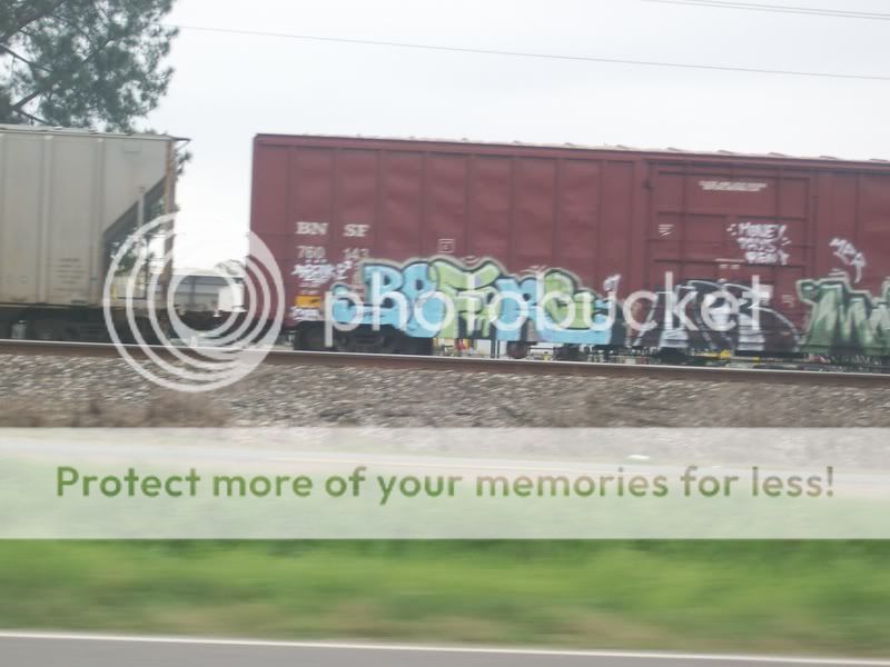
I like the one of the train, the only way I could think of to improve it is to edit it a little, some ideas might be to swtich slant, crop to main focus area so the eye isn't s distracted, possibley darken photo, add some more contrast and/or saturation, maybe warm the color temp, really just play around with it till you see something that you like...
not sure if you can really understand what I just wrote, rereading it confused me so I'll add ex:
1:all the ideas listed combined

2:all listed above + B&W

|
 |
|
|
|
|
|
|
|
|
|
|
|
|
|
|
|
|
Posted: Wed Apr 11, 2007 5:19 pm
i really like this one.
it might just be because its kinda random.
but i dont know.
i like it when they dont looked too planed out.
|
|
|
|
|
|
|
|
|
|
|
|
|
|
|
Posted: Fri Apr 13, 2007 1:22 pm
Dr[[Acula]]
i really like this one.
it might just be because its kinda random.
but i dont know.
i like it when they dont looked too planed out.
I also like how random it is, but the thumb or finger in the corner really bothers me sweatdrop , you might want to crop it out since it's a little distracting...
|
|
|
|
|
|
|
|
|
|
|
|
|
|
|
|
|
|
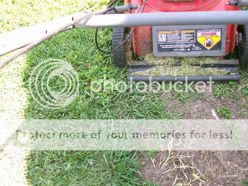
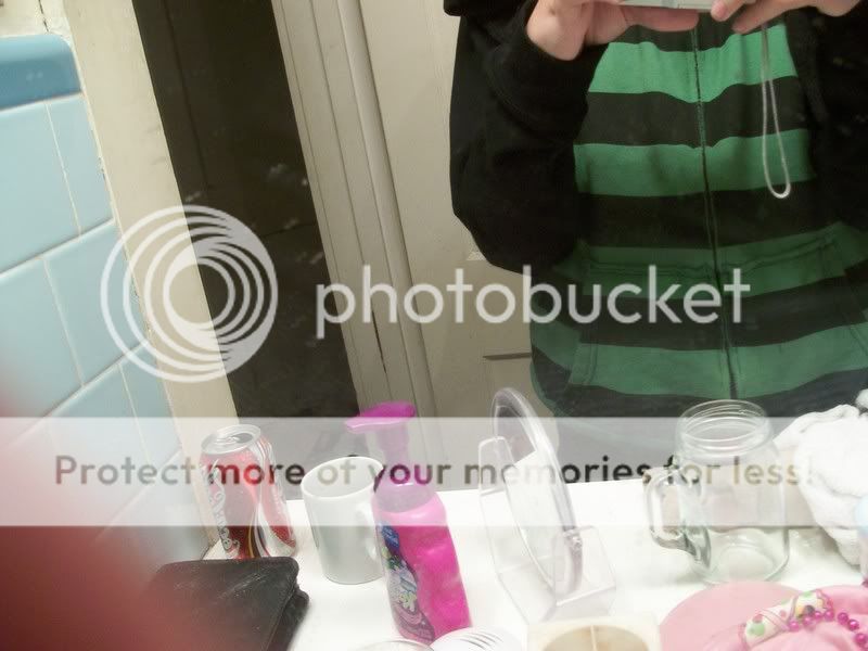
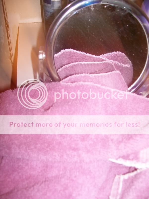
Posted: Sat Apr 28, 2007 7:15 am
not bad.
i like the second one the best.
pick your subjects a little more carefully
and search for good angles.
watch the flash also, buddy
the flash on the towel produces glare (it hurts!)
try to choose a calm background
the one of your torso in the mirror there,
it looks cluttered...
i hope this falls under constructive criticism...
|
|
|
|
|
|
|
|
|
|
|
|
|
|
|
Posted: Sun Apr 29, 2007 6:49 pm
zmorkian not bad. i like the second one the best. pick your subjects a little more carefully and search for good angles. watch the flash also, buddy the flash on the towel produces glare (it hurts!) try to choose a calm background the one of your torso in the mirror there, it looks cluttered... i hope this falls under constructive criticism... The flash helped with effect biggrin
|
|
|
|
|
|
|
|
|
|
|
|
|
|
|
|
|
|
Posted: Mon Apr 30, 2007 7:23 pm
Anarchy-x zmorkian not bad. i like the second one the best. pick your subjects a little more carefully and search for good angles. watch the flash also, buddy the flash on the towel produces glare (it hurts!) try to choose a calm background the one of your torso in the mirror there, it looks cluttered... i hope this falls under constructive criticism... The flash helped with effect biggrin eh, ok if it suits ya, its your photo im picky with photography
|
|
|
|
|
|
|
|
|
|
|
|
|
|
|
Posted: Tue Jul 03, 2007 1:21 pm
i like the last one
its very...
different
|
|
|
|
|
|
|
|
|
|
|
|
|
|
|
|
|
|
|