|
|
|
|
|
|
|
|
|
 Posted: Tue Mar 27, 2007 10:59 pm Posted: Tue Mar 27, 2007 10:59 pm
 I don't like it. Why is it so ugly?
|
 |
|
|
|
|
|
|
|
|
|
|
|
|
|
Posted: Wed Mar 28, 2007 4:55 am
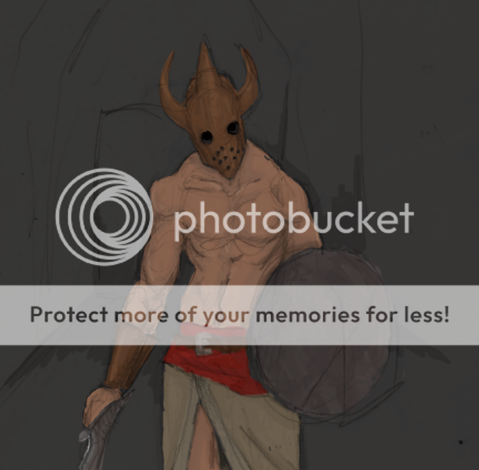
There's nothing wrong with the actual guy in the picture, it's just how you're CGing.
This isn't the final version is it?
All those lines should be cleaned up, and right now the colours you've used just look like base colours. They're all dull and more shades and highlights should be added. Especially to the metal stuffs. Plus a background would be cool. cool
|
|
|
|
|
|
|
|
|
|
|
|
|
|
|
|
|
|
Posted: Wed Mar 28, 2007 5:34 pm
Tawney There's nothing wrong with the actual guy in the picture, it's just how you're CGing. This isn't the final version is it? All those lines should be cleaned up, and right now the colours you've used just look like base colours. They're all dull and more shades and highlights should be added. Especially to the metal stuffs. Plus a background would be cool. cool Nope, it's not the finished version, I just got to this point, and didn't know where to go. I think you got it exactly right- I need more shades, and the lines are kinda' messy. The reason it looks soo dull is because I was going for dark room kind of thing. As for background- any suggestions?
|
|
|
|
|
|
|
|
|
|
|
|
|
|
|
Posted: Wed Mar 28, 2007 6:41 pm
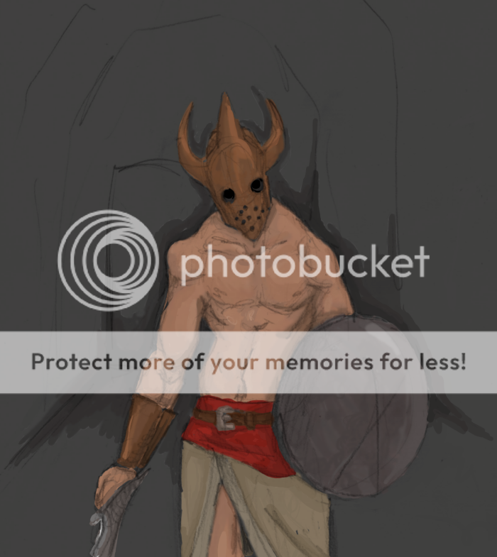
THIS NAME IS QUITE SMART Tawney There's nothing wrong with the actual guy in the picture, it's just how you're CGing. This isn't the final version is it? All those lines should be cleaned up, and right now the colours you've used just look like base colours. They're all dull and more shades and highlights should be added. Especially to the metal stuffs. Plus a background would be cool. cool Nope, it's not the finished version, I just got to this point, and didn't know where to go. I think you got it exactly right- I need more shades, and the lines are kinda' messy. The reason it looks soo dull is because I was going for dark room kind of thing. As for background- any suggestions? Well, since he's a warrior guy you could have a bunch of like... monstrous black silhouettes (maybe with glowy eyes... that might be too much) in the background, like he's about to kick some monster a** or something. That's what first popped into my head anyway. Heheh. But yeah, adding some highlights to the helmet and shield will definitely liven things up, and getting rid of some of the scribbles, especially on his chest/arms/shield/etc. XD
|
|
|
|
|
|
|
|
|
|
|
|
|
|
|
|
|
|
Posted: Wed Mar 28, 2007 9:20 pm
Tawney THIS NAME IS QUITE SMART Tawney There's nothing wrong with the actual guy in the picture, it's just how you're CGing. This isn't the final version is it? All those lines should be cleaned up, and right now the colours you've used just look like base colours. They're all dull and more shades and highlights should be added. Especially to the metal stuffs. Plus a background would be cool. cool Nope, it's not the finished version, I just got to this point, and didn't know where to go. I think you got it exactly right- I need more shades, and the lines are kinda' messy. The reason it looks soo dull is because I was going for dark room kind of thing. As for background- any suggestions? Well, since he's a warrior guy you could have a bunch of like... monstrous black silhouettes (maybe with glowy eyes... that might be too much) in the background, like he's about to kick some monster a** or something. That's what first popped into my head anyway. Heheh. But yeah, adding some highlights to the helmet and shield will definitely liven things up, and getting rid of some of the scribbles, especially on his chest/arms/shield/etc. XD Well, here.  You know, I put a lot of new shades in, and cleaned up some of the lines, but it doesn't look much different, lolz.
|
|
|
|
|
|
|
|
|
|
|
|
|
|
|
Posted: Thu Mar 29, 2007 12:59 am
|
|
|
|
|
|
|
|
|
|
|
|
|
Posted: Thu Mar 29, 2007 12:04 pm
cant really see a big difference sad
|
|
|
|
|
|
|
|
|
|
|
|
|
|
|
Posted: Thu Mar 29, 2007 1:50 pm
I think that if you are trying to get decent at OC you need to use cleaner lines to start with.
|
|
|
|
|
|
Dr. Valentine Vice Captain
|
|
|
|
|
|
|
|
|
|
|
|
Posted: Thu Mar 29, 2007 4:53 pm
Dr. Valentine I think that if you are trying to get decent at OC you need to use cleaner lines to start with. But I can't draw gud ne moar.
|
|
|
|
|
|
|
|
|
|
|
|
|
|
|
Posted: Sat Mar 31, 2007 8:20 am
THIS NAME IS QUITE SMART Dr. Valentine I think that if you are trying to get decent at OC you need to use cleaner lines to start with. But I can't draw gud ne moar. stop copping out and start copping in you've gotta get up to get down GET IN IT TO WIN IT
|
|
|
|
|
|
Dr. Valentine Vice Captain
|
|
|
|
|
|
|
|
|
|
|
|
Posted: Sat Mar 31, 2007 6:14 pm
Dr. Valentine THIS NAME IS QUITE SMART Dr. Valentine I think that if you are trying to get decent at OC you need to use cleaner lines to start with. But I can't draw gud ne moar. stop copping out and start copping in you've gotta get up to get down GET IN IT TO WIN ITHas anyone ever told you, you'd be an excellent rapper?
|
|
|
|
|
|
|
|
|
|
|
|
|
|
|
Posted: Sun Apr 01, 2007 12:05 am
 Highlights, and I toned down the black layer that I have which was making it look soo dull. Whatchathink?
|
|
|
|
|
|
|
|
|
|
|
|
|
|
|
|
Dr. Valentine Vice Captain
|
Posted: Sun Apr 01, 2007 7:49 am
|
|
|
|
|
|
|
|
|
|
Posted: Mon Apr 02, 2007 12:00 am
Your lighting is really straight on (angle wise). How about putting the light source at a different angle to get more interesting-looking shadings?
|
|
|
|
|
|
|
|
|
|
|
|
|
|
|
|
|
|
|