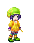
I drew the example pic a long time ago, but it demonstrates most of the techniques I still use. (Although my lighting skills were a lot worse... if you would like to learn more about lighting, which is just as important - if not more so - as the and tools you use and the way you use them, you can check out my coloring/shading tutorial thread in the AD if you want.. EDIT: Hey wait!;;; What happened to my thread??;;; Oh well. Sorry. XD There are bound to be other tutorials around. I'd suggest searching deviantART.com.)
I hope this is helpful to you guys who still use real media!
Oh, and excuse the, er... ickiness of some of the scans. That scanner was in the process of dying a slow, painful death.;;;
Step 1: Sketch
Tools:
Paper: something thicker then regular printer paper. I use Deleter type B doujinshi paper (www.deleter.com) and sometimes cardstock. Other artists sometimes use Bristol board or watercolor paper . Any thickish paper that is compact (not light and airy, or the marker will soak in too fast or bleed too much) will probably work. Markers will bleed on thin paper because the ink doesn't have anywhere to go, because it can't soak down into the paper. I prefer something with a smooth surface as well, because it's easier to erase and ink on.
Pencil: Most any pencil will work, but try to pick something that's easy to erase. (Sorry, I'm no pencil expert, you'll have to test your pencil's eraseability ^^; ) I just use a .5mm mechanical pencil and the lead that comes with it.

The sketch doesn't have to be perfect, just get down the shapes you want, and worry about detail like hair and clean lines later. Concentrating on detail too much at this point can keep you from getting the overall shape right. Try not to press too hard, you're going to erase all the pencil lines after you ink. Guidelines aren't necessary if you feel like you don't need them, but they're just a nice easy way to keep everything lined up right. The head (without hair/ears/etc) should fit inside (& touch all edges of) a circle or an upside down egg shape. (Whichever you prefer... the egg shape is more realistic, but the circle will give your character a cuter, slightly chibi look.) The horizontal line should go through the center of both eyes and both ears, and the vertical line should go right between the eyes, and through the nose and the point of the chin. (These guidelines work on almost any style, anime/comic/realism/etc)
Step 2: Inking
Tools:
Inking pen: Get something waterproof that you can color over with markers. (But as Death T-2 pointed out bellow, some "waterproof" ink like Higgins will still streak when you color, so always test out your ink before you use it on a drawing for the first time!) I prefer felt tipped pens, because the ink can't come out too fast, and is easy to control. Sakura, Deleter, and Copic are all good brands. (Lots of stores have Sakura pens) I use size 0.1mm, but if you haven't used them before, I suggest 0.3 or maybe 0.5, so you can get used to how the tip works without having to mess with an itty-bitty, easy-to-squish thing. Other types of pens you can use are ball point, (The regular writing kind usually smudges badly, but there are art brands like Staedtler and Pilot that you should be able to get at any art store.) or a fountain pen. Fountain pens are fun to use, but somewhat difficult to control, and easy to smudge. You can get the kind with ink already inside the pen, (Pilot makes fountain pens as well as ball-points, and both kinds come in lots of great colors) or you can get the kind with interchangeable nibs that you dip in ink. Brushes are good inking tools as well, if you feel confident enough. ^__~
Eraser: Most types of white erasers or erasers made for art will work, and if you can get a kneaded eraser (the squishy grey ones that look like clay) they work very well and don't erase little bits of the ink like some erasers do. (A rough eraser can erode your lines and make them look rough.) I suggest most anything but one of those gross pink erasers that smudges everything and feels all hard and smooth like it's been sitting in a 4th grader's desk for a year. (No offense to 4th graders if you are one, I had these in my desk back then too. ^_~; )

When inking, you should probably go about it carefully, because it's hard to fix mistakes. (White-out shows up when you color over it) Go over the lines you want to keep with longish, smooth, steady strokes, instead of short sketchy ones. Varying the line width (making the lines thin in some places and thick in others) makes a picture look more interesting, and gives it depth. There's no real rule for how to do this, (since there aren't lines like this in real life) but I usually thicken lines around bug curves and in corners, and leave the long parts of the line thin. Also, making the lines in your foreground thicker and the ones in your background thinner will give your picture more depth, because the background will appear to sort of fade into the distance. After you're finished, wait a minute or two so the ink can dry, (especially if you've used a fountain pen or a brush. Touch it to make sure!) and then erase the guidelines and extra pencil lines, making sure you get all of them so it looks nice and neat.
Step 3: Color, part A
Tools:
Markers: Most art markers are rather expensive, but are a very good investment if you're going to be using them a lot. Copic, (The kind I use. www.copicmarkers.com They're great because you can refill them and change the nibs, which you can't do with Prismas. And Copic Ciao markers are actually cheaper than most other markers.) Prismacolor, (www.prismacolor.com) Neopiko (www.deleter.com) and Tria (www.pantone.com) are all good brands of alcohol based markers. (Meaning the liquid inside them that carries the pigment is alcohol and not water) I haven't used water based markers before, (besides elementary school Crayola markers and such) so I can't say if any of my techniques will work for them.

First, you want to lay down your base colors. This means you pick out a few colors for every area, (a few similar colors, some light & some dark) and fill that area with the lightest one. (Try not to go over your inking lines too much, even good waterproof ink will sometimes streak a little if it's gotten too thick in an area.) You can either lay down all the base colors at once, or finish one area at a time. (If you do this, color the lighter areas first, or you might accidentally drag some dark color into a light area.) Ex: I'm going to use three colors on Hermione's skin: egg shell, milky white, and light pink. Egg shell is the lightest color, so I'll fill in all of her skin with it. Only go over the area once, so it stays light. It might look sort of streaky, but that will go away or lessen significantly when you add the shadows and blend it all together later.
Step 4: Color, part B
After that, I'd use milky white, because it's a bit darker. I'd put it where I want the shadowing to be, like under her bangs, or around the edges of her jaw, and beside her nose. (The scan's a little light for some reason, sorry ^^; ) After this step, take the base color again, and go over the edges of the shadow you just put down a few times so it blends in with the rest of her skin. You can repeat and layer this however you want until you're happy with it. (If you choose to add another layer of shadow for more contrast, or another color such as light blue or purple which can make the shadow look more realistic, since shadows are all sorts of colors in real life... although you'll have to look up a lighting tutorial if you want more of an explanation, sorry ^^; use whichever skin color is closest in value [lightness/darkness] to blend it in) I usually don't go over the entire area again. Instead, I leave a few parts light so the shading doesn't get too flat looking. You sort of just have to use instinct and judgment here, because with some colors it's difficult to keep the texture the way you want it (no streaks, etc.) but you'll get a better feel for it the more often you use markers. Next, I would put the light pink on her cheeks and lips, and a few other places: maybe the nose, ears or fingers. (Adding pink, or even light reddish-orange or something, really helps make the skin look more realistic and gives it a nice glow. Real skin has all sorts of subtle color changes going on... so adding other more unusual colors works the same way, so it's something you may want to experiment with.) I've also put down a darker pink in the middle of the blushie areas, and blended it in with the light pink. For shinier areas like hair, I would use more then three colors. Leaving very light highlights and making some of the shadows very dark will make the hair look shiny. Just use the same technique, but with more colors. Sometimes it takes awhile, but if you like how it looks, it's worth it. (If you don't have many colors, just going over the same area a lot with your base color will make it darker too, but you may have to work hard at it to make it look good and shiny.) Just remember that more contrast=shinier. ^_^ (PS I usually move my marker in a sort of circular motion when I color, especially in this step. Sometimes this makes it easier to make the color look smooth instead of streaky.)

Step 4 1/2: Blending
Tools: Markers, colorless blender marker

The blender is just like the other markers, but has no pigment in the liquid. Some people like to use a colorless blender and some don't. I don't use my blender very much.; If I want to blend colors together, I just use the base color like I explained in step 4. The only real use I find for the colorless blender is when I want to make a color fade into white: I go over the edge of the color with the blender until it gets fuzzy and faded. (This works best with light colors. It's the technique I used on the highlights of Hermione's hair.) It can also be used to lighten an area that you think is too dark, but sometimes the area will look blotchy after you use the blender on it, even if you go over it evenly, so be careful. Another way to lighten an area that is too dark is to go over it with a thin layer of white ink/paint/white-out/gel pen, rub it in with your finger, and then go back over it with a lighter marker to make it look soft again. This usually turns out better than a blender-lightened area.
Also, blenders can be used to give subtle texture to areas such as fabric. Just go over parts of the area in criss-cross patterns, and the markings will slowly appear as slightly lighter marks as the blender ink dries. I've also seen the blender used to create many other patterns, but (in my opinion) you should really use this trick sparingly. It's a nice effect in small amounts, but, like filters in Photoshop, it can start to look a bit cheap if you use it too often or too heavily.
In short: a blender is nice to have, but you can probably get along without it.
Step 5: Sparklies! (and stuff)
Tools: White gel pen, or white paint/ink and a fountain pen or a very small brush. (I've also used white-out when I didn't have other supplies around, but Silvyee informed me on the third page of this very tutorial that it's a good idea to avoid using it if you can, as white-out will start looking bad after five years or so.)

This is the fun part! You can add lines to the hair and eyes to make them look especially shiny, or you can put sparkle dots anywhere you wish. Why? Because it makes stuff look cool! biggrin Put as few or as many as you want, I've seen pictures that are loaded with sparklies and it looks fantastic. I myself don't usually use too many, just because that's how I like it; it's up to you. A good strategy to making the sparklies look really cool it to put two or three grouped together, and make some dots larger than others. If you think the background of your picture looks too boring, but you don't want to draw something there, just adding colored sparklies to it will brighten it up a bit. You can even put in a simple border or design; it doesn't have to be fancy to be effective.
And that's all! The end! Go away now. biggrin (Thank you for reading my tutorial!) No, wait! First, if you've drawn something with the help of this tutorial, scan it or take a picture & show us. Okay, now you can go. -^____^-
(EDIT: I'm sorry if you comment in this thread - or any of my tutorial threads, really - and it takes me ages to reply. ^^;;; I'm pretty busy, and I don't come here as often as I'd like.)