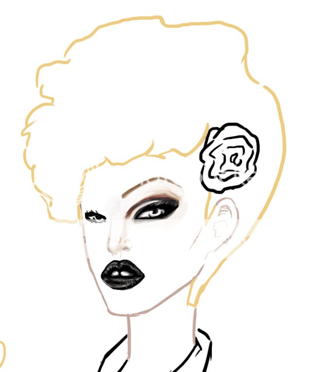
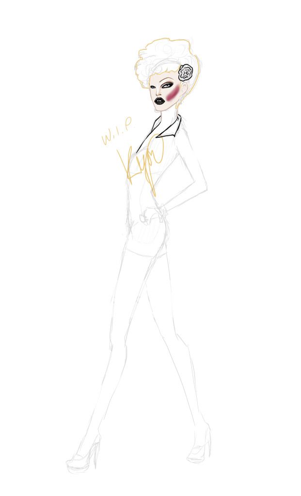
Please critique?
Here's a close up of the face:
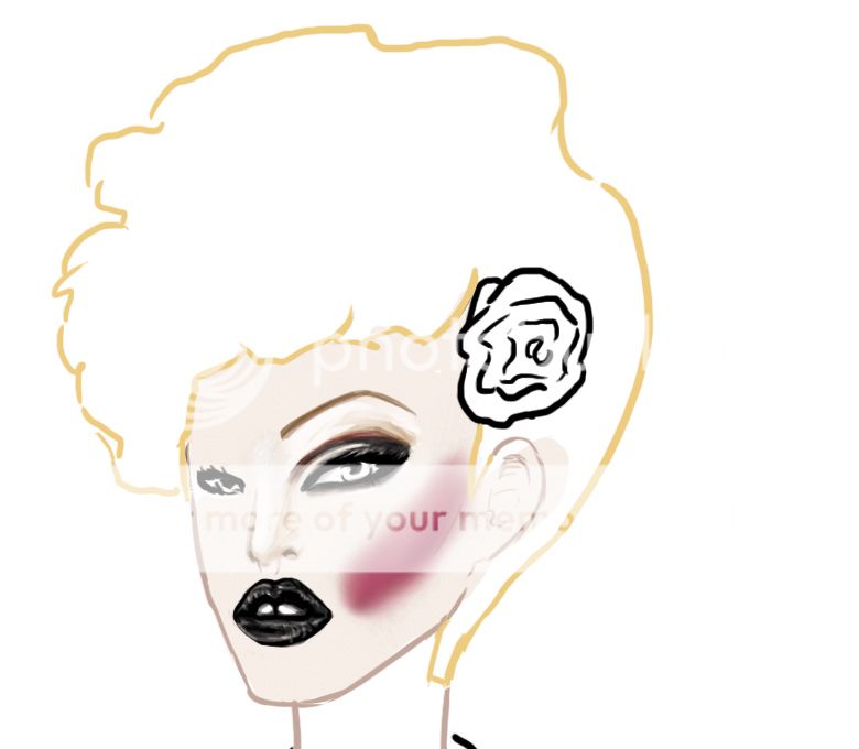
This is just a work in progress, of course. I used smudge for the cheeks because idk... I can't really get them to blend the way I want it without it. Anyone have any suggestions on that? Or do you think they look OK for the most part? The problem is that they are supposed to look really obvious, but I dunno... I'll take any suggestions for improvement.
Here's the images I am inspired by:
One
Two
Three
The cheeks are more striking in the first image, but not so much in the two others...