|
|
|
|
|
|
|
|
|
 Posted: Fri Oct 07, 2011 2:05 am Posted: Fri Oct 07, 2011 2:05 am
|
|
|
|
|
|
|
|
|
|
|
Posted: Mon Oct 10, 2011 11:05 am
|
|
|
|
|
|
|
|
|
|
|
|
|
Posted: Mon Oct 10, 2011 6:10 pm
|
|
|
|
|
|
|
|
|
|
|
Posted: Mon Oct 10, 2011 11:18 pm
 |
|
|
|
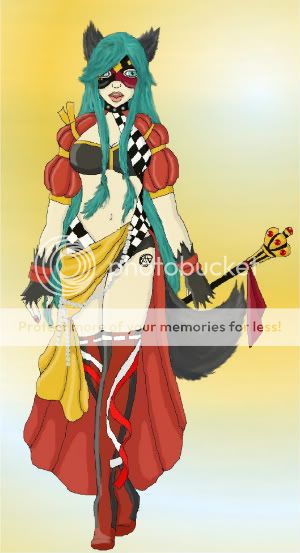
MahoHaku Loving the character design. It's very awesome, and the colors go really well together. The not floating is a good thing to do in drawing as well. Floating a character in the middle of a blank page is probably a fatal flaw several artists have so that's a plus. You have a strong drawing for the hand anatomy wise, and the face is okay as well and really good as far as an anime/cartoon style. As far as the rest of the anatomy I might take into consideration the perspective on her torso and shoulder level. The angle of the shoulders. I would also make her ears bigger. This is a frontal 3/4-ish view so I would show a bit more of the back of her head wink
If you were to redraw I would suggest nothing more than some contrast in shading on the colors to give it more depth or smoothen it out more for a comic or cartoon like appeal. And fix a few perspective flaws, namely her torso and around her ear area, giving to volume and filling up more space.
lol, yeah, I have a hard time with ears, ^//^ I normally hide them if I can, but I'm trying to get better at it. Its funny that you say you like the colors, most of them are highlighters or the pens that I had just bought that day and was testing out. lol, though color contrast is a strong suite of mine. Oh, I'm suprised you didn't say anything on her mouth that's were I thought I went wrong the most. Lol, I like you critique, thank you for taking the time. Oh and the character is from a manga I'm trying to do. |
 |
|
|
|
|
 |
|
|
|
|
|
|
|
|
|
|
|
|
|
|
|
|
Posted: Wed Oct 12, 2011 1:27 pm
|
|
|
 |
OneWeekRainisu MahoHaku Loving the character design. It's very awesome, and the colors go really well together. The not floating is a good thing to do in drawing as well. Floating a character in the middle of a blank page is probably a fatal flaw several artists have so that's a plus. You have a strong drawing for the hand anatomy wise, and the face is okay as well and really good as far as an anime/cartoon style. As far as the rest of the anatomy I might take into consideration the perspective on her torso and shoulder level. The angle of the shoulders. I would also make her ears bigger. This is a frontal 3/4-ish view so I would show a bit more of the back of her head wink
If you were to redraw I would suggest nothing more than some contrast in shading on the colors to give it more depth or smoothen it out more for a comic or cartoon like appeal. And fix a few perspective flaws, namely her torso and around her ear area, giving to volume and filling up more space. lol, yeah, I have a hard time with ears, ^//^ I normally hide them if I can, but I'm trying to get better at it. Its funny that you say you like the colors, most of them are highlighters or the pens that I had just bought that day and was testing out. lol, though color contrast is a strong suite of mine. Oh, I'm suprised you didn't say anything on her mouth that's were I thought I went wrong the most. Lol, I like you critique, thank you for taking the time. Oh and the character is from a manga I'm trying to do.
For anime that mouth is okay although maybe the jaw line could be angled slightly different or lower, depending on how you would redraw the head a bit for her ear. Shaping the anatomy first before drawing the character is very important in getting a good piece no matter if it's an animal, object, or person. |
|
|
|
|
|
|
|
|
|
|
|
|
|
|
|
|
|
|
|
|
|
|
|
|
|
|
|
|
|
|
|
Posted: Fri Nov 18, 2011 7:18 pm
|
|
|
|
|
|
|
|
|
|
|
Posted: Fri Nov 18, 2011 7:45 pm
|
|
|
|
|
|
|
|
|
|
|
|
|
|
|
|
|
|
|
|
|
|
Posted: Fri Nov 18, 2011 11:01 pm
|
|
|
|
|
|
|
|
|
|
|
|
|
Posted: Sun Nov 20, 2011 3:00 pm
|
|
|
|
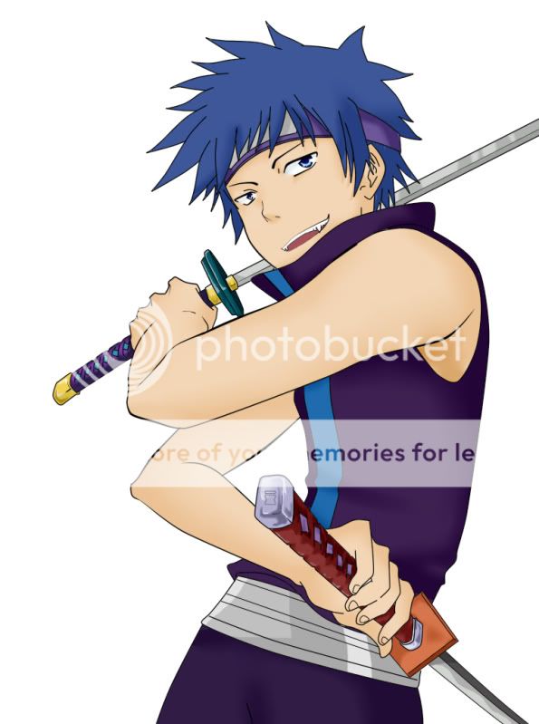
I-Daisuke Kaicho-I MahoHaku I-Daisuke Kaicho-I a guy could use some help Very ninja I like it. I like the character design and the perspective works for him. He's very anime stylized and it works. I think that if possible always remember 3 lighting. Rim lighting, key lighting, fill lighting. Deep shadows are also a good thing unless it's an intended style. For this you have the right shading on the eyes but I would carry it through out the piece. Yea a lot of people tell me to to darken the shadow and what not . . . lol but I like my shadowing soooo yea... Thx you very much I really enjoyed hearing what you had to say about it.
Glad I can help... but another word of advice is that if you were going into a field of art other than personal art I would suggest not always doing what you want to do. Sure you will eventually get to your own art but for a long while till you move your way up, making art for others is what it's all it's about. If they don't like the piece you don't get paid ya know. Anyway please work on several types of work, and do many different things with that art, rework them. If you don't you'll never improve. |
|
|
|
|
|
|
|
|
|
|
|
|
|
|
|
|
|
|
|
|
Posted: Sun Nov 20, 2011 5:08 pm
|
|
|
|
MahoHaku I-Daisuke Kaicho-I MahoHaku I-Daisuke Kaicho-I a guy could use some help Very ninja I like it. I like the character design and the perspective works for him. He's very anime stylized and it works. I think that if possible always remember 3 lighting. Rim lighting, key lighting, fill lighting. Deep shadows are also a good thing unless it's an intended style. For this you have the right shading on the eyes but I would carry it through out the piece. Yea a lot of people tell me to to darken the shadow and what not . . . lol but I like my shadowing soooo yea... Thx you very much I really enjoyed hearing what you had to say about it. Glad I can help... but another word of advice is that if you were going into a field of art other than personal art I would suggest not always doing what you want to do. Sure you will eventually get to your own art but for a long while till you move your way up, making art for others is what it's all it's about. If they don't like the piece you don't get paid ya know. Anyway please work on several types of work, and do many different things with that art, rework them. If you don't you'll never improve. |
|
|
|
|
|
|
|
|
|
|
|
|
|
|
|
|
|
|
|
|
|
|
Posted: Mon Jan 23, 2012 11:25 am
|
|
|
|
|
|
|
|
|
|
|
|
|
|
|
|
|
|
|
|
|
|
|
|
|
|
|
|
|
|
|
|
|