|
|
|
|
|
|
|

Profitable Conversationalist
|
 Posted: Tue Aug 11, 2009 4:44 pm Posted: Tue Aug 11, 2009 4:44 pm
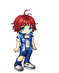
Here's my OC. I know her outfit is rather plain, but that's how I want her to look. How is the anatomy? I'm trying to get better.  I'll ink this later.
|
|
|
|
|
|
|
|
|
|
|
|
|
|
|
Posted: Wed Aug 12, 2009 7:49 am
It looks good so far. 4laugh
The waving arm is a little off; the shoulder needs to be higher, and the eyes are a bit too close together. Other than that, it's good. C:
|
|
|
|
|
|
|
|
|
|
|
|
|
|
|
|
|
|
Posted: Wed Aug 12, 2009 10:27 am
|
|
|
|
|
|
|
|
|
|
Posted: Thu Aug 13, 2009 12:48 pm
The anatomical part looks stunning, it's quite nice to see an artist who draws breasts that are in proportion to the body ^^; The slightly bent leg makes up for the lean, so the picture is not to static and she doesn't look like she will fall over, well done :]
Regarding the arm on the right side, I tried to mimic the pose, but it was very uncomfortable (well, I'm definitely not athletic in any way) to hold my elbow in line with my shoulder - lowering the elbow might make it feel a bit more relaxed.
If she is meant to be a 'normal' person (that is, she won't start throwing sparkles and summon demons) then that outfit isn't plain at all. The high boots and tucked in pants are a nice detail, as is the belt, etc.
|
|
|
|
|
|
|
|
|
|
|
|
|
|
|
|
Profitable Conversationalist
|
Posted: Fri Aug 14, 2009 9:39 pm
Mm'kay...I've fixed the eyes, the nose placement and perspective on the face (wrong side of face was visible, oops). I dropped the shoulder slightly.
I'll post the updates later this weekend, Saturday night with any luck.
I still need to work out folds/creases in the clothes before I can start inking...that worries me a little, sigh.
|
|
|
|
|
|
|
|
|
|
|
|
|
|
|
Posted: Sat Aug 15, 2009 11:01 am
OK, here are the edits. Photoshop didn't like me today, so it did weird erasures on one pant leg to spite me. I think it hates uninked art. 
|
|
|
|
|
|
Profitable Conversationalist
|
|
|
|
|
|
|
|
|
|
|
|
Posted: Thu Aug 20, 2009 10:30 am
Thaliat Everwood OK, here are the edits. Photoshop didn't like me today, so it did weird erasures on one pant leg to spite me. I think it hates uninked art. Here is a quick tip that can help you with your pencil sketches:
Go to Image-Levels or use the simplified way Ctrl+L.
The screen that pups up has a graph indicating the brightness and contrast of your image and there are two anchors or arrows below the graphic, if you move those arrows to the left, the lines will be lighter but moved to the right it will make your lines more visible or darker.
Just "play" with the contrast until you are satisfied with the result biggrin
|
|
|
|
|
|
|
|
|
|
|
|
|
|
|
Posted: Thu Aug 20, 2009 7:58 pm
her arms are a littel short and the hands are little small. The hand waving looks akwardly possitioined too. The eyes also look like, and I'm not rying to critisise, a doll's button eyes.
The eyes are actually harder than they look, I erase a lot when drawing them so I now how hard it is to make them look sorta the same. But the trick is in how you make the shine in the eye match the direction of the light. One big shine goes on the side that the light comes from (light from right=shine on the top right corner of the light and vice versa) and a smaller one at the opposite corner of the eye.
The arms are well structure but are sorta short for the body they should come a few inches above the knee, and even while posing the arms differently making them short in no excuse.
And last but NOT least are the hands:
Problem 1. In reality our hands, when opened out like a high five, is the same size as the face and them being well structured does not excuse the fact that they are small.
Problem 2. The one that looks like it's waving looks awkwardly positioned like it has a crook in it or something, try pointing it more towards you and vioal, You got A promising hello wave!
|
|
|
|
|
|
Amaya Himura X Zero Kiryu
|
|
|
|
|
|
|
|
|
|
Profitable Conversationalist
|
Posted: Sat Aug 22, 2009 8:05 am
[.Potemkin.] Here is a quick tip that can help you with your pencil sketches:
Go to Image-Levels or use the simplified way Ctrl+L.
The screen that pups up has a graph indicating the brightness and contrast of your image and there are two anchors or arrows below the graphic, if you move those arrows to the left, the lines will be lighter but moved to the right it will make your lines more visible or darker.
Just "play" with the contrast until you are satisfied with the result biggrin Awesome! I am going to try that next time. Thanks! ssanimegirl her arms are a littel short and the hands are little small. The hand waving looks akwardly possitioined too. The eyes also look like, and I'm not rying to critisise, a doll's button eyes. The eyes are actually harder than they look, I erase a lot when drawing them so I now how hard it is to make them look sorta the same. But the trick is in how you make the shine in the eye match the direction of the light. One big shine goes on the side that the light comes from (light from right=shine on the top right corner of the light and vice versa) and a smaller one at the opposite corner of the eye. The arms are well structure but are sorta short for the body they should come a few inches above the knee, and even while posing the arms differently making them short in no excuse. And last but NOT least are the hands: Problem 1. In reality our hands, when opened out like a high five, is the same size as the face and them being well structured does not excuse the fact that they are small. Problem 2. The one that looks like it's waving looks awkwardly positioned like it has a crook in it or something, try pointing it more towards you and vioal, You got A promising hello wave! Oh, geez, those eyes are just temporary...like place holders. I guess I forgot to mention that. But thanks for the tip on shine placement, I have a tendency only to draw the big shiny spots and forget the smaller ones. As for the arms, all the drawing reference books I have say the wrist should end at the pelvic region. That puts the end of the hands at about mid-thigh. So that's probably why they look a little short to you...although I have seen drawing styles where the arm length is exaggerated and the hands do end just a bit above the knee! (Oh, and the waving arm is slightly turned away from us in her pose.) As for the hands: if I put my hand to my face, with my chin and the base of my palm aligned, the tip of my longest finger falls just about at the middle of my forehead. Now, her fingers are slightly bent and the hand is a little cupped (cause when I wave that's how I tend to do it!) to have a casual and relaxed look as to the more rigid royalty wave you see the Queen do. So my hands aren't actually that small. Point taken on the arm looking a mite awkward. But I tried the pose and was able to hold it comfortably enough, so it's staying...that arm/hand gave me enough hell already! Anyway, I don't like this shrunken view, but we all know Gaia and it's size restraints. When I do ink this, I'll post a link to the larger version so the eyes and smaller details will be a bit more visible.
|
|
|
|
|
|
|
|
|
|
|
|
|
|
|
|
|
|


![[.Potemkin.]'s avatar](https://a1cdn.gaiaonline.com/dress-up/avatar/ava/03/18/25c190a02d1803_flip.png?t=1593704296_6.00_11)