|
|
|
|
|
|
|
|
|
 Posted: Sun Apr 19, 2009 1:35 pm Posted: Sun Apr 19, 2009 1:35 pm
This time I would like you people to critique the coloring choosed on this one.
It's more like a Comic coloring style.
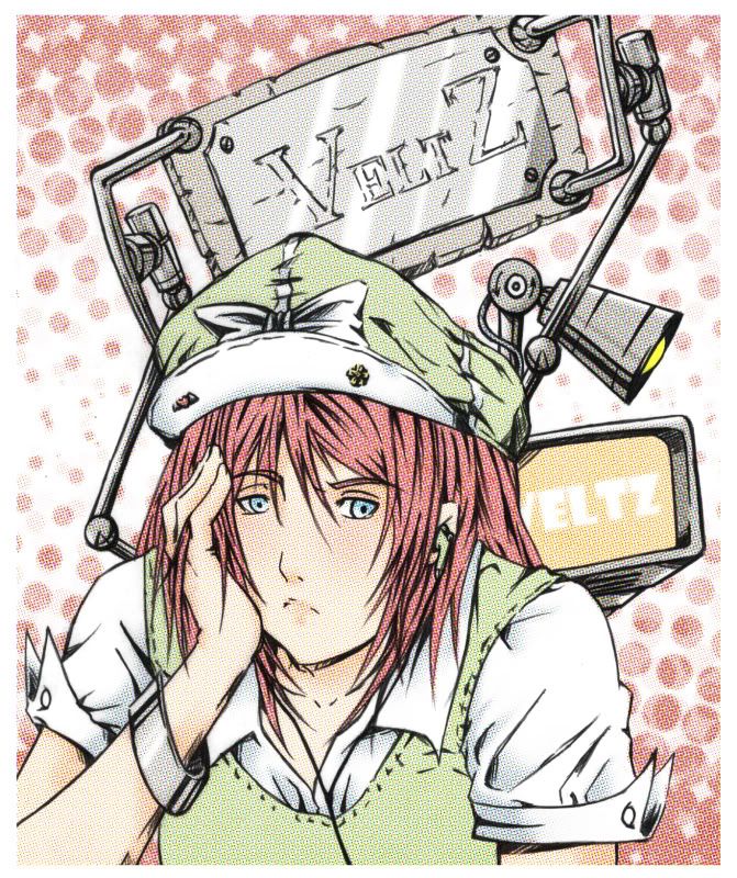
Is it any good?
|
 |
|
|
|
|
|
|
|
|
|
|
|
|
|
Posted: Sun Apr 19, 2009 6:50 pm
The person pops out nicely, but the background (for me at least) should be duller because it looks too vivid . Maybe if you make the background more duller it'll help your person standout more. Also maybe use a cool color for the background. Cool tends to draw back and let the warm colors pop out more.
Over all I like it. 3nodding Love the style you used too. The outfit and hair are done well, because the complementary colors scheme you have makes the person look great.
|
|
|
|
|
|
|
|
|
|
|
|
|
|
|
|
|
|
Posted: Sun Apr 19, 2009 9:23 pm
It looks amazing! He has an older face than the colors you used show. >w<
So cute!
|
|
|
|
|
|
|
|
|
|
|
|
|
|
|
|
|
|


![[.Potemkin.]'s avatar](https://a1cdn.gaiaonline.com/dress-up/avatar/ava/03/18/25c190a02d1803_flip.png?t=1593704296_6.00_11)