|
|
|
|
|
|
|
|
|
 Posted: Tue Nov 24, 2009 9:48 pm Posted: Tue Nov 24, 2009 9:48 pm
|
|
|
|
|
|
|
|
|
|
Posted: Wed Nov 25, 2009 12:15 pm
That is awsome!!! Realy great. please leave a comment on my work plss?
|
 |
|
|
|
|
|
|
|
|
|
|
|
|
|
|
|
|
Posted: Wed Nov 25, 2009 12:26 pm
Let me say your art is far better than mine... but my only thing is the lines of the hands could be smoother-I noted there was some feathering of those lines... aside i love it
|
|
|
|
|
|
|
|
|
|
|
|
|
|
|
Posted: Thu Nov 26, 2009 3:35 am
You're on your way of becoming really good! surprised
|
|
|
|
|
|
|
|
|
|
|
|
|
|
|
|
|
|
Posted: Fri Nov 27, 2009 5:23 pm
Oh my goodness, they're all so soft and beautiful! If anything I think the arms of the first three pics are a bit disproportionate. But thats it. I really like your style, especially in the facial region.
|
|
|
|
|
|
|
|
|
|
|
|
|
|
|
Posted: Fri Nov 27, 2009 11:17 pm
You're very good. I really like the hair, faces, and general proportions.
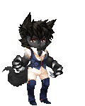
1st picture: The arm in the back seems to have a longer forearm than the one in the front. The hands also seem kinda big, but maybe that's just your style. I think the feet are too small. The legs seem like they should be longer... I don't remember where it was (I think within this guild), but I think I read someone post one of their general proportion tips about the thighs - if you have your knees up to your chest, the knees should be right around the collar bone. This picture looks like they'd only be around the middle of the breasts.
2nd picture: Upper arm in the back looks longer than the one in the front. Like, even with that angle... seems a bit off. Overall, love it.
3rd picture: The mouth and nose aren't centered. The upper arm to the right isn't as thick as the one on the left. The wrist area on the forearm to the right isn't as slender as the one on the left. The arms are different lengths, but I don't think the depth difference is noticeable enough (if intended). Overall, I really like the proportions.
4th picture: Looks great.
|
|
|
|
|
|
|
|
|
|
|
|
|
|
|
|
|
|
Posted: Mon Nov 30, 2009 6:52 pm
Thanks for all the comments guys. Really appreciate the constructive criticism too. heart
|
|
|
|
|
|
|
|
|
|
|
|
|
|
|
Posted: Tue Dec 01, 2009 11:44 am
Awesome drawings. I like how they look overall but they appear sketchy.
1 The first drawing comes across to me as stiff, especially the arms. The arm further back is out of proportion. The feet look too tiny.
2 The second drawing looks great. The only thing I see is that the arms may not be proportionate to the body once again.
3 For the third, well it looks awkward. The position of the nose and mouth are off. The face is looking forward but the nose and mouth indicate an angled view. They need to be centered. There isn't enough emphasis on the breasts. The clothing shows no indication of providing support.
4 As for the final one... looks amazing (all do). Nothing really pops out to me on this one as being off.
|
|
|
|
|
|
|
|
|
|
|
|
|
|
|
|
|
|
|