|
|
|
|
|
|
|
 Posted: Thu Apr 21, 2005 11:40 am Posted: Thu Apr 21, 2005 11:40 am
sailoreclipse lol thanks. ^^ I'll keep that highlighting trick in mind for future reference. And petals isn't my mate; just a friend. XD I'm a girl--and as you can probably tell from his outfit--he is NOT into girls very much. emotion_sweatdrop In England, 'mate' and 'friend' are the same thing. Meanwhile... Vorty AND Shock? I really must be getting good...
|
 |
|
|
|
|
|
|
|
|
|
|
|
|
|
Posted: Thu Apr 21, 2005 12:01 pm
Praise from a naked pirate...
"Like, that's totally sweet, dude." xd
|
|
|
|
|
|
|
|
|
|
|
|
|
|
|
|
|
|
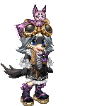
Posted: Thu Apr 21, 2005 5:18 pm
 which one looks better? im having a hard time.
|
|
|
|
|
|
|
|
|
|
|
|
|
|
|
Posted: Thu Apr 21, 2005 5:32 pm
I like the dog in the first version, but I also dig the texture on version 2's pants.
So if you can combine the two, it'll be great xd
I'd also suggest going with a greyer and darker shadow on the pants, at the moment they look almost neon.
|
|
|
|
|
|
|
|
|
|
|
|
|
|
|
|
|
|
Posted: Fri Apr 22, 2005 8:21 am
Vorty I like the dog in the first version, but I also dig the texture on version 2's pants.
So if you can combine the two, it'll be great xd
I'd also suggest going with a greyer and darker shadow on the pants, at the moment they look almost neon. -looks at her own pj pants- your right...they are in need of darker shades/..but trust me, i wouldnt expect mircles from ms paint if i were you.
|
|
|
|
|
|
|
|
|
|
|
|
|
|
|
Posted: Fri Apr 22, 2005 10:33 am
I would. Don't limit yourself by saying things like that. You can accomplish whatever you want with whatever you have if you put enough effort into it.
I like your shading all over on the second version, but Sir Vorty is right about the dog.
Could your make your white areas on the pants a light grey/green? That would tone down your electric effect, and yet still work for highlights. whee
|
|
|
|
|
|
|
|
|
|
|
|
|
|
|
|
|
|
Posted: Fri Apr 22, 2005 11:30 am
|
|
|
|
|
|
|
|
|
|
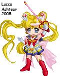
Posted: Fri Apr 22, 2005 11:41 am
Absolutely glorious-but her hands are too small!
You've got some brilliant motion and light coming from this-I love action shots that don't physically move!
heart
Can you make the wings on her wand stand out more from her hair?
The gorgeous, gorgeous hair....*drools*
|
|
|
|
|
|
|
|
|
|
|
|
|
|
|
|
|
|
Posted: Fri Apr 22, 2005 11:54 am
Hmm, yes, now that you mention it, the hands do look a bit odd. I've fixed it up: 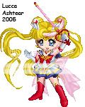
|
|
|
|
|
|
|
|
|
|
|
|
|
|
|
Posted: Fri Apr 22, 2005 2:18 pm
Only thing I can see is that her bangs seem kinda high up on her head...but that might be just me...or the gaian avies...XD *has seen way too many pics of usa*Awesome job. ^^
|
|
|
|
|
|
|
|
|
|
|
|
|
|
|
|
|
|
Posted: Sat Apr 23, 2005 7:16 am
TheQualityofMercy I would. Don't limit yourself by saying things like that. You can accomplish whatever you want with whatever you have if you put enough effort into it.
I like your shading all over on the second version, but Sir Vorty is right about the dog.
Could your make your white areas on the pants a light grey/green? That would tone down your electric effect, and yet still work for highlights. whee true, ill try and find a grey-green color on the pallets in paint, and then ill combine the dog!!
|
|
|
|
|
|
|
|
|
|
|
|
|
|
|
Posted: Sat Apr 23, 2005 8:25 am
fixed it! version 1 dog, version 2 texture, and i made the pants a grey/green color so its not so vibrant. does it look any better? 
|
|
|
|
|
|
|
|
|
|
|
|
|
|
|
|
|
|
Posted: Sat Apr 23, 2005 10:46 am
|
|
|
|
|
|
|
|
|
|
Posted: Sat Apr 23, 2005 11:37 am
Huzzah for the re-working success of the both of you!
heart
|
|
|
|
|
|
|
|
|
|
|
|
|
|
|
|
|
|
Posted: Sat Apr 23, 2005 4:52 pm
Erlyn's Dias edit inspired me to remake my own Dias. 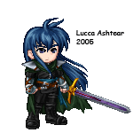
|
|
|
|
|
|
|
|
|
|
|
|
|
|