Since it wasn't obvious to begin with, no, I don't care about the existence of Better Gaia. Something as basic as decent website should NOT have to be provided for a business by a third party, end of story.
I bitched about this when the change from the old blue banner format was implemented, and I'm bitching about it now, because at the end of the day, it bugs me literally every time I go into a thread for whatever reason.
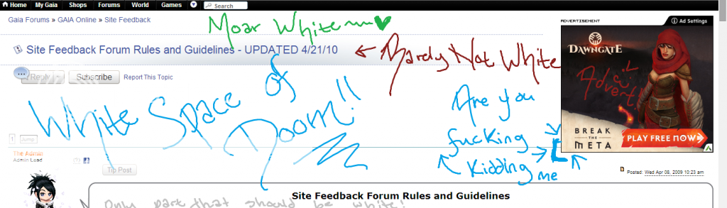
I mean, really.
Look at it.
Look at it long and hard.
And then go get some ice cubes to help deal with your severe eye strain, because this s**t is atrocious.
Literally nowhere else on the site is the background completely white like this--the forums themselves have a sort of beige background, the main index has sort of a little blue-ish thing going on in the forum descriptions, the main page has a nice cool grey to even things out. I get that Gaia evolves over time--hell, since I joined, the site design has been overhauled at least three or four times. That doesn't excuse why something as basic as the thread title space has been left outdated and untouched in this form for so many years.
Hell, the old blue bar we used to have in 2007/2008 wasn't much better, but at least it had soon damned COLOR. This just feels empty.
Don't even get me started on the font sizes.
I know it's easy to forget, especially with the hustle and bustle about announcements, gold generators, and poor customer service, but Gaia's a forum website. Shocking, I know. Making the forums not look terrible and broken (not to mention inconsistent and dated) might help revitalize interest in the site.
And if you're going to stretch the thread header enough so that you can fit ads off to the side despite it looking awkward as hell, AT LEAST HAVE THE DECENCY TO ACTUALLY HAVE ENOUGH ROOM FOR THE ADS.
Also, wtf is up with the alignment on this site? That could warrant a whole other thread.


 100
100


 ⇝⊰
⇝⊰