Welcome to Gaia! ::


To be honest I've been sick since I started this thread but it got a lot worse yesterday. I was gonna get on and do the crit anyway but as soon as I got on the internet I got some seriously bummer news that's hard to explain to people so I just left my laptop alone for the rest of the day ;;
I'm going to catch up ASAP though!

Batman_Senpai's Husband

Shy Noob

consider these two? as a couple? any pose is fine and i love your art its soooooo awesome
User Image
Cupcake Hemophilia
To make up for being so horrendously late, I'll try to give you the most detailed crit my illness-ravaged mind can offer right now ;;

As a general note, I like the style you have going on! It feels fun and cartoony, and it's clear you've been experimenting with different things. You'll want to work on your facial proportions, since all three have a little wrong in the faces. I put redlines under the spoiler tags to clarify what I'm saying a bit. ...And then I put those under the spoilers the crits are under cos I ended up making them very long lolsob

1
User Image - Blocked by "Display Image" Settings. Click to show.
Beat-up faces are really hard to do! I have a friend who has done a few good ones, but only after trying some out that didn't turn out as well. They're difficult mainly because most people don't come into contact with them. I tried looking up some for reference for you, but most searches just lead to makeup or photoshops, so I can see why it'd be annoying to try figuring it out on your own. Using as deep of a purple as you had implies that it was serious, so the lids would most likely be bloated, especially the upper one. All scratches and such would follow the curvature of the face to some extent, which is why I also redid them in purple to show you. If the thick part on the left is blood and not the skin being ripped off, then my purple is way wrong cos I didn't think of that possibility until just now ;;

I really like that you put definition in the side of her face, so that you get a feel for the shape of her cheeks and chin, The shading on the cheek closer to the viewer is odd though. At least of the faces I've seen, the only time the cheek would stick out enough to be shaded in that manner is when you have a big smile, and in that case, most of the shadow would lie closer to the corner of the mouth. The way you have it, the cheek seems precariously raised off of her face. You might want to study portraits for the way light hits faces and the shadows they cast.
For the features of the face, I like the detail you put into the lips. I'm bad at capturing the cupid's bow between the lips, you you pulled it off pretty well. While it's true that upper lip tends to be thinner than the lower lip, yours comes off as just a little too thin in comparison. It's good to keep in mind also that the corners of the mouth tend to fall just under the middle of the eye. The nose also ended up being a little long. My quick reference I fall back on for the standard length of the nose is that it's an extra eyeball (not how much you see, but the size of the whole thing) below the bottom of the eyeball. Other people measure it out as ending at the halfway point of the bottom half of the face (with the eyes sitting on the halfway point of the whole face). Speaking of the eyes, it's good of you to include the caruncula when going for more detailed eyes. You seem to have drawn both of them from a head-on angle while the head is viewed from a three-quarters view, though. I do completely commend you on the ear though, aside from being a little small, it's at the right height on the head and at the appropriate distance from the eye for that angle of the head.
The other thing about the head is that it's too big for the face. I assume it's because you drew the face first, then put the hair on top, and felt like you had to make room for both the hair and the crown. I mentioned a little earlier that putting the eyes in the middle of the face helps determine where the things below it go, but the same is absolutely true for the top of the head, as well. I tried to keep the facial features all lined up as well as I could in the redline so you could see how much extra hair it was, as well as how to fit it and the flower crown in.

For the hair, it's generally bad form to do a heavy outline of only the very outside edge of the hair unless it's flat, neat hair. Perhaps next time, draw the borders around the clumps of hair you used in the bangs? The shading you used for that part of the hair is subtle, but still makes the form and shape of the hair apparent, even without being outlined. The other option would be to forgo the outlines all together, like you seem to have done with the scarf. While the subtle shading on the bangs are nice, the strong, isolated highlights above the flower crown don't work out as well. Like with the cheek, I think this is mostly an issue of not knowing how light hits the hair. Since heads are round, unless the light is hitting from the side, highlights will generally form a ring around the head, rather than a few isolated streaks in the direction of the light.
In terms of the other parts of the picture, the main standout is the halo. The shading was probably nice before you blurred it! Blurring is generally a bad idea until you learn how to work it into the rest of the piece. The halo looks very out of place since it's so unclear while everything else has a distinct outline. For the flower crown, the detail on the flowers looks nice, but having the colors blur and bleed into other flowers heavily detracts from that. For the scarf, there should be some cast shadow from the head. Also, a good tip for making folds it to avoid parallel lines as much as you can. Try to aim for triangular shapes, instead.

Overall, I like the definition in the face, but you should study lightsources more and work on your shading technique (not the values, but your stroke method).

2
User Image - Blocked by "Display Image" Settings. Click to show.
I like the expression in this one! I don't like drawing chins from below, but you pulled it off rather well! Just like with the last one, your definition in the edge of the face is very descriptive of the shape of the face, including the single line you used for the right side, though that one drifted off a little. For the eyes, you moved the irises so far to the corners, I'm not sure he can even see the blade. My style's a little more anime so I made the irises a little bigger, but the point is how much of the circle of the iris you should be able to see ;; The nose would have looked really nice if it wasn't from below. Keep in mind that you should be seeing the bottom of the nose from that angle. The mouth also came out looking nice, except it doesn't match the angle that the head is turned to. I mentioned the lining up of the corners of the mouth in the last part, but the teeth also same out a bit far. You showed the right amount of teeth and kept the elements in the mouth arranged correctly though, which seems to trouble people when it comes to open mouths not viewed from the front.

For the rest of the body, when leaning back, your neck is limited by the spine, so it wouldn't lean back farther than the rest of the chest, it just seems that way because of tilting the head. For the hands, you kept the thumbs on the correct side, but you drew fingernails on the pad side of the hand on the left. The fingernails are well done though, and fit the form of the finger nicely. Keep in mind that the middle finger should be the longest though! Please don't mind the lines in the middle of the fingers in the redline, it's my shortcut to getting the lengths approximately right quickly ;;
You gave the lower arms nice definition, but the upper arm came out kind of wonky. It shouldn't ever really depress like that, the only place it would curve in would be a little between the biceps and deltoids. I think I covered the chest shape for you pretty well in the redline, and the same note about shirt folds from the last crit applies here. Because he's leaning back, the shirt scrunches where his back folds, so that's where the folds are coming from.

This one's very expressive, both in the face and body language! You just need to work on lining up what goes where a little better.

3
User Image - Blocked by "Display Image" Settings. Click to show.
I like the texture you chose for this. It's easy enough on the eyes while still being visually interesting. It's good that you chose a calm, simple subject for it, so the attention can be focused on the hair and what you did with it. I think it's great that you made the hair so curly and voluminous, to add some direction and give the eye something to follow when looking over the image. It's also nice that you kept to two tones of shading, because adding too much volume to the rest of the image while using a texture for the hair would have made it seem really flat. Instead, it works out rather well!

For the face, you have a few construction issues. The line above the eyelashes is either the bump at the end of the eyelid of the curve of the top of it, but it ended up in the middle of the eyelid shape. For the folded lid bump, you drew them correctly, just too far from the lashes. For the curve of the eyelid covering the eyeball, they need to be on top of where the eyeball sits inside the head, and curved the other way. The nose is a little long, and isn't defined as well as the ones in your other pictures were. Normally for a frontal view, all of the definition is in the nostril area, while the rest is more subtle.
For the lips, your mouth doesn't actually curve up or down. Instead, the very corners pull up or down. The shading on them is nice, but unless the light is coming from head-on, one lip is usually cast in shadow. This will be the upper lip, unless the light comes from below. About the blush you added, normally the cheeks flush and the nose might redden, but it would be down the nose rather than across it, and won't necessarily be connected to the blush in the cheeks. If you fade the edges of the blush more, it'll also seem more natural.

I only have a few notes for the body, since most of it's covered up. The neck wouldn't show in front of the shoulders like that, but the lines you used for the shoulders coming up to the neck are correct, so just getting rid of the lines in front fixes it. If those lines were meant to be the sternocleidomastoid (that muscle that pokes out on both sides of your neck), they should curve in towards the dip in the collarbone. The shoulders themselves look well-formed, you made sure they dipped down, where some people just draw them stiff. The arms shouldn't taper in so much unless they're being put behind her back, though.
As for the breasts, from what I can see from the one stray line on the right, you went for the teardrop method. From the breasts I've seen, generally you can see where they connect to the armpit, then they hang down and rest on the chest. The shape from there really depends on the size of the chest and breasts, among other things. I'm not sure what the line in the middle is supposed to be, though? The closest thing I can think of is cleavage, which doesn't exist when breasts are hanging loose. Instead, they kind of curve in to where they attach to the chest, which I drew in the redline. The one other thing that bothers me is that you covered the breasts with the hair for the most part, but you didn't keep in mind where the areolae would be. The one on the right would actually peek through where you had a gap between the hair.

As a whole, the picture is nice, where the concept, subject and execution work together really well. Mostly you just need to work on how you draw the different parts.


Haha, sorry, my mind doesn't work at full capacity when I'm this sick, so the vocabulary/grammar here might have come off as...weird and stiff, but if anything didn't make sense let me know and I'll try to think harder for the right words!
loveless_passions
consider these two? as a couple? any pose is fine and i love your art its soooooo awesome
Ummmm did you read the thread at all? If you have an opinion on my art, you most likely saw it in the first post...

Batman_Senpai's Husband

Shy Noob

LettuceJamming
loveless_passions
consider these two? as a couple? any pose is fine and i love your art its soooooo awesome
Ummmm did you read the thread at all? If you have an opinion on my art, you most likely saw it in the first post...


yes i have read your fist post what about it
Hyatt Hyacinth
Haha, I stick to digi mostly cos I'm lazy. What I like about doing stuff trad is that I have a better feel for things when drawing them with a pencil? Expressions and poses feel more natural, etc. Most of my friends who aren't doing art seriously anymore also stick with digi for the most part ;; Except for one who never got a tablet, but her pencil work is gorgeous beyond belief anyway-- Mostly my skill in school was with pen haha ;;
I'd say establish the frills in the linework, but I'm also a sucker for beautiful lines unless I'm painting. I found something that might explain it better, though I still recommend looking at actual frilly dresses for reference.

Well, like I mentioned, ink was like my one forte in school so I can go on and on about line weight and economy of line and such ;; Your lines didn't seem particularly heavy to me, but it also eases up how heavy the line appears when you draw a big picture like you did. Most of it seems like normal line weight, and the ends of the hair came out thin (which is part of why I complimented it!). The one place it seems heavy is in the cat ears, which I thought was intentional line weight.
I-I just realised you might mistake what I mean by line weight ahhh ;; If that's the case, I don't mean like how hard or light you press in one go-through, but rather how many times you go over one line to make it appear thicker/darker. If that seems weird and you want me to do an example, just say the word.

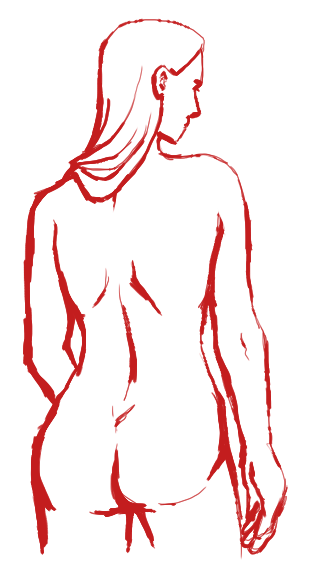
In terms of anatomy, the best thing to do is to take a class. Most places offer a figure drawing class you can take over the summer, and I'd highly recommend one of those. What I'd recommend though, is drawing people in real life. Quick sketches of people passing by, or sitting around during class/work, or even your family members when they have a few free minutes. Classes will help you learn the best ways to look at the figure to learn to draw it better (most people wouldn't think of looking at the negative space, etc), but lots and lots of practice from life is what will help the most. The more you draw the body, the more you recognise the things that are the same each time, the relationships between the different parts of the body, and so on. I wouldn't recommend books until you've gotten a good hang of anatomy, since they're mostly shortcuts and tips.
What kinds of anatomy classes have you taken? I took a month-long figure drawing course in the summer once when I was in high school, but it really, really helped me. It's the main reason I'd really recommend summer courses, haha ;;

You may have filled the paper, but you can always crop it again after you scan ittt

W-wow I got cover-my-face-with-my-hands embarrassed reading that last line. I'm nowhere near good enough to be aiming for an art degree. I'm in college, but it's a military college and I'm a math major. I just do art for fun, friends and to make sure I don't get rusty ;;
I went to an arts-oriented middle and high school though, so I have a bit more experience in art than a regular math major ehe My level of crit is more likely due to my analytical mind and thorough nature, really ;; My friends in high school got a little annoyed at how in-depth my crits were haha
loveless_passions
yes i have read your fist post what about it
Then you should know that this thread is for helping people out with their art, not for me to make art for people.
It's about time for me to hit the sack, but as long as I don't wake up too sick I'll try to get back on tomorrow!

Big Bum

LettuceJamming


User Image - Blocked by "Display Image" Settings. Click to show. Thank you so much for this! Yeah there are things I felt I wasn't doing quite right (the length of my noses, the left hand on #2, for example) and being told and shown how to do it is just...so helpful! blaugh Also you're, like, way more descriptive than me on a good day. xd
So thank you for doing this and putting so much thought in this, and I hope you get well soon!! heart heart heart
User Image - Blocked by "Display Image" Settings. Click to show.
Cupcake Hemophilia
User Image - Blocked by "Display Image" Settings. Click to show. Thank you so much for this! Yeah there are things I felt I wasn't doing quite right (the length of my noses, the left hand on #2, for example) and being told and shown how to do it is just...so helpful! blaugh Also you're, like, way more descriptive than me on a good day. xd
So thank you for doing this and putting so much thought in this, and I hope you get well soon!! heart heart heart
User Image - Blocked by "Display Image" Settings. Click to show.
You're very welcome! I'm glad I could be of service.
I felt horrible for taking off for a whole day, so I really wanted to make up for it. I was just way too bummed out to be of any use to anyone that day ;;

Thanks! I'm still sick (this has been going on for a while...) but I'm trying to get better. At least I got it out of the way before the semester started ehe ;;
I'm going to be on all night again tonight, though I might not be consistent in how often I check back here. I'll make sure to respond to anyone who posts once I see them!
Keep in mind that the crits themselves take a while to type up though, since they're so lengthy ;;

Inquisitive Entrepreneur

9,125 Points
  • Risky Lifestyle 100
  • Peoplewatcher 100
  • Entrepreneur 150
I checked out those references for the frills and it really helped me out alot, and I got a better understanding of what you mentioned before about them. I thank you for that biggrin
Also with the line work I get what your saying now too about that too but I wouldn't mind a reference of it if you don't mind.

With anatomy I've taken a few classes in high school & college, in HS I was good and in college I got better. (a hell of alot) i guess for me personally i've never really tried to apply the things I learn to cartoons, I guess i felt like it didn't need to be applied since cartoons are usually stylized & have their own sense of anatomy. but Its like you mentioned too practice makes it perfect so i gotta get back into sketching & stuff,

aw I didn't mean to embarrass you like that~! redface and wow that an interesting college and major you have and a way of thinking too. I myself I'm not too good at math sweatdrop but there are certain art forms & stuff that use math in order to create art and you shouldn't cut yourself short about becoming a professional artist. wink you got knack for it and being an art critic too, if anything just keep the idea on the back burner.

sweatdrop but i'm not saying that it's bad to do what your doing now in college. I'm sorry if i came off a bit insensitive to your current major & profession.
Hyatt Hyacinth
I'll work on a picture with line weight right after I'm done typing this up, then!
Well, with art, you apply what you learn to everything you do, hopefully. The thing about cartoons is you take what you learn from real anatomy and bend the rules a little to suit your needs, ehe ;;

I get embarrassed at compliments and the like because when I went to high school at least half of my friends were better at art than me, and now I feel like they're all AT LEAST at my level (most are above it, I think), so I'm not used to people thinking my art's a big deal or anything like that.
It's fact that the most common response I get to telling people my major is "I'm not good at math." I find math to be fun though, haha. I've got one friend who's going to college to do art professionally, but it's not for me, really. I'm planning to be a submariner if all goes well ;;

Art's something I still do for fun, and it's good to have as a hobby. I didn't feel as though you were talking down about my major at all! It makes me curious to know what you're studying/where you're working, though. If you don't mind my prying, that is!
Hyatt Hyacinth
D-don't look at the anatomy and stuff my sis is calling me so I wanted to go to her...I'll be back eventually...
User Image
I'ts messy, but hopefully you get the idea!

I'll be back....later tonight some time, haha...
Back!
And I should be on for a while still before I go to sleep.

Quick Reply

Submit
Manage Your Items
Other Stuff
Get GCash
Offers
Get Items
More Items
Where Everyone Hangs Out
Other Community Areas
Virtual Spaces
Fun Stuff
Gaia's Games
Mini-Games
Play with GCash
Play with Platinum