Thoughts:
The inverted colors is a very interesting idea, and it could work very nicely. It has a unique-looking scratchboard-like effect. However, either black on white or white on black, you still need far more tonal contrast. What you have here are just simple lines. Add some shading, with pure tone or with hatching. Shadows and highlights will work not only to give your images a finished look, but will also help to define spaces and shapes, achieving distinction between objects and a more three-dimensional look.
Yes. The font is extremely hard to read. Proper grammar and capitalization should not be an option, either. For example, in the poem on page four, is it "With God's children", "With gods' children", "With gods, children", etcetera? Your meaning can't be determined simply by your punctuation and capitalization. Get someone, who hasn't read the script or knows what's coming, to look it over for you, to check if they can read and follow each page, before you post them up.
Now, individual pages.
1. The cover is intriguing from the first, and immediately made me curious as to the plot. But for a splash page (title page), don't be afraid to go all-out on the artwork. The title is a good one, but you should make it bigger, as well as include the credits.
2. Text could be rearranged to make for an easier time determining the reading order of each block. Are those clouds on top, or a horizon line? This would be a really good shot to show off a nice landscape and immediately set the scenery for the reader. What time of day is it? What is the landscape like? Is this in the country, or a graveyard in a city? What country is it in? Also, drawing crosses is always tricky freehand. Don't be afraid to make a rular your best friend for making strong, straight lines.
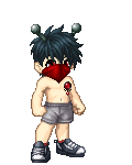
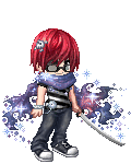
3-4. Hmm. Repeat artwork followed by a page of plain text. Looks lazy, kid. It would be better if you, first, gave your page flow more rhythm by making a multiple-panel page. You could easily combine these two pages into one. Also, vary the shots used in the panels. Maybe give us a nice, front-facing intro drawing of this character. Done well, it will show not only his(?) reactions to the situation and physical makeup, but also his personality.
5. On the bottom, is that one panel, or two? I can't tell, and the action between them(?) is also unclear.
Your story looks like it could be a good one. You have definite skills with pacing and mood. You just need to clean up some problem areas with clarity. Keep at it. I like what I've seen so far, and I'll be bookmarking your site to see how it develops.