|
|
|
|
|
|
|
|
|
 Posted: Sun Apr 15, 2007 5:40 pm Posted: Sun Apr 15, 2007 5:40 pm
For anyone who doesn't know, my full name is: Bazino Bazino, the Kid Whose Hair is on FIRENow, I use The GIMP dominantly, and have made a couple of Terragen scenes. I don't have a favorite style, though much of my work has either Abstract, Grunge, or Pentool in it. Also, I recently suffered from a serious, dreaded artistic disease known simply as the "slump" and I have been slowly healing and recovering from it. Seeing as this is a gallery, why don't I put some of my tags below? My favorite from each period will be in image form. Pre Slump GIMPwork: [oldest on top] http://i13.photobucket.com/albums/a285/lozocara/spritetag2x.pnghttp://i13.photobucket.com/albums/a285/lozocara/j4m.pnghttp://i13.photobucket.com/albums/a285/lozocara/lostfaith.pngGIMP Slumpwork [oldest on top]: http://i13.photobucket.com/albums/a285/lozocara/strike2.png http://i13.photobucket.com/albums/a285/lozocara/amoeba.png http://i13.photobucket.com/albums/a285/lozocara/finalcut.pngPost Slump Recoverywork: http://i13.photobucket.com/albums/a285/lozocara/strikethreev4.png http://i13.photobucket.com/albums/a285/lozocara/graffiti.png http://i13.photobucket.com/albums/a285/lozocara/graffiti.pngPost Recovery GIMPwork: http://i13.photobucket.com/albums/a285/lozocara/tasteofdefeat.pnghttp://i13.photobucket.com/albums/a285/lozocara/aero.png
|
 |
|
|
|
|
|
|
|
|
|
|
|
|
|
Posted: Tue Apr 17, 2007 9:58 pm
|
|
|
|
|
|
|
|
|
|
|
|
|
Posted: Wed May 02, 2007 5:24 am
A lot of your newer stuff is pretty good, although I think the last "March On" sig looks like simple filtering, although I wouldn't know cause I've never used GIMP...
Woot, 1st post...
|
|
|
|
|
|
|
|
|
|
|
|
|
|
|
Posted: Thu May 03, 2007 3:50 am
The only Filters I used in March On were the Gradient Map and Pick filters. Everything else is brushing or blending stuff different ways (really helps, IMO). But hey, when has a Filters only tag ever been a bad thing? Thanks for teh post, and actually, you're technically third post, but no one posts hhere anyways... New!!:  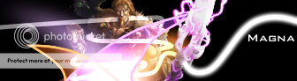 
|
|
|
|
|
|
|
|
|
|
|
|
|
|
|
|
|
|
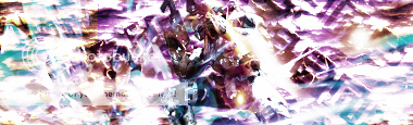
Posted: Fri May 04, 2007 12:51 pm
Lawl first post besides the author,.....
Anyway, the abstract is very good, although it strikes me as a tad plain...
|
|
|
|
|
|
|
|
|
|
|
|
|
|
|
Posted: Fri May 04, 2007 12:59 pm
meh. Oh well. It looks nice, so that tis enough for me...
BTW, I was wondering which of my posted work i should make a tut for...
|
|
|
|
|
|
|
|
|
|
|
|
|
|
|
|
|
|
Posted: Fri May 04, 2007 1:21 pm
I think the Magna one...I think thats the most interesting... cool
|
|
|
|
|
|
|
|
|
|
|
|
|
|
|
Posted: Fri May 04, 2007 8:41 pm
out of all the digital art I have in my portfolio, you want the Magna one?
A'ight, whatever. I'll get right on it boss *salutes*
|
|
|
|
|
|
|
|
|
|
|
|
|
|
|
|
|
|
Posted: Sun May 06, 2007 7:04 am
lol, it looks different then a lot of the other sigs I've seen...
|
|
|
|
|
|
|
|
|
|
|
|
|
|
|
Posted: Thu Jun 07, 2007 11:18 pm
|
|
|
|
|
|
|
|
|
|
|
|
|
Posted: Mon Jun 18, 2007 4:32 am
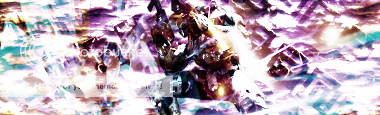
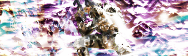
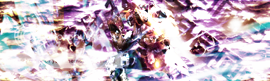
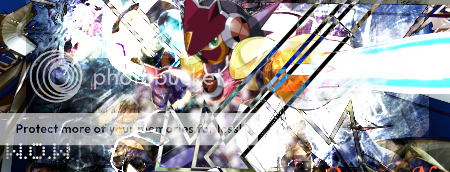
Why are the multiples of the same sigs? The are basically the same except some were jsut blurred or brightened more than the others from what I can see. You should just leave it at one super sig instead of multiple lone-like sigs.
|
|
|
|
|
|
|
|
|
|
|
|
|
|
|
Posted: Tue Jun 19, 2007 6:54 pm
I wanted to see which of the versions was the best, so I made 7... xD
|
|
|
|
|
|
|
|
|
|
|
|
|
|
|
|
|
|
Posted: Wed Jun 20, 2007 12:53 am
bazino I wanted to see which of the versions was the best, so I made 7... xD In the sigs you made above, the colors and the render seem to all oppose each other. Thus resulting in a grainy-looking blob that is your sigs.
|
|
|
|
|
|
|
|
|
|
|
|
|
|
|
Posted: Wed Jun 20, 2007 2:02 am
|
|
|
|
|
|
|
|
|
|
|
|
|
Posted: Thu Jun 28, 2007 7:26 pm
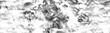
I must be quite frank...the new sigs were not to good. Try using less eyeblinding colors I suppose...Maybe you have too much going on, I really don't know rolleyes
|
|
|
|
|
|
|
|
|
|
|
|
|
|
|
|
|
|


 (hand-drawn ink, colored w/ GIMP)