Shironu-san
...
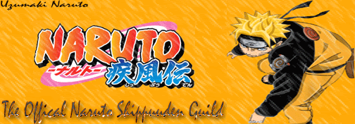
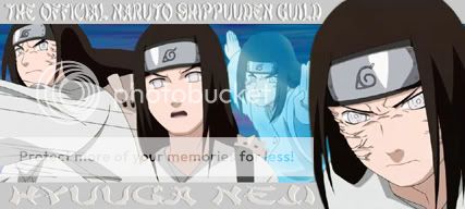
I made a banner:
What do you guys think? Because personally, I think it's bad.
Acutally there is a way to improve it.. you have it just need to twick it.
What yah need to do is lightly use a small eraser, with a low opacity and take the excess around the swirles from Resengen... and lightly gradiate it from visiable to faded...
Then around Naruto use a small eraser and light opacity to get rid of the excess around him and a little bit around Sakura.
You could also do for both Sakura and Naruto is make a duplicated layer and that duplicated layer change into motion blur and have the blur go from the middle to outside.. make it look as if they're coming at you but separating...
Then try messing around with having Sakura and Naruto being in color or change the background... cuz the images and background kinda blend together... It needs some added color to give it more power..
But you have it.. you really do, you just need to experiment with it more... believe me it takes me awhile just to do something like this... but first focus on fixing up the image mostly of Naruto and a little on Sakura...
And then see if it needs some added color or not.
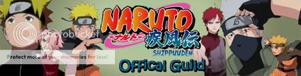
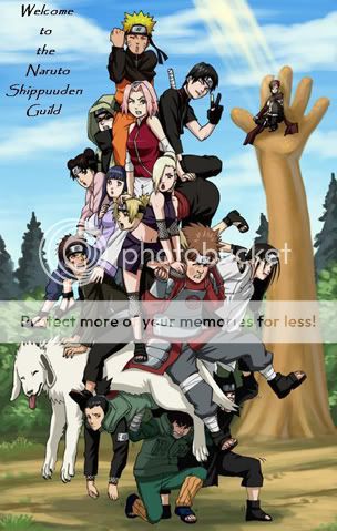
Take a look at my signature image and the banner for this guild I'm putting in underneath yours...