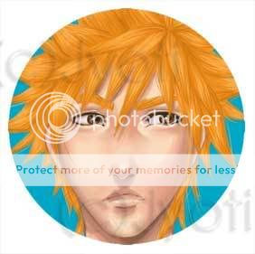
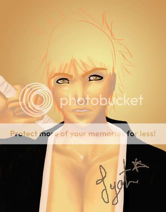
I like the way you drew the face. I think it looks fine. I'm not sure what you mean by ugly here. What parts of it are bothering you?
But there are a few things I'd like to pint out.
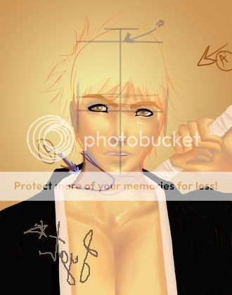
First of all, I see the orange sketch underneath and it seems to me like your plan for the whole head is a bit too.. tall at the top.
Another thing would be the eye placement. This one always gets me also, but one eye seems to be a bit higher than the other.
And judging from the more prominent shadow under the chin it seems you have a defined lightsource. You might want to make some more prominent shadows from that on the face to match the direction. Because right now it looks like a light is hitting him from right in front of the face but slightly raised in some parts of his face. Whereas the shadow under the chin looks like it is off to the left side and raised. So you might want to lighten and darken different parts of his face according to the light source.
Also, I find that if I flip a picture around horizontally I can see it in a different perspective and it becomes easier spotting any mistakes. That might help you so I flipped it over for ya.
Am I making any sense? xD