Welcome to Gaia! ::

Reply Art Fags
Some stuff

Quick Reply

Enter both words below, separated by a space:

Can't read the text? Click here

Submit

Tielyn

PostPosted: Sun Feb 04, 2007 11:43 pm


User Image
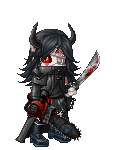
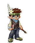
This is a sketch for my character Dii, and the other one is some random warrior chick. I know Dii's head is a bit too big, and I meant to fix that but I got side tracked. Please reply on what is good, and what I can improve on. (ignore the different signuratures. I had a username change between them)

User Image - Blocked by "Display Image" Settings. Click to show.
PostPosted: Mon Feb 05, 2007 1:14 pm


Are those pictures both by you?

'Cause the one on the right looks waaaay better. o_o;

Tawney


Tielyn

PostPosted: Mon Feb 05, 2007 4:50 pm


Yes, they are both by me. I did the one on the right at a much slower and more detailed pace, and it was meant to be more realistic. The one on the right was a less detailed, more anime-fied character sketch out, not really meant to be anything.

If you need proof, i have screenshots of the details and sketch layers and PSD files.

(and if you could check the larger version of my signurature, it has the same watermark/signing name as the one on the right)

http://www.deviantart.com/deviation/48154668/
http://www.deviantart.com/deviation/48154600/?qo=1&q=by:zenidii+in:scraps&qh=sort:time
PostPosted: Wed Feb 07, 2007 3:40 pm


I'm guessing that you like the stylized elongated body... I definitely like the picture on the right side. The sketchy one is nice, but the one on the right has better proportions, I think. 3nodding

Gahaku


Tawney

PostPosted: Thu Feb 08, 2007 5:19 am


Zenidii
Yes, they are both by me. I did the one on the right at a much slower and more detailed pace, and it was meant to be more realistic. The one on the right was a less detailed, more anime-fied character sketch out, not really meant to be anything.

If you need proof, i have screenshots of the details and sketch layers and PSD files.

(and if you could check the larger version of my signurature, it has the same watermark/signing name as the one on the right)

http://www.deviantart.com/deviation/48154668/
]http://www.deviantart.com/deviation/48154600/?qo=1&q=by:zenidii+in:scraps&qh=sort:time


Don't worry, I wasn't accusing you of anything. x3 I definitely prefer the realistic style, though.

The thing that most bothers me about the first picture is her chest. It's little a little weird uni-lump in the middle of her torso. o__o Maybe use a reference next time? xd heart
PostPosted: Thu Feb 08, 2007 10:57 am


the breasts are sort of weird, like you treat them as one solid mass hanging from the middle of her chest.

we actually get two lumps of flesh in stead of one, and usually the outer curve of the breast comes from the area where arm meets body. Even if you wear clothing that pushes them together, you'll still see them sort of pulled together from the sides.

(sorry if it's unclear, it would be easier to explain with visuals but i don't have any at the moment)

Page Boy

Reply
Art Fags

 
Manage Your Items
Other Stuff
Get GCash
Offers
Get Items
More Items
Where Everyone Hangs Out
Other Community Areas
Virtual Spaces
Fun Stuff
Gaia's Games
Mini-Games
Play with GCash
Play with Platinum