|
|
|
|
|
|
|
|
|
 Posted: Thu Jan 25, 2007 9:11 am Posted: Thu Jan 25, 2007 9:11 am
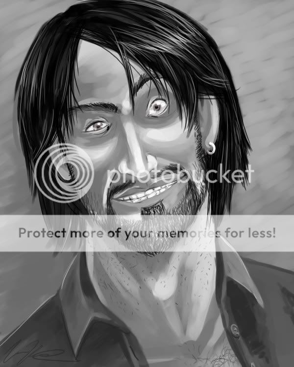
Painting in open canvas at three AM makes me LARF!! so I've been really unhappy with my art as of late, and figured I'd start experimenting a little more realistic as well as a little more exaggerated and see where it takes my style and so on. Doodled up my RP character last night on a whim. This is painted entirely in open canvas with no guidelines or references or anything practical to make it come out right, but somehow I feel like it looks good anyway smile but that explains any crooked bits or disproportioned bits, I swear! XD maybe it was the whole... three AM thing. anyhoo I'm rather proud of this and figured it was a good come-back piece to post here again! so, um, Hallo after a long absence!
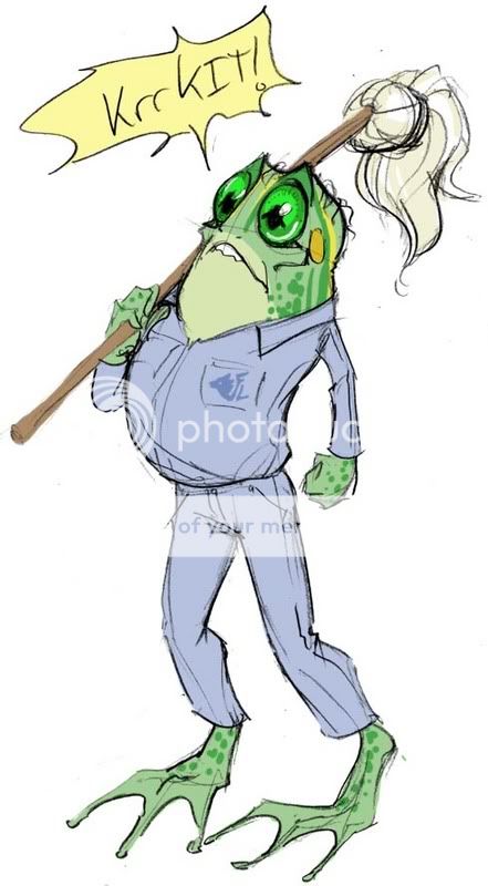
aand um... something else only related by the fact it's from the same RP, I had to post up my funny frog mutant janitor man because I thought he was cute. <3
ENJOY, FAGS!edit: note to self: work on drawing lips ):<
|
 |
|
|
|
|
|
|
|
|
|
|
|
|
|
Posted: Thu Jan 25, 2007 3:35 pm
i like how your sketches have loosened up, but things like the anatomy and proportions are getting better too!
The painting is nice too. I need to get open canvas X___X
Billys eyes look really small, they could be a tad bigger. I get the impression they dont fill out the socket as well. His teeth also give me the impression of being too small, i think because too many are visible with his mouth open as much as it is.
<3
|
|
|
|
|
|
|
|
|
|
|
|
|
|
|
|
|
|
Posted: Thu Jan 25, 2007 3:49 pm
Uh, yeah, wow.
That is vastly superior.
Vastly.
The style you were working in before is this "Girl who likes to draw pirates" thing I see a lot with thin faces and disproportionately long noses, but that piece above really blows all of those away. I hope you continue in this direction.
|
|
|
|
|
|
|
|
|
|
|
|
|
|
|
Posted: Thu Jan 25, 2007 4:17 pm
I am liking these a lot. Definitely looks like you're finding your artistic voice (wow, that was pretty art-faggy) - not to be harsh, but your older stuff looked slightly generic - it kind of reminded me of these pictures you see from Cal Arts students who have Learned To Animate The Disney Way, which means they all draw characters that have a very similar style. These look a lot looser and more vibrant and natural, less like you're drawing something that adheres to a model sheet. pirate
Pirate chap is very cool, though I will echo what was said about eyes and teeth. More shadows on the teeth to make them look like they're behind the lips would be good, and maybe more depth of shading on the contours of his face would help the image pop more.
Froggy janitor just makes me happy. whee
|
|
|
|
|
|
|
|
|
|
|
|
|
|
|
|
|
|
Posted: Thu Jan 25, 2007 9:52 pm
Notes taken! Thankfully I built the file so it would be easy to go back and do tweaking- skin/face one layer, hair one layer and shirt another layer. >:3
and what's wrong with drawing pirates? ):< <3 I just need to learn how to draw BETTER pirates XD
when I get the chance to fiddle with it, I'll post up the results smile
edit: and you know, come to think of it, it might benefit me actually trying to make that face in a mirror, wouldn't it? XD lawlz
|
|
|
|
|
|
|
|
|
|
|
|
|
|
|
Posted: Sat Jan 27, 2007 12:53 am
ahah that frog is cuuuute
sorry im sure that was not even remotely a helpful contribution here XD ninja
|
|
|
|
|
|
|
|
|
|
|
|
|
|
|
|
|
|
|