Welcome to Gaia! ::

The Gaian Graphic Designers Guild

Back to Guilds

Gaia's official Graphic Design Guild for all things profiles, logos, graphics and much much more! 

Tags: Graphic, Design, Digital art, Photoshop, Profiles 

Reply
Buffalo Auto Show Poster

Quick Reply

Enter both words below, separated by a space:

Can't read the text? Click here

Submit

You like?
  yes
  no
  needs work
View Results

masakazu652

PostPosted: Mon Jan 22, 2007 8:59 pm


It was for a contest and I submitted it today. What do you think of it?

User Image
PostPosted: Mon Jan 22, 2007 9:07 pm


Hey a fellow New Yorker. Any ways lets get down to buisness. ITs not that good to many things going, on Text plain boring. You wouldve been better off with a photo minap mixed with stock.

CrZyJ0E


masakazu652

PostPosted: Mon Jan 22, 2007 9:13 pm


CrZyJ0E
Hey a fellow New Yorker. Any ways lets get down to buisness. ITs not that good to many things going, on Text plain boring. You wouldve been better off with a photo minap mixed with stock.


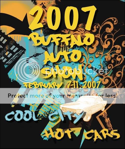
I used a stock photo for the car and i wanted to give it an urban feel. I used pictures throughout buffalo of buildings and used color overlays. It look busy as is but the poster is 21" x 25" so it's all spaced out. Yeah the text is boring I hand drew some text but the file didn't work at kinkos and I had to submit it today. My teacher said the exact same thing... But she saw it printed and she said it worked out. I was worried.
Thank you for the opinion though. I wasn't sure how long it would take to get a reply.
What do you mean by photo minap?
PostPosted: Mon Jan 22, 2007 9:42 pm


Photo Minap is a style used for photo shop which is basicly photo manipulation. Its an awsome style.

CrZyJ0E


masakazu652

PostPosted: Mon Jan 22, 2007 9:48 pm


CrZyJ0E
Photo Minap is a style used for photo shop which is basicly photo manipulation. Its an awsome style.


oh ok then. I'm starting to play with displacement effects. Well I will once I get back to school. No computer at home to play with. Well not a good one at least
PostPosted: Tue Jan 23, 2007 5:16 pm


Hello! Your work is very creative, however, it does look very busy. Also, the words "cool city and hot cars" don't stand out as well. THe colors are great though, but I think the white on the car doesn't balance the picture well. I like how all the building thingies are black in the background though. biggrin

miigiro

3,500 Points
  • Person of Interest 200
  • Signature Look 250
  • First step to fame 200

masakazu652

PostPosted: Wed Jan 24, 2007 8:07 pm


mrmrs_sukiher
Hello! Your work is very creative, however, it does look very busy. Also, the words "cool city and hot cars" don't stand out as well. THe colors are great though, but I think the white on the car doesn't balance the picture well. I like how all the building thingies are black in the background though. biggrin


Yeah. Now that you pointed it out, it's kind of bugging me. Darn too late to make changes now.
PostPosted: Wed Jan 24, 2007 9:05 pm


I don't have anything to add beyond what's already been said sweatdrop I do very much like the individual elements and the overall feel of the piece, but it's just a bit busy altogether.

Chisa
Vice Captain


masakazu652

PostPosted: Sat Jan 27, 2007 5:00 pm


Chisa
I don't have anything to add beyond what's already been said sweatdrop I do very much like the individual elements and the overall feel of the piece, but it's just a bit busy altogether.


I checked out the other entries and I think I crushed the competition. Not to sound cocky or anything (although I think it's too late) but the other posters were done in marker, crayon, colored pencil, or were just lousy. Very few looked close to professional. Not saying that mine does. Yeah it's busy... I'll work in that in my other projects.
Reply


Manage Your Items
Other Stuff
Get GCash
Offers
Get Items
More Items
Where Everyone Hangs Out
Other Community Areas
Virtual Spaces
Fun Stuff
Gaia's Games
Mini-Games
Play with GCash
Play with Platinum