|
|
|
|
|
|
|
 Posted: Fri Jan 05, 2007 3:52 pm Posted: Fri Jan 05, 2007 3:52 pm
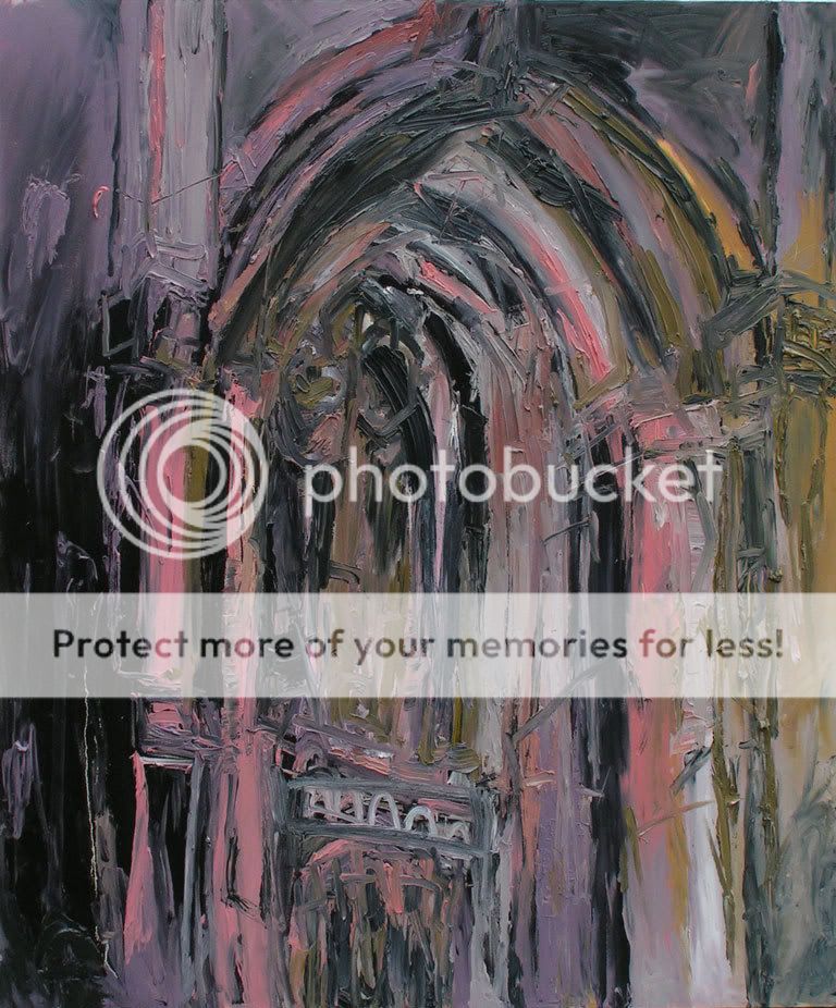
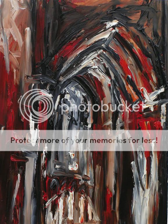
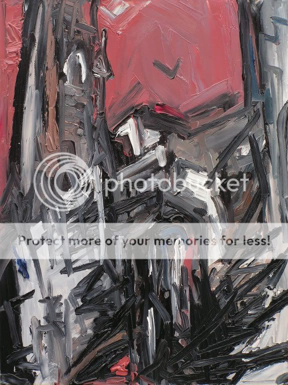
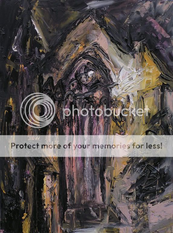
I'll just post a wee selection and try and get around other topics tomorrow... Photographed outside and I couldn't quite eliminate the effect of sunlight... 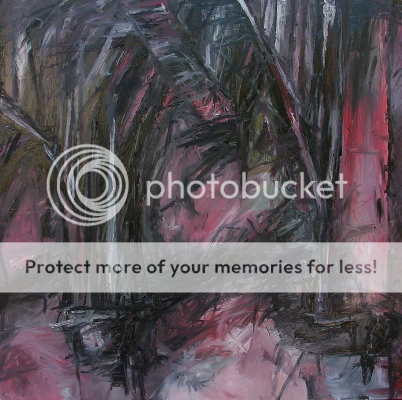 Small one, this. One of my favourite churches... 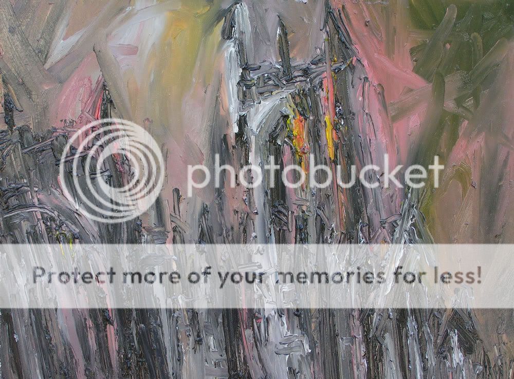 My other favourite church... 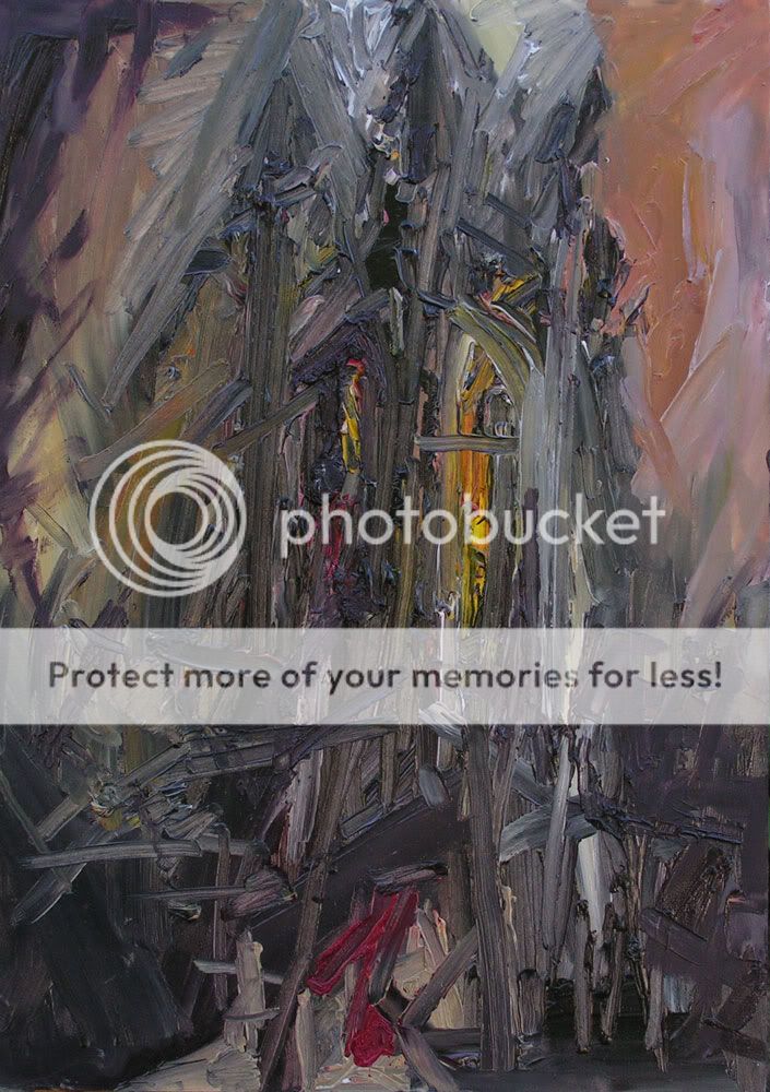 Charcoal drawing, different church... 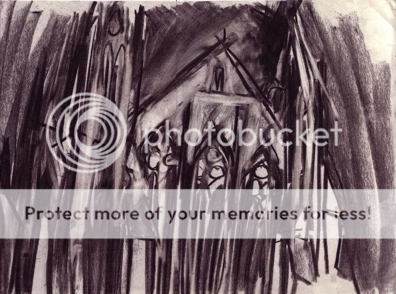 And again... 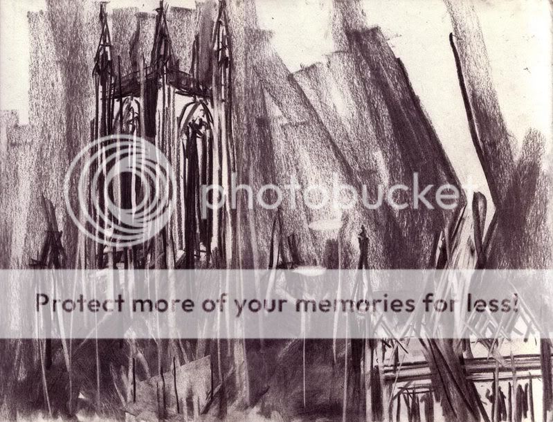
|
 |
|
|
|
|
|
|
|
|
|
|
|
|
|
Posted: Fri Jan 05, 2007 5:16 pm
these are really cool. i like that they're kind of impressionistic (or expressionistic, i can never tell the flippin difference), but i don't like the lines/marks which go more horizontally [in the second and third paintings]. it seems like in the second and third paintings, the direction of the strokes is mostly vertical, and i like that. but then these horizontal marks break the flow.
but then again, this is merely my opinion. i just don't think it adds anything to the peice.
i will say, though, that i'm totally in love with the "dirtiness" (if one can call it that) of your style. its raw and real. i just like it.
|
|
|
|
|
|
|
|
|
|
|
|
|
|
|
|
|
|
Posted: Fri Jan 05, 2007 6:45 pm
Welcome to the guild!
you've got an interesting style going. there's a lot of freedom and energy.
though i have to disagree with heather there (kriro26). there's a point where the mugginess just doesn't work anymore, like the first one. the colors are just not working for me. but the second painting is more pleasing to my eyes. i have friend who paints with similar colors. it takes her lots of practice to get the right kind of "dirty-ness".
so may i ask, why is it that you chose churches as your subject?
|
|
|
|
|
|
|
|
|
|
|
|
|
|
|
Posted: Sat Jan 06, 2007 5:53 am
Dirty_sox3 Welcome to the guild! you've got an interesting style going. there's a lot of freedom and energy. though i have to disagree with heather there (kriro26). there's a point where the mugginess just doesn't work anymore, like the first one. the colors are just not working for me. but the second painting is more pleasing to my eyes. i have friend who paints with similar colors. it takes her lots of practice to get the right kind of "dirty-ness". so may i ask, why is it that you chose churches as your subject? I'd agree there. The first painting is much larger than the other two and that's probably a factor in losing focus a bit. And yes, it takes time... I "finished" one last month that went through a lot of layers before the colour felt right. But I think that has the bonus of making things extra-textured! Churches are ornate and made of lots of lines. The first image is the underside of an old iron rail bridge chosen for similar reasons. In the past I've turned to industrial and building sites because there's lines and angles going everywhere in the structure and you can pick out a composition all over. The second reason is I draw mostly at night, and churches are invariably lit up at night lol
|
|
|
|
|
|
|
|
|
|
|
|
|
|
|
|
|
|
Posted: Sun Jan 07, 2007 4:12 pm
I'm not so sure if I like the paintings, but I do like the charcoal drawings. 3nodding
So you do these on site?
|
|
|
|
|
|
|
|
|
|
|
|
|
|
|
Posted: Mon Jan 15, 2007 1:29 pm
Drawings are all in situ, paintings made from them, yup.
|
|
|
|
|
|
|
|
|
|
|
|
|
|
|
|
|
|
Posted: Fri Feb 02, 2007 7:22 am
|
|
|
|
|
|
|
|
|
|
Posted: Fri Feb 02, 2007 10:39 am
I really like the second one with the red in it. It is really the only one that appeals to me, but in your case that is a good thing (I never liked abstract art) wink So if I like even just one take it as a complement. whee I don't know what it is about that one maybe it is the fact that it feels twisted and demented. It even somewhat looks like it could be an entry way to hell. 3nodding Whatever it is I like it and I think that it is one of yout best pieces. I also like the charcol ones as well, but not as much as that one. xd
|
|
|
|
|
|
|
|
|
|
|
|
|
|
|
|
|
|
Posted: Fri Feb 02, 2007 11:25 am
I really like your style. I LOVE paintings that involve ALOT of paint..it's how I paint myself. Did you scratch into the paint to draw out some of the lines?
|
|
|
|
|
|
|
|
|
|
|
|
|
|
|
Posted: Fri Feb 02, 2007 10:13 pm
No scratching, but I paint with a combination of a brush so old its practically a stick and my hands, so that has something to do with it.
hottie_hulio: I think the second-to-last one is more demented.
|
|
|
|
|
|
|
|
|
|
|
|
|
|
|
|
|
|
Posted: Sat Feb 03, 2007 11:49 am
Doug of Akkad No scratching, but I paint with a combination of a brush so old its practically a stick and my hands, so that has something to do with it. hottie_hulio: I think the second-to-last one is more demented. right 3nodding I like that effect. You paint with your hands? that's cool. how long does it take you to complete one? I really like the red and black one...the colours work really well with that, and seem to give it more depth and emotion than the other paintings. strong contrasty colours work better I think, but it depends on what you're going for 3nodding
|
|
|
|
|
|
|
|
|
|
|
|
|
|
|
Posted: Tue Feb 06, 2007 5:33 am
I don't think strong contrasts are going to be a huge factor in the rest of my stuff this year... I'm working on a big version of one of these in which the form looks more like the ghost of a church than the building itself. It's gonna be hot smile
I work in short bursts so its hard to say how long they take. Even with the big ones, you can redo the whole surface in an hour or so, or pick and choose what to layer up. Maybe 3-4 hour long sessions for each? There isn't much time difference between the small and large.
|
|
|
|
|
|
|
|
|
|
|
|
|
|
|
|
|
|
Posted: Tue Feb 06, 2007 4:09 pm
yep, gotta say that the red-ish one is grabbing my attention, probably because it seems so different than the others. i don't want to say that it feels demented, but perhaps more gruesome than the others. the second to last one...it's really nice. i like lots of paint kinds of paintings, but i also like to (easily) know what's going on, so the details in it really draw me in.
when i (attempt to) paint, i generally either use lots of paint or lots of water. i generally work with watercolor or acryllics, though i have frustrated myself using oils once.
is there a reason you usually work with muted colors? i know you've said you work at night, is that it?
|
|
|
|
|
|
|
|
|
|
|
|
|
|
|
Posted: Tue Feb 06, 2007 4:31 pm
To a degree, I think. Colour selection is led by a combination of the drawings and some lingering sense of being at the place, plus I usually end up with a pretty murky palette because I don't clean anything.
Also, since most of these are looming out of the dark, it feels more natural to have them toned down. Or at least it does right now. The ones in the first post don't really...
|
|
|
|
|
|
|
|
|
|
|
|
|
|
|
|
|
|
Posted: Wed Feb 07, 2007 11:56 am
Doug of Akkad I don't think strong contrasts are going to be a huge factor in the rest of my stuff this year... I'm working on a big version of one of these in which the form looks more like the ghost of a church than the building itself. It's gonna be hot smile I work in short bursts so its hard to say how long they take. Even with the big ones, you can redo the whole surface in an hour or so, or pick and choose what to layer up. Maybe 3-4 hour long sessions for each? There isn't much time difference between the small and large. cool 3nodding I do love the thickness of the paint and sense of texture in the paintings 3nodding
|
|
|
|
|
|
|
|
|
|
|
|
|
|