|
|
|
|
|
|
|

Dr. Valentine Vice Captain
|
 Posted: Tue Dec 19, 2006 2:00 am Posted: Tue Dec 19, 2006 2:00 am
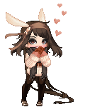
 i suck, i know it i'm a total newb at opencanvas I'm looking for some suggestions to help make this passable at least. Also, if any of you more experienced OC users have any helpful hints, I'd appreciate hearing them. (for example, what the crap do Effect 1 and Effect 2 do?)
|
|
|
|
|
|
|
|
|
|
|
|
|
|
|
Posted: Tue Dec 19, 2006 2:10 am
Oh goody, I love OC. (I only use 1.1, so everything from 3 and 4.06 I'll be useless for.)
If I were going to guess, I'd say you did this all on one layer. I usually make my lines on the bottom layer and create a new multiply layer over it for my colour. That way you can open/close the eye (Making the lines visible/invisible), thus making it easier to make a lineless image seem a bit more structured. 3nodding
I think this is adorable. <3 A couple things though, the first thing that stood out to me was the hair, it sort of looks like two globs of playdough, which is fun and all, but probably not what you were going for? I'd suggest shading it lightly, highlighting lightly (the highlighting's good, but the black shading-- Never actually shade with black) and then make strands with a colour darker than the base but slightly lighter than the lowlight. Same with the highlights.
The eye bothers me in that, there's no cornea. o: Or an eyelid. And I think you're doing the same thing I did/still do-- not using enough contrast. Shading dark isn't necessarily a bad thing! :'D Some more definition in the hands and ruffle would be good, too. Stiffer lines would make the ruffle pop, using white and the grey you used for the base of the PJs.
Maybe some smoke off the cig?
EDIT: If you'd like, I could send you the event file for the image in my sig some time. A couple people have found it pretty handy. 3nodding
|
|
|
|
|
|
|
|
|
|
|
|
|
|
|
|
Dr. Valentine Vice Captain
|
Posted: Tue Dec 19, 2006 2:18 am
I used lots of layers, but I do see everythng you suggest. Sadly I know better than to shade with black, and I have no idea how I managed to do that there.
I think I am going to redraw the eye entirely as an actual eye instead of trying to replicate the cartoony blob.
I see what you mean about deepening the shading, even in the sample pic the shadows do go much darker.
Smoke and a slight glow will be added later in Paint Shop Pro.
And yes I would love to see the event file for that image, I think it could be very educational. If it's not very large can you email it to luis.boisvert@gmail.com for me please?
|
|
|
|
|
|
|
|
|
|
|
|
|
|
|
Posted: Tue Dec 19, 2006 2:45 am
I usually tend to stick to just two, anything more complex and I get lost and end up doing things on the wrong layers. x'D I send the file, hope you got it?
|
|
|
|
|
|
|
|
|
|
|
|
|
|
|
|
|
|
Posted: Thu Dec 21, 2006 9:44 am
The cigarette seems to be coming out of his neck. Move it to the right a bit?
|
|
|
|
|
|
|
|
|
|
|
|
|
|
|
Posted: Thu Dec 21, 2006 7:04 pm
|
Dr. Valentine Vice Captain
|
|
|
|
|
|
|
|
|
|
|
|
|