|
|
|
|
|
|
|

Dr. Valentine Vice Captain
|
 Posted: Sun Dec 10, 2006 3:09 pm Posted: Sun Dec 10, 2006 3:09 pm
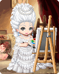
 comission This is my first finished image completely created in paint shop pro with a tablet. I'm still getting used to the finer points of tablet use, so any tips available are appreciated.
|
|
|
|
|
|
|
|
|
|
|
|
|
|
|
Posted: Sun Dec 10, 2006 3:31 pm
Very nice style, color scheme, and pose. The right leg looks a little off, either it is too thick or too long. The shading looks a bit 2d, with no definite light source. I'm thinking maybe the tail(?) should be more effected by the light coming from her hands. This is an overall clean and nice looking picture.
|
|
|
|
|
|
|
|
|
|
|
|
|
|
|
|
|
|
Posted: Mon Dec 11, 2006 3:51 pm
ekirei Very nice style, color scheme, and pose. The right leg looks a little off, either it is too thick or too long. The shading looks a bit 2d, with no definite light source. I'm thinking maybe the tail(?) should be more effected by the light coming from her hands. This is an overall clean and nice looking picture. HEY Now that you mention it, the tail has no shadings on it. WTF MATE. I would fix that up, along with some other shading spots you missed, like under the hair on the face, and on the legs- and this would improve 193764%
|
|
|
|
|
|
|
|
|
|
|
|
|
|
|
Posted: Thu Dec 14, 2006 3:02 am
I like the idea of minimal shading on this, but there dont seem to be enough shadows in the right places to define and light source.
the colors are nice and i like the pose and the really simple specifal effects.
|
|
|
|
|
|
|
|
|
|
|
|
|
|
|
|
|
|
Posted: Thu Dec 14, 2006 7:06 pm
Aside from what's been said already, it seems like her right n****e should be popping out any moment now: the bra is a little to low on it. Her belly button also seems a bit off center. Try drawing a line down her body imitating her spine, it will help to line things up a bit more. Her right arm is a little thicker than the other, and her knee is a bit pointy. Try hoisting your leg up in a picture to see how it would bend. I'm having trouble seeing how the fingers on her right hand are placed.
I like the color scheme, the bright candy colors are nice, and the movement is very nice. I especially love her horns.
|
|
|
|
|
|
|
|
|
|
|
|
|
|
|
|
|
|