|
|
|
|
|
|
|
|
|
 Posted: Sat Dec 09, 2006 5:49 pm Posted: Sat Dec 09, 2006 5:49 pm
|
|
|
|
|
|
|
|
|
|
 Posted: Sun Dec 10, 2006 3:46 pm Posted: Sun Dec 10, 2006 3:46 pm
i really like what you've got here. as for critiqueing, i'll use numbers to refer to the pictures. 1. looks really cute, but i think the hands are a little big. i'm all about 4 and 5, but in 4 the cookie in her mouth looks more...on her mouth. in the future, changing the angle of the cookie would correct this. in five, i'm really like the details you've added, but i think they need /slightly/ more defined knees. i love the colors on 6. the different blues are really complimented by the warmer browns and yellows.
so all in all: awesome, just a few areas that could use some improvement. i also have to say that i think this is markers (right?) and your markerwork is really good in most areas--its hard (impossible for me) to avoid those stupid marker lines, but the colors are very smooth in these pictures.
|
 |
 |
|
|
|
|
|
|
|
|
|
|
|
|
|
|
|
 Posted: Mon Dec 11, 2006 3:23 pm Posted: Mon Dec 11, 2006 3:23 pm
Interesting pics you have here. biggrin I especially like the Christmas pic. The pink hair came out really well in that one.
One thing I would work on is getting the colors to work together more, to be smoother. Smoother lines will also help. Variance in the line weight can help bring parts of the picture out and help with definition. biggrin
Keep at it, though! I'd love to see more from you. 3nodding
|
 |
 |
|
|
|
|
|
|
|
|
|
|
|
|
 Posted: Mon Dec 11, 2006 3:51 pm Posted: Mon Dec 11, 2006 3:51 pm
the proportions are a little off for some of the drawings, and you tend to draw hands too big for the body. they're cute though. i can see some improvement, which is what's important. keep working at it. i look forward to seeing more from you biggrin
|
 |
 |
|
|
|
|
|
|
|
|
|
|
|
|
|
|
|
 Posted: Sat Dec 30, 2006 12:44 pm Posted: Sat Dec 30, 2006 12:44 pm
kirio26 i really like what you've got here. as for critiqueing, i'll use numbers to refer to the pictures. 1. looks really cute, but i think the hands are a little big. i'm all about 4 and 5, but in 4 the cookie in her mouth looks more...on her mouth. in the future, changing the angle of the cookie would correct this. in five, i'm really like the details you've added, but i think they need /slightly/ more defined knees. i love the colors on 6. the different blues are really complimented by the warmer browns and yellows. so all in all: awesome, just a few areas that could use some improvement. i also have to say that i think this is markers (right?) and your markerwork is really good in most areas--its hard (impossible for me) to avoid those stupid marker lines, but the colors are very smooth in these pictures. thank you so much!! i can never see these thing unless people point them out n.n and your so right about all of them that i have to laugh!! n.n thanx again
|
 |
 |
|
|
|
|
|
|
|
|
|
|
|
|
 Posted: Sat Dec 30, 2006 12:48 pm Posted: Sat Dec 30, 2006 12:48 pm
euclids_triangle Interesting pics you have here. biggrin I especially like the Christmas pic. The pink hair came out really well in that one. One thing I would work on is getting the colors to work together more, to be smoother. Smoother lines will also help. Variance in the line weight can help bring parts of the picture out and help with definition. biggrin Keep at it, though! I'd love to see more from you. 3nodding n.n thanks very much!!!n.n btw....are you talking about the stawberry pic? sweatdrop
|
 |
 |
|
|
|
|
|
|
|
|
|
|
|
|
|
|
|
 Posted: Sat Dec 30, 2006 12:49 pm Posted: Sat Dec 30, 2006 12:49 pm
Dirty_sox3 the proportions are a little off for some of the drawings, and you tend to draw hands too big for the body. they're cute though. i can see some improvement, which is what's important. keep working at it. i look forward to seeing more from you biggrin n.n thank you very much!! ya hands are definatly my weakness. i tend to draw them bigger to see what im doing lol n.n
|
 |
 |
|
|
|
|
|
|
|
|
|
|
|
|
 Posted: Mon Jan 01, 2007 10:18 pm Posted: Mon Jan 01, 2007 10:18 pm
lol. Yeah, I guess it's the strawberry pic I'm liking. biggrin
|
 |
 |
|
|
|
|
|
|
|
|
|
|
|
|
|
|
|
 Posted: Tue Jan 02, 2007 2:38 pm Posted: Tue Jan 02, 2007 2:38 pm
|
|
|
|
|
|
|
|
|
|
 Posted: Tue Jan 02, 2007 2:54 pm Posted: Tue Jan 02, 2007 2:54 pm
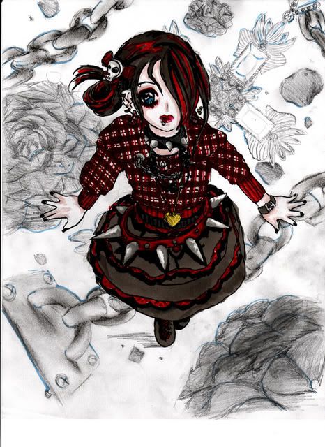
whoa, were those gothic looking pictures there before? i totally love em. you've got such patience for detail. curious: how big are these?
i'm all about the one from above (4th from bottom). it's really cool. i think the fingers need to be a little longer though. to prevent the fingers being too short, you can first sketch out each joint individually (it's what i have to do, otherwise they just end up looking wrong and rubbery). since you're using markers, i'd erase it lightly before coloring. if you're going to use the outline, i'd erase it completely (i've found that markers dont always mix with pencil).
i love the costumes; did you design them yourself?
|
 |
 |
|
|
|
|
|
|
|
|
|
|
|
|
|
|
|
 Posted: Wed Jan 03, 2007 9:55 am Posted: Wed Jan 03, 2007 9:55 am
They're really good 3nodding I especially like the first and last one..I love the detail.
|
 |
 |
|
|
|
|
|
|
|
|
|
|
|
|
 Posted: Wed Jan 03, 2007 2:47 pm Posted: Wed Jan 03, 2007 2:47 pm
kirio26 whoa, were those gothic looking pictures there before? i totally love em. you've got such patience for detail. curious: how big are these? i'm all about the one from above (4th from bottom). it's really cool. i think the fingers need to be a little longer though. to prevent the fingers being too short, you can first sketch out each joint individually (it's what i have to do, otherwise they just end up looking wrong and rubbery). since you're using markers, i'd erase it lightly before coloring. if you're going to use the outline, i'd erase it completely (i've found that markers dont always mix with pencil). i love the costumes; did you design them yourself? computer paper size and....yes i designed them myself n.n
|
 |
 |
|
|
|
|
|
|
|
|
|
|
|
|
|
|
|
 Posted: Sat Jan 06, 2007 3:10 pm Posted: Sat Jan 06, 2007 3:10 pm
Shadow__Dweller They're really good 3nodding I especially like the first and last one..I love the detail. thank you!! i work hard on detail! but it looks like i need to work harder on proportion and action/poses huh? lol
|
 |
 |
|
|
|
|
|
|
|
|
|
|
|
|
 Posted: Thu Jan 18, 2007 10:13 pm Posted: Thu Jan 18, 2007 10:13 pm
|
|
|
|
|
|
|
|
|
|
|
|
|
 Posted: Fri Jan 19, 2007 3:13 pm Posted: Fri Jan 19, 2007 3:13 pm
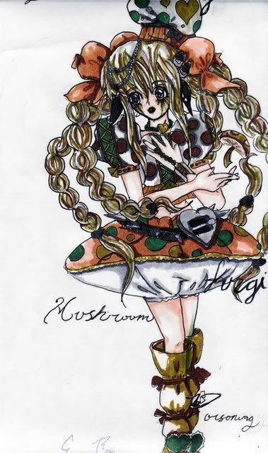
hmm...call me crazy, but it seems like a couple of these are not new? i dunno. it seems like i've seen them before. for the sake of ease (unless i'm rambling on like a crazy old lady, that is), could you group the old ones together and/or make some sort of divider (maybe just the word "new") to differentiate?
anyways, enough of that crap. i really like the colors in the second one, and i really like the folds in the skirt. on a more picky note, i think the red start on the skirt detracts from it. the other stars look fine, but...i dunno. maybe i'm just too in love with the skirt sweatdrop
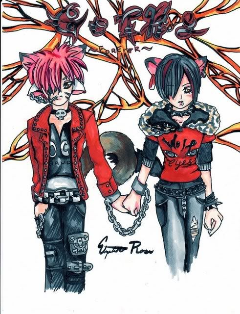
that last one reminds me of an icon. it has two hands holding in handcuffs and it says "i'm yours" on it. the picture is super cute, but at the same time, edgy and hardcore-ish. i like it.
|
 |
 |
|
|
|
|
|
|
|
|
 |
|
|
|
|
|
|


