|
|
|
|
|
|
|
|
|
 Posted: Sat Dec 09, 2006 2:02 pm Posted: Sat Dec 09, 2006 2:02 pm
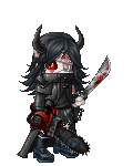
This is the only CG I have done that I have been semi-satisfied with. I see it still has a lot of problems. I am not very good at CG/very new to it.  surprised surprised ?
|
 |
|
|
|
|
|
|
|
|
|
|
|
|
|
Posted: Sat Dec 09, 2006 3:04 pm
You're quite good for being new to it. biggrin
I think it'd nice to see a few more (brighter-ish) highlights... maybe on the bum. I dunno, a bum without a little shiny highlight is just... strange to me. XD
I quite like the shading on those nifty boots.
|
|
|
|
|
|
|
|
|
|
|
|
|
|
|
|
|
|
Posted: Sat Dec 09, 2006 3:20 pm
Tawney You're quite good for being new to it. biggrin I think it'd nice to see a few more (brighter-ish) highlights... maybe on the bum. I dunno, a bum without a little shiny highlight is just... strange to me. XD I quite like the shading on those nifty boots. I had a definite issue with the bum. It looks really flat, but I couldn't figure out where to put the highlight! crying
|
|
|
|
|
|
|
|
|
|
|
|
|
|
|
Posted: Sat Dec 09, 2006 3:59 pm
what's up with the boobs?...
|
|
|
|
|
|
|
|
|
|
|
|
|
|
|
|
|
|
Posted: Sat Dec 09, 2006 4:00 pm
Jumble what's up with the boobs?... It's a good question. I don't know the answer crying
|
|
|
|
|
|
|
|
|
|
|
|
|
|
|
Posted: Sat Dec 09, 2006 7:13 pm
The fairy wand looks excellent as well as her hair, the gloves, and her skin color. The bottom picture's tush looks much better smoothed out. The tips of the boots are kinda tilted up, though.
Is this an avatar? Do you do commissions?
|
|
|
|
|
|
|
|
|
|
|
|
|
|
|
|
|
|
Posted: Sat Dec 09, 2006 7:27 pm
ekirei The fairy wand looks excellent as well as her hair, the gloves, and her skin color. The bottom picture's tush looks much better smoothed out. The tips of the boots are kinda tilted up, though. Is this an avatar? Do you do commissions? It's an avatar, and the boots are like that because the tips of the Nitemare Boots are curly. x-x My boyfriend didn't like it, either. I am working on a commission right now, b ut all the requests I've gotten for work like this has made me contemplate opening a shop.
|
|
|
|
|
|
|
|
|
|
|
|
|
|
|
Posted: Sat Dec 09, 2006 8:09 pm
The Iconoclast ekirei The fairy wand looks excellent as well as her hair, the gloves, and her skin color. The bottom picture's tush looks much better smoothed out. The tips of the boots are kinda tilted up, though. Is this an avatar? Do you do commissions? It's an avatar, and the boots are like that because the tips of the Nitemare Boots are curly. x-x My boyfriend didn't like it, either. I am working on a commission right now, b ut all the requests I've gotten for work like this has made me contemplate opening a shop. I'll be plundering booty.. and saving up. pirate
|
|
|
|
|
|
|
|
|
|
|
|
|
|
|
|
Dr. Valentine Vice Captain
|
Posted: Sun Dec 10, 2006 3:04 pm
I get an unbalanced feeling from this, like it should be leaning more left. Also, I think that the gold bits could be a bit shinier.
|
|
|
|
|
|
|
|
|
|
|
|
|
|
|
Posted: Thu Dec 14, 2006 8:00 am
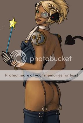 so, instead of explaining, i decided to take a stab at showing you what immediately jumped out at me -- your manner of coloring made it look like she was made more out of clay than flesh in places, her armor being cupped around the outside of her shoulder meant it should be less visible on the opposite side, and her arm was looking a little concave and long (even if the girl is emaciated, the back of the upper arm is generally either straight or having a bit of an outward curve). i hope my shoddy paintover job gives you a bit of an idea of what i'm saying, haha. i also noticed that while her hips suggest that she'd be standing straight up, her legs kind of branch off in an unnatural way~ if you follow the hip to determine where the femur should be, and then the knee, especially on the left leg, her lower leg shouldn't be able to bend that far forwards. her right leg is more solid in that respect, though it still gives the impression that she's trying to clench her a** and thighs together while forcing her feet apart -- i'd move that entire right leg over a bit, starting just below her butt.
|
|
|
|
|
|
|
|
|
|
|
|
|
|
|
|
|
|
Posted: Thu Dec 14, 2006 10:50 am
kitteh so, instead of explaining, i decided to take a stab at showing you what immediately jumped out at me -- your manner of coloring made it look like she was made more out of clay than flesh in places, her armor being cupped around the outside of her shoulder meant it should be less visible on the opposite side, and her arm was looking a little concave and long (even if the girl is emaciated, the back of the upper arm is generally either straight or having a bit of an outward curve). i hope my shoddy paintover job gives you a bit of an idea of what i'm saying, haha. i also noticed that while her hips suggest that she'd be standing straight up, her legs kind of branch off in an unnatural way~ if you follow the hip to determine where the femur should be, and then the knee, especially on the left leg, her lower leg shouldn't be able to bend that far forwards. her right leg is more solid in that respect, though it still gives the impression that she's trying to clench her a** and thighs together while forcing her feet apart -- i'd move that entire right leg over a bit, starting just below her butt. I never noticed that thing about her legs. How did you get her skin to be so smooth? o_o;
|
|
|
|
|
|
|
|
|
|
|
|
|
|
|
Posted: Thu Dec 14, 2006 11:32 am
The Iconoclast I never noticed that thing about her legs. How did you get her skin to be so smooth? o_o; are we both using painter? i use this brush with these settings for everything in painter7~ 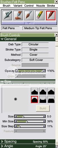 i usually just take advantage of my tablet's pressure sensitivity for smooth coloring (as opposed to fiddling with the actual opacity, though that's a valid option as well) and press lightly while using a larger brush -- with the min size setting i have there, the center of the brush lays color more thickly than the perimeter, making the edges of large brushes especially more smooth, and if you're covering more area per stroke, there's less of a chance of things getting all uneven.
|
|
|
|
|
|
|
|
|
|
|
|
|
|
|
|
|
|
|