|
|
|
|
|
|
|
|
|
 Posted: Tue Dec 05, 2006 8:23 pm Posted: Tue Dec 05, 2006 8:23 pm
So, after getting the commission like, three months ago, I finally finished it tonight. rofl It's of her OC Dagger, I think she's from the Legend of Zelda.. I think. Hence the triforce in the back ground. XD So, here 'tis. I'm not really looking for critique, since I already sent it to her, but I would like to know how I could improve the colouring for future reference. XD Thanks! 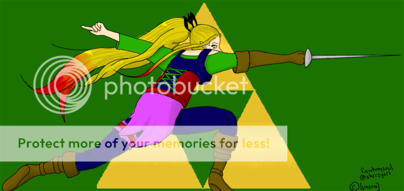 Photobucket downsized it, so the full size is here: http://www.sheezyart.com/view/1002059/(Okay, so the full size is actually like, 3000 some thing by 2000 something pixells.. xD)
|
 |
|
|
|
|
|
|
|
|
|
|
|
|
|
Posted: Wed Dec 06, 2006 5:28 am
As for improving the colouring in the future... You could really use some more shading. I don't know if you were going for a flat 2d look in this picture, but that's what it came out as. x3
I'd suggest finding some good DA tutorials on shading/CGing, and take a look at them. I can barely see any shading on this piece.
Also, try coming up with one solid colour scheme. I think there's too many colours going on here, especially in her outfit. It'd be better if you stuck to two or three main colours, then maybe did some variations in shade (ie dark green, medium green, light green, then maybe some blues...)
|
|
|
|
|
|
|
|
|
|
|
|
|
|
|
|
|
|
Posted: Wed Dec 06, 2006 3:31 pm
Tawney As for improving the colouring in the future... You could really use some more shading. I don't know if you were going for a flat 2d look in this picture, but that's what it came out as. x3 I'd suggest finding some good DA tutorials on shading/CGing, and take a look at them. I can barely see any shading on this piece. Also, try coming up with one solid colour scheme. I think there's too many colours going on here, especially in her outfit. It'd be better if you stuck to two or three main colours, then maybe did some variations in shade (ie dark green, medium green, light green, then maybe some blues...) First: I didn't choose the colours. The colours for her outfit are all part of the character I was drawing for her. Second: I was using a tutorial... IT was easier to see when I kept it at the original size but.. the original size was outrageously big. The shading is the entire reason it took me so long to do, that and it was also my first time ever colouring something on Photoshop. So I don't know if the shading thing is the style I used for it or what. It's kind of... cell shading. kind of. Thank you!
|
|
|
|
|
|
|
|
|
|
|
|
|
|
|
Posted: Thu Dec 07, 2006 5:15 am
[Unseen] Tawney As for improving the colouring in the future... You could really use some more shading. I don't know if you were going for a flat 2d look in this picture, but that's what it came out as. x3 I'd suggest finding some good DA tutorials on shading/CGing, and take a look at them. I can barely see any shading on this piece. Also, try coming up with one solid colour scheme. I think there's too many colours going on here, especially in her outfit. It'd be better if you stuck to two or three main colours, then maybe did some variations in shade (ie dark green, medium green, light green, then maybe some blues...) First: I didn't choose the colours. The colours for her outfit are all part of the character I was drawing for her. Second: I was using a tutorial... IT was easier to see when I kept it at the original size but.. the original size was outrageously big. The shading is the entire reason it took me so long to do, that and it was also my first time ever colouring something on Photoshop. So I don't know if the shading thing is the style I used for it or what. It's kind of... cell shading. kind of. Thank you! So, did the person who gave you the commission tell you to draw her clothes with just like... "purple, blue, green", etc etc? If so, you could have experimented a bit more with the tones and hues of the colours, because as they are now, they're kind of bright and clashing (I would've chose a much darker, richer purple as well as green). If she had the actual swatches of colour picked out for you... well, that's her fault for making the colours clash. XD What I notice about your shading is that it just goes around the veeery edges of the things you're shading.. it doesn't really look like cell-shading, 'cause with cell-shading, the shades are quit visible and noticeably different from the unshaded areas. See this tutorial to see what I mean. So yeah, just keep in mind for next time, about the shading... make it more dramatic! biggrin
|
|
|
|
|
|
|
|
|
|
|
|
|
|
|
|
|
|
Posted: Thu Dec 07, 2006 11:58 am
Tawney [Unseen] Tawney As for improving the colouring in the future... You could really use some more shading. I don't know if you were going for a flat 2d look in this picture, but that's what it came out as. x3 I'd suggest finding some good DA tutorials on shading/CGing, and take a look at them. I can barely see any shading on this piece. Also, try coming up with one solid colour scheme. I think there's too many colours going on here, especially in her outfit. It'd be better if you stuck to two or three main colours, then maybe did some variations in shade (ie dark green, medium green, light green, then maybe some blues...) First: I didn't choose the colours. The colours for her outfit are all part of the character I was drawing for her. Second: I was using a tutorial... IT was easier to see when I kept it at the original size but.. the original size was outrageously big. The shading is the entire reason it took me so long to do, that and it was also my first time ever colouring something on Photoshop. So I don't know if the shading thing is the style I used for it or what. It's kind of... cell shading. kind of. Thank you! So, did the person who gave you the commission tell you to draw her clothes with just like... "purple, blue, green", etc etc? If so, you could have experimented a bit more with the tones and hues of the colours, because as they are now, they're kind of bright and clashing (I would've chose a much darker, richer purple as well as green). If she had the actual swatches of colour picked out for you... well, that's her fault for making the colours clash. XD What I notice about your shading is that it just goes around the veeery edges of the things you're shading.. it doesn't really look like cell-shading, 'cause with cell-shading, the shades are quit visible and noticeably different from the unshaded areas. See this tutorial to see what I mean. So yeah, just keep in mind for next time, about the shading... make it more dramatic! biggrin Heh, no, she gave me the link to a reference picture of her character, and she tells me I got the colours perfect. XD Here, this is the tutorial I used for the clothes. Maybe the reason it didn't turn out so well is she didn't cover it very well, and she was using black, so it didn't require so much shading? http://www.deviantart.com/deviation/20971527/But I'll keep that in mind next time for the shading! Thanks! heart
|
|
|
|
|
|
|
|
|
|
|
|
|
|
|
Posted: Thu Dec 07, 2006 4:12 pm
[Unseen] Heh, no, she gave me the link to a reference picture of her character, and she tells me I got the colours perfect. XD Here, this is the tutorial I used for the clothes. Maybe the reason it didn't turn out so well is she didn't cover it very well, and she was using black, so it didn't require so much shading? http://www.deviantart.com/deviation/20971527/But I'll keep that in mind next time for the shading! Thanks! heart
Her skin tutorial would probably be of more help:
http://www.deviantart.com/deviation/9687375/?qo=62&q=by:joulee&qh=sort:time+-in:scraps
(You have to download it for the text directions, apparently).
Other tutorials that might help:
http://ashen-ray.com/goodies/tut/index.html
http://www.deviantart.com/deviation/23076553/?qo=3&q=tutorial+coloring&qh=boost:popular+age_sigma:24h+age_scale:5
Tawney: HOMG, OPENCANVAS TUT! *glomp*
|
|
|
|
|
|
|
|
|
|
|
|
|
|
|
|
|
|
Posted: Thu Dec 07, 2006 7:08 pm
sybex Shark [Unseen] Heh, no, she gave me the link to a reference picture of her character, and she tells me I got the colours perfect. XD Here, this is the tutorial I used for the clothes. Maybe the reason it didn't turn out so well is she didn't cover it very well, and she was using black, so it didn't require so much shading? http://www.deviantart.com/deviation/20971527/But I'll keep that in mind next time for the shading! Thanks! heart
Her skin tutorial would probably be of more help:
http://www.deviantart.com/deviation/9687375/?qo=62&q=by:joulee&qh=sort:time+-in:scraps
(You have to download it for the text directions, apparently).
Other tutorials that might help:
http://ashen-ray.com/goodies/tut/index.html
http://www.deviantart.com/deviation/23076553/?qo=3&q=tutorial+coloring&qh=boost:popular+age_sigma:24h+age_scale:5
Tawney: HOMG, OPENCANVAS TUT! *glomp*I've tried her skin tutorial. YOu can no longer download it, so I did kind of use it, I just kind of guess at how it went by looking at the pictures. I think my problem is more of understanding how shading looks rather than how to do it if that makes any sense. Like... I don't know where to put it. D:
|
|
|
|
|
|
|
|
|
|
|
|
|
|
|
Posted: Sat Dec 09, 2006 9:22 am
One thing im noticing in these tutorials is that the artists are using a darker shade of a flesh tone in which to shade with..Bad, bad idea.
Shadows are not just darker shades of one color..They too have color, and its really important to inclued that.
If you're really serious about your art, I suggest going to http://www.itchstudios.com/psg/art_tut.htm
That will help you immensly, I know it helped me tons. It's amazing. It'll also teach you how to place your shadows since you asked about that.
One very important thing is to try to work from a reference; so you can get body puportions correct and also to figure out lighting. Especially when you're new to working with those factors.
|
|
|
|
|
|
|
|
|
|
|
|
|
|
|
|
|
|
Posted: Sun Dec 10, 2006 2:43 am
[.Starlight.Manifesto.] One thing im noticing in these tutorials is that the artists are using a darker shade of a flesh tone in which to shade with..Bad, bad idea.
Shadows are not just darker shades of one color..They too have color, and its really important to inclued that.
If you're really serious about your art, I suggest going to http://www.itchstudios.com/psg/art_tut.htm
That will help you immensly, I know it helped me tons. It's amazing. It'll also teach you how to place your shadows since you asked about that.
One very important thing is to try to work from a reference; so you can get body puportions correct and also to figure out lighting. Especially when you're new to working with those factors. I'll be sure to check out the site, thanks! And I was working from a reference, but it was mainly for the pose, and not the lighting or proportions (since it was a male in full fencing gear D smile
|
|
|
|
|
|
|
|
|
|
|
|
|
|
|
|
|
|


![[Unseen]'s avatar](https://a1cdn.gaiaonline.com/dress-up/avatar/ava/ca/5d/2947949df5dca_flip.png?t=1357268746_6.00_00)