|
|
|
|
|
|
|
|
|
 Posted: Mon Nov 27, 2006 4:43 pm Posted: Mon Nov 27, 2006 4:43 pm
Haven't drawn anything decent in ages, but as I was doodling today I actually managed to churn out something semi-okay. So I just did some lineart for it. 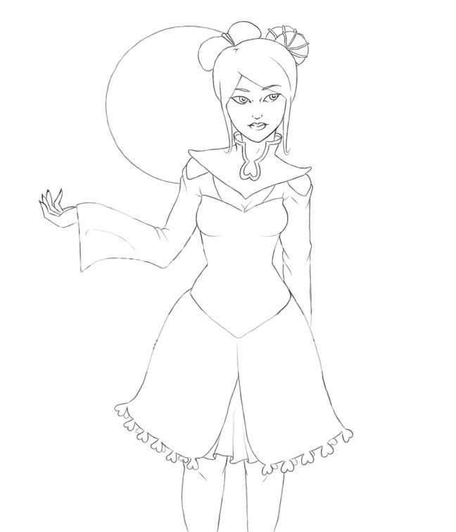 Now, what I'm wondering... - any anatomical stuff that can be easily fixed? - what can I do to make that hand look better? - any ideas for patterns on her outfit? - colour scheme suggestions? For the background I thought maybe like... a moon light thing, with either fog or snow. yeahhh. biggrin
|
 |
|
|
|
|
|
|
|
|
|
|
|
|
|
Posted: Mon Nov 27, 2006 7:05 pm
Plus a bit more work on the face... 
|
|
|
|
|
|
|
|
|
|
|
|
|
|
|
|
|
|
Posted: Mon Nov 27, 2006 7:23 pm
Lovely, but it seems like her torso should be tilted/bent or something. Her shoulders and head make it look like she leaning the the right, but then the hips and torso are almost straight on. If she is leaning, she probably wouldn't be standing with her legs turned in like they are now or else she'd probably fall over.
|
|
|
|
|
|
|
|
|
|
|
|
|
|
|
Posted: Mon Nov 27, 2006 7:25 pm
Orecchiette Lovely, but it seems like her torso should be tilted/bent or something. Her shoulders and head make it look like she leaning the the right, but then the hips and torso are almost straight on. If she is leaning, she probably wouldn't be standing with her legs turned in like they are now or else she'd probably fall over. Ah, okay. I'll tilt her body a bit more. 3nodding Thanks!
|
|
|
|
|
|
|
|
|
|
|
|
|
|
|
|
|
|
Posted: Tue Nov 28, 2006 10:58 am
I dont really get the pose--why she seems to be leaning slightly to the right, why her knees make her look pigeon toed. It seems like a sort of awkward stance for a chracter that looks like she's supposed to be more elegant and serene.
i also have qualms with the hand behind the back because it looks like how people pose figures when they dont want to draw hands.
otherwise i'm impressed with the inking, i really have no idea how to get lines that smooth and crisp digitally.
|
|
|
|
|
|
|
|
|
|
|
|
|
|
|
Posted: Tue Nov 28, 2006 1:17 pm
Page Boy I dont really get the pose--why she seems to be leaning slightly to the right, why her knees make her look pigeon toed. It seems like a sort of awkward stance for a chracter that looks like she's supposed to be more elegant and serene. i also have qualms with the hand behind the back because it looks like how people pose figures when they dont want to draw hands. otherwise i'm impressed with the inking, i really have no idea how to get lines that smooth and crisp digitally. Yeah, I don't like drawing hands. I admit it. D: Should I attempt to put the other one in front of her? I'm gonna fix those legs, don't worry. I kinda rushed that part, since I don't really know how far down her legs should go. As for the inking, I just scanned in the sketch at like... 150 DPI, then just did the lineart in Photoshop at 1px in a new layer. I'm surprised at how nice and crisp it turned out, since my lineart usually isn't wonderful. XD
|
|
|
|
|
|
|
|
|
|
|
|
|
|
|
|
|
|
Posted: Tue Nov 28, 2006 6:20 pm
Hmm, I say cut her at the thigh. Those knees are nasty, like podgy old lady knees.
Nice development on the face. It should be a fun colour!
|
|
|
|
|
|
|
|
|
|
|
|
|
|
|
Posted: Wed Nov 29, 2006 12:24 am
Tawney Page Boy I dont really get the pose--why she seems to be leaning slightly to the right, why her knees make her look pigeon toed. It seems like a sort of awkward stance for a chracter that looks like she's supposed to be more elegant and serene. i also have qualms with the hand behind the back because it looks like how people pose figures when they dont want to draw hands. otherwise i'm impressed with the inking, i really have no idea how to get lines that smooth and crisp digitally. Yeah, I don't like drawing hands. I admit it. D: Should I attempt to put the other one in front of her? I'm gonna fix those legs, don't worry. I kinda rushed that part, since I don't really know how far down her legs should go. As for the inking, I just scanned in the sketch at like... 150 DPI, then just did the lineart in Photoshop at 1px in a new layer. I'm surprised at how nice and crisp it turned out, since my lineart usually isn't wonderful. XD i think whether or not the hand is in front of or behind the figure should be based on the composition, the nature of the pose and what the body language is trying to convey. hm, i usually scan things in in at least 300 dpi. What resolution is the lineart when you go to color it? is it the same size as the image we see here? I also think the knees are fine. You could avoid the pudgy old lady look if they demonstrated a more youthful taper from a shapely thigh to a smaller knee than back to a shapely calf.
|
|
|
|
|
|
|
|
|
|
|
|
|
|
|
|
|
|
Posted: Wed Nov 29, 2006 5:01 am
Page Boy Tawney Page Boy I dont really get the pose--why she seems to be leaning slightly to the right, why her knees make her look pigeon toed. It seems like a sort of awkward stance for a chracter that looks like she's supposed to be more elegant and serene. i also have qualms with the hand behind the back because it looks like how people pose figures when they dont want to draw hands. otherwise i'm impressed with the inking, i really have no idea how to get lines that smooth and crisp digitally. Yeah, I don't like drawing hands. I admit it. D: Should I attempt to put the other one in front of her? I'm gonna fix those legs, don't worry. I kinda rushed that part, since I don't really know how far down her legs should go. As for the inking, I just scanned in the sketch at like... 150 DPI, then just did the lineart in Photoshop at 1px in a new layer. I'm surprised at how nice and crisp it turned out, since my lineart usually isn't wonderful. XD i think whether or not the hand is in front of or behind the figure should be based on the composition, the nature of the pose and what the body language is trying to convey. hm, i usually scan things in in at least 300 dpi. What resolution is the lineart when you go to color it? is it the same size as the image we see here? I also think the knees are fine. You could avoid the pudgy old lady look if they demonstrated a more youthful taper from a shapely thigh to a smaller knee than back to a shapely calf. Alright. I'll work on those legs next. :3 The full picture is 864x1007 and 150 DPI, the one I posted here is a bit smaller. For most of the picture I zoomed in quite far to draw the lineart (maybe like 400x), so maybe that was what made a difference. 3nodding
|
|
|
|
|
|
|
|
|
|
|
|
|
|
|
Posted: Mon Dec 04, 2006 6:23 pm
Update... 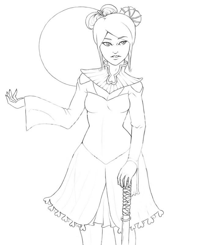 Anything else to fix before colouring begins? :s
|
|
|
|
|
|
|
|
|
|
|
|
|
|
|
|
|
|
Posted: Tue Dec 05, 2006 1:34 pm
the legs still seem off. You keep drawing them as though the knee would be covered by the dress. That would make for a very very short thigh. the hand on the sword looks about ten times better, btw. i think the raised arm might be too long. Here's a redline for the legs to show what i meant about the knees. http://img231.imageshack.us/img231/2882/tawneydd2.jpgit also implies you might try shifting the position of her knees to be more in line with her head (more so than in my drawing). It gives her a proper center of gravity and fixes the leaning problem slightly.
|
|
|
|
|
|
|
|
|
|
|
|
|
|
|
Posted: Tue Dec 05, 2006 3:12 pm
Page Boy the legs still seem off. You keep drawing them as though the knee would be covered by the dress. That would make for a very very short thigh. the hand on the sword looks about ten times better, btw. i think the raised arm might be too long. Here's a redline for the legs to show what i meant about the knees. http://img231.imageshack.us/img231/2882/tawneydd2.jpgit also implies you might try shifting the position of her knees to be more in line with her head (more so than in my drawing). It gives her a proper center of gravity and fixes the leaning problem slightly. Thank you! XD I'll fix up those legs + arm then I'll be ready to go. biggrin
|
|
|
|
|
|
|
|
|
|
|
|
|
|
|
|
|
|
Posted: Thu Dec 07, 2006 4:56 pm
Plus skin... 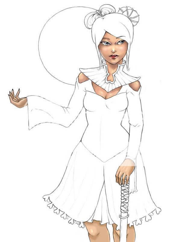 For some reason I'm not totally happy with her face. I've re-done it like.. 5x but it still doesn't look right. ;3;
|
|
|
|
|
|
|
|
|
|
|
|
|
|
|
Posted: Fri Dec 08, 2006 10:48 am
|
|
|
|
|
|
|
|
|
|
|
|
|
Posted: Sat Dec 09, 2006 3:56 pm
Well, her eyes are very close together and the angle of descent from her cheekbones down to her jaw is different on both sides of the face.
|
|
|
|
|
|
|
|
|
|
|
|
|
|
|
|
|
|