|
|
|
|
|
|
|
|
|
 Posted: Sat Nov 04, 2006 9:36 pm Posted: Sat Nov 04, 2006 9:36 pm
It's been like 10,000 years since I posted somthing. It's Red Sonja. Now that I look at it, it doesn't really look much like her at all. OH WELL. I like it anyways. Tell me what you like, and what you hate. 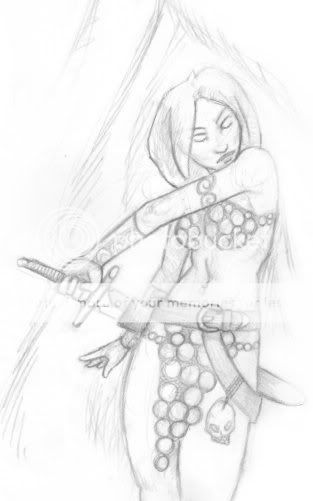
|
 |
|
|
|
|
|
|
|
|
|
|
|
|
|
Posted: Mon Nov 06, 2006 10:26 pm
Wow, that is a lot more girlesque than some of your previous girls for sure. I do wish you would ink and/or color things sometimes though.
|
|
|
|
|
|
Dr. Valentine Vice Captain
|
|
|
|
|
|
|
|
|
|
|
|
Posted: Tue Nov 07, 2006 5:14 am
The head looks a bit large and I'm not too fond of the big round things... (chainmail?)
I really quite like the pose and the anatomy looks pretty good. :3 Ink it nowww!
|
|
|
|
|
|
|
|
|
|
|
|
|
|
|
Posted: Tue Nov 07, 2006 11:57 am
Tawney The head looks a bit large and I'm not too fond of the big round things... (chainmail?) I really quite like the pose and the anatomy looks pretty good. :3 Ink it nowww! I think the head is just kinda' at a weird angle, but I know what you mean x_x And I think it's scalemail. Or like, circlethingsmail.
|
|
|
|
|
|
|
|
|
|
|
|
|
|
|
|
|
|
Posted: Tue Nov 07, 2006 12:08 pm
wow, the figure is drawn rather nicely, it really looks like you've improved a lot.
|
|
|
|
|
|
|
|
|
|
|
|
|
|
|
Posted: Tue Nov 07, 2006 2:51 pm
Page Boy wow, the figure is drawn rather nicely, it really looks like you've improved a lot. I would like to think so :> I gotta' keep practicing though... I hope to have some more stuff up soonish, maybe colored/inked stuff.
|
|
|
|
|
|
|
|
|
|
|
|
|
|
|
|
|
|
Posted: Wed Nov 15, 2006 2:02 pm
Well, what am I supposed to say? It's just not very interesting.
|
|
|
|
|
|
|
|
|
|
|
|
|
|
|
Posted: Fri Nov 17, 2006 8:50 pm
The Iconoclast Well, what am I supposed to say? It's just not very interesting. I like what page boy said. You should try that on. :b
|
|
|
|
|
|
|
|
|
|
|
|
|
|
|
|
|
|
Posted: Thu Nov 23, 2006 3:30 pm
It looks nice, but the nose and the front shoulder could use a bit of retouching.
But it looks nice. Ink it? :3
|
|
|
|
|
|
|
|
|
|
|
|
|
|
|
Posted: Sat Nov 25, 2006 5:33 pm
THIS NAME IS QUITE SMART The Iconoclast Well, what am I supposed to say? It's just not very interesting. I like what page boy said. You should try that on. :b Usually I do, but I think a wide range of honest responses is healthy and fair. "It's boring because in its unfinished state, it lacks anything that would really hook an audience". I have the same problem, too. I draw a lot of things that I think are good drawings but they're really boring.
|
|
|
|
|
|
|
|
|
|
|
|
|
|
|
|
|
|
Posted: Sun Nov 26, 2006 5:37 am
^_^; Umm, I hope you don't mind my two cents~
I like the overall picture but her right arm (our left) seems... off? It looks a little bit too short, and like it's too far out. Thats my only problem with this, ^^ Overall it looks really nice, the hand reaching for the sword was done well too.
|
|
|
|
|
|
|
|
|
|
|
|
|
|
|
Posted: Thu Dec 07, 2006 7:20 am
The hair is flat.. I think it should be more.. mid-motion. But the anatomy is so much better than what I could muster up. Kudos.
|
|
|
|
|
|
|
|
|
|
|
|
|
|
|
|
|
|
|