
My post in the Art Forum
I can't believe I spent FOUR HOURS doing this on MS Paint.
O_<
First I put Shea, then I did the background, then the lettering, and I know I spent about half an hour doing the lettering on the bottom pixel by pixel gonk
And this is only the green version.
What do you think of my from 12 AM to four AM blood, sweat, and tears? And the occasional dramatic breakdown scene?
EDIT: Forgot to mention, but the reason I attempted this in the first place is I wanted to color it to make it look more anime-like. You know how the artists for animes are totally lazy and, for one sheet of color, use only that base color, a lighter hue for the light patches, and a darker hue for the shadows? They don't really get into the shading because it takes too much time to animate it as well. That was what I was trying to do. D: And it's a CHIBI. D:<
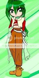
The evolution! D:

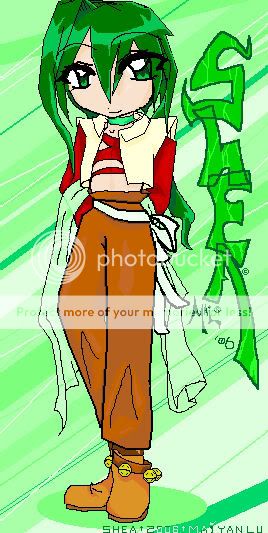
End result!

![[Unseen]'s avatar](https://a1cdn.gaiaonline.com/dress-up/avatar/ava/ca/5d/2947949df5dca_flip.png?t=1357268746_6.00_00)