|
|
|
|
|
|
|
|
|
 Posted: Tue Jul 11, 2006 9:10 am Posted: Tue Jul 11, 2006 9:10 am
|
|
|
|
|
|
|
|
|
|
Posted: Thu Jul 13, 2006 10:42 am
I really like the designs of them. Very well done ^^. I have mostly alot of gaia work and not too many other sigs, but I'll post some of my stuff later. 3nodding
|
 |
|
|
|
|
|
|
|
|
|
|
|
|
|
|
|
|
Posted: Fri Jul 14, 2006 10:27 am
Kioko14 I really like the designs of them. Very well done ^^. I have mostly alot of gaia work and not too many other sigs, but I'll post some of my stuff later. 3nodding Thanks! Sounds great. Feel free to post!
|
|
|
|
|
|
|
|
|
|
|
|
|
|
|
Posted: Sat Jul 15, 2006 9:44 am
I like your work, great job!
|
|
|
|
|
|
|
|
|
|
|
|
|
|
|
|
|
|
Posted: Sat Jul 22, 2006 8:42 pm
Fushiro I like your work, great job! Thanks again!
|
|
|
|
|
|
|
|
|
|
|
|
|
|
|
Posted: Sun Jul 23, 2006 12:30 am
aah~ signatures xD thats my place
heres what i think about them:
first one: simple and cute, but the text doesnt fit in, and it has pixel edges. that ruins the sig.
second one: too dark. >.< just too dark.
third one: this one is ok. tho the dark spots of blood or paint or whatever it is, kinda jump out of the rest. maybe if they were a bit lighter?
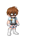
fourth one (the avatar): i like it ^^
fifth one: maybe the pic could be blended in more? dunno.
sixth one: the buttons could be blended more. they really pop out of the sig.
and last, i noticed how you use the pixel font is wrong >.<
i know i know, i was doing the same thing till a guy told me.
pixel font us used on 8px settings as none, and with only 1 px stroke.
it looks really better that way.
|
|
|
|
|
|
|
|
|
|
|
|
|
|
|
|
|
|
Posted: Sun Jul 23, 2006 2:53 pm
Arsea Neko aah~ signatures xD thats my place heres what i think about them: first one: simple and cute, but the text doesnt fit in, and it has pixel edges. that ruins the sig. second one: too dark. >.< just too dark. third one: this one is ok. tho the dark spots of blood or paint or whatever it is, kinda jump out of the rest. maybe if they were a bit lighter? fourth one (the avatar): i like it ^^ fifth one: maybe the pic could be blended in more? dunno. sixth one: the buttons could be blended more. they really pop out of the sig. and last, i noticed how you use the pixel font is wrong >.< i know i know, i was doing the same thing till a guy told me. pixel font us used on 8px settings as none, and with only 1 px stroke. it looks really better that way. Can you explain the font thing a little better? I agree with what you say for all the sigs exept the blood one. I would say that the onlything wrong with it would be the size and maybe the text.
|
|
|
|
|
|
|
|
|
|
|
|
|
|
|
Posted: Sun Jul 23, 2006 11:20 pm
ok i can explain how to use the pixel font. its rather easy. this is :not: the way to use it:  this is the gaia_right way to use it: for example the pixel font on one of your sigs: and the pixel font on one of mine: (dont pay attention to outer glow on the font ^^;; see the difference?
|
|
|
|
|
|
|
|
|
|
|
|
|
|
|
|
|
|
Posted: Mon Jul 24, 2006 8:56 am
Cool, I'm not so good at the image kind of thing, I can create abstracts but...
|
|
|
|
|
|
|
|
|
|
|
|
|
|
|
Posted: Mon Jul 24, 2006 10:34 am
abstracts r easy in a way.
go nd comment my work ^^
|
|
|
|
|
|
|
|
|
|
|
|
|
|
|
|
|
|
Posted: Mon Jul 24, 2006 2:45 pm
Oh, I get it now. Thanks for the tip and the screen shots - very helpful.
|
|
|
|
|
|
|
|
|
|
|
|
|
|
|
Posted: Tue Jul 25, 2006 12:48 pm
|
|
|
|
|
|
|
|
|
|
|
|
|
Posted: Wed Apr 11, 2007 5:40 am
I love them all really.
The first one has to be my favourite, I love the blue abstractness effect, and the character looks brilliant on the background. The phrase goes well to.
The second one, the tank one is not really my style. But I do think it looks pretty good, the tank is camouflaged into the abstract looking background, fab.
The third quite bloody one looks quite good, I mean the blood effects splattered across the background of it. Its missing something though, possible a monster of the night, like a werewolf with blood dripping from its wide and open jaws.
The last one looks great for posting on gaming sites with.
|
|
|
|
|
|
|
|
|
|
|
|
|
|
|
Posted: Wed Apr 11, 2007 5:49 pm
|
|
|
|
|
|
|
|
|
|
|
|
|
|