|
|
|
|
|
|
|
 Posted: Tue Jun 27, 2006 10:13 am Posted: Tue Jun 27, 2006 10:13 am
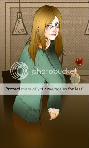 I like how this turned out ... but something's bothering me and I can't quite pick out what. Help! @@ It definitely has to do with the colouring. I sort of like how the flatter colours look but ... nn, this image might be better with more detail? I don't know. smile Please give me suggestions ! Thanks ~
|
 |
|
|
|
|
|
|
|
|
|
|
|
|
|
Posted: Tue Jun 27, 2006 10:32 am
<_>>
are you using the burn tool to do your shading?
you should go ahead and shade using a darker shade of what you colored with.
|
|
|
|
|
|
|
|
|
|
|
|
|
|
|
|
|
|
Posted: Tue Jun 27, 2006 3:32 pm
the image looks strange because all of the shadows are misplaced, the lighting doesn't make a whole lot of sense
i think you should stick to flat coloring and re-define some of the lines a bit more, they get lost in some areas [like the sweater]
|
|
|
|
|
|
|
|
|
|
|
|
|
|
|
Posted: Tue Jun 27, 2006 3:52 pm
The Dred Pirate Gossy <_>> are you using the burn tool to do your shading? you should go ahead and shade using a darker shade of what you colored with. Hmm ... no ~ I didn't use the burn tool .. @@~! @@ Argh! Yes. The light source. Now I feel like a complete moron. smile Thanks a bunch ~
|
|
|
|
|
|
|
|
|
|
|
|
|
|
|
|
|
|
Posted: Wed Jun 28, 2006 2:49 am
i feel like the blur you used on the colors towards the bottom of the image looks a bit cheap. the coloring in general seems a bit flat and lifeless compared the the line work.
|
|
|
|
|
|
|
|
|
|
|
|
|
|
|
Posted: Wed Jun 28, 2006 5:55 am
All that brown in the bottom right. crying
Lovely face though. pirate
|
|
|
|
|
|
|
|
|
|
|
|
|
|
|
|
|
|
Posted: Wed Jun 28, 2006 2:32 pm
I think the three different colors at the bottom kind of makes it hard to find the focal point, as far as shading.
you should try and use more detailed shading on the sweater and hair, like you did on the face. Since the drawing overall it very nice and good, the not great job of coloring kind of detracts from that and makes it hard to appreciate it for what it's actually worth.
the flower in the vase looks very good, adding a contrasting element that doesn't seem too out of place.
but as for the bottom of the image, I think you should change the greeny brown faded part that it has now at the bottom, into the color of the shadowed out table on the far side, like a blacky pale brown.
but overall it looks pretty good, IMO. Nice work!
|
|
|
|
|
|
|
|
|
|
|
|
|
|
|
Posted: Wed Jun 28, 2006 6:58 pm
Thanks @@ Rrr! Yeah, I feel like I could have done a lot better on the colouring before calling it a "finished work" ... Thanks for all the help smile I'll post the new one once it's done.
|
|
|
|
|
|
|
|
|
|
|
|
|
|
|
|
|
|
Posted: Thu Jun 29, 2006 4:41 pm
its all blurry at the bottom
i'm not an art pro or anything but
its all nice and clear and then its like x:
actually i think i should stfu sry x:
|
|
|
|
|
|
|
|
|
|
|
|
|
|
|
Posted: Thu Jun 29, 2006 10:34 pm
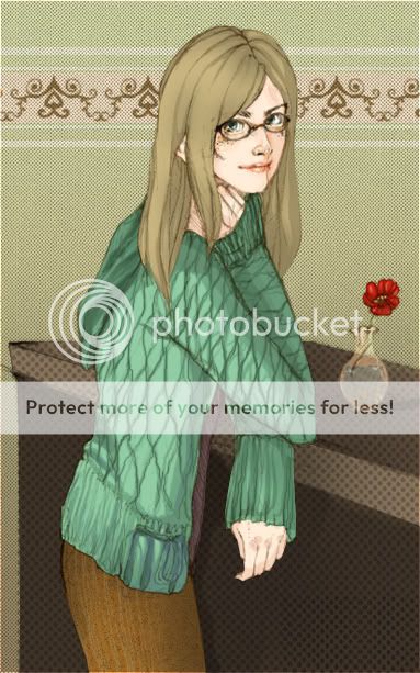 Here's the new one :3 What else do you guys think I can improve on?
|
|
|
|
|
|
|
|
|
|
|
|
|
|
|
|
|
|
Posted: Fri Jun 30, 2006 2:24 am
Aww betta. mrgreen It looks lovely, I kinda miss the blackboard but, yeah, it's beautiful.
|
|
|
|
|
|
|
|
|
|
|
|
|
|
|
Posted: Fri Jun 30, 2006 9:45 am
ficklefiend Aww betta. mrgreen It looks lovely, I kinda miss the blackboard but, yeah, it's beautiful. ! Thank you so much ~~
|
|
|
|
|
|
|
|
|
|
|
|
|
|
|
|
|
|
Posted: Sat Jul 01, 2006 2:31 am
Gorgeous smile
I might suggest that if you toned down the obvious quilting on the girl's sweater in some areas it might accentuate the direction of the light source, like airbrush them out around the tops of the shoulders or whatever. You might be trying to avoid the airbrushed look though, so that's not really necessary.
For some reason the water in the vase is particularly eyecatching to me. 3nodding
|
|
|
|
|
|
|
|
|
|
|
|
|
|
|
Posted: Sat Jul 01, 2006 8:04 am
television Gorgeous smile I might suggest that if you toned down the obvious quilting on the girl's sweater in some areas it might accentuate the direction of the light source, like airbrush them out around the tops of the shoulders or whatever. You might be trying to avoid the airbrushed look though, so that's not really necessary. For some reason the water in the vase is particularly eyecatching to me. 3nodding Thank you ~ smile I think I'll try out your suggestion on the quilting in the sweater asap ! heart
|
|
|
|
|
|
|
|
|
|
|
|
|
|
|
|
|
|
Posted: Sun Jul 02, 2006 10:17 am
it appears as though the figure only has one leg. o o
|
|
|
|
|
|
|
|
|
|
|
|
|
|