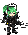
Welcome to Gaia! ::

Reply Art Fags
Costume Concept for elves.

Quick Reply

Enter both words below, separated by a space:

Can't read the text? Click here

Submit

Crisscoula

1,050 Points
  • Signature Look 250
  • Gaian 50
  • Member 100
PostPosted: Tue Jun 27, 2006 9:09 am


I have to admit, i was a little scared of posting here but, i know some good harsh critisism would be quite helpful for me to progress.
but any-way..

Im not much of a colourist, i do enjoy the flat look. but if it looks terrible and every-one hates it then i will, colour properly. sweatdrop

I was mostly concentrating on the fashion part, the idea of Dark elves haveing spiders and Elves having butterflies came to mind. heh. any-way! any comments will be appreciated and im sorry i draw my males a little girly. sweatdrop

User Image
PostPosted: Tue Jun 27, 2006 10:18 am


These are lovely! The costumes are really great and I'm definitely a fan of the flat colouring ~

I like the subtle hints of colour in the ears and cheeks of the one on the right a lot. Maybe if you put more of those really subtle shades in, it may enhance the drawings a bit? smile

Zebee


The Dred Pirate Gossy

PostPosted: Tue Jun 27, 2006 10:28 am


i really dislike the red on the whitey elf. I don't think it goes well with the greens and yellows.

:edit:
and the blue on edge of the circles as well. it just looks... XB
it reminds me of ms paint
PostPosted: Tue Jun 27, 2006 11:43 am


The Dred Pirate Gossy
i really dislike the red on the whitey elf. I don't think it goes well with the greens and yellows.

:edit:
and the blue on edge of the circles as well. it just looks... XB
it reminds me of ms paint


lol! i know what you mean. I was looking at photos of different butterflys, and alot of them had soft colours and then extreme bright colours that stood out. sweatdrop

Crisscoula

1,050 Points
  • Signature Look 250
  • Gaian 50
  • Member 100

magaly

Wheezing Bloodsucker

5,000 Points
  • Member 100
  • Gaian 50
  • Timid 100
PostPosted: Tue Jun 27, 2006 3:30 pm


i like the flat coloring
i also think if you added some shadows it would definately enhance the image [like you did with the elf on the left in the creases of the shawl]
the elf on the right looks a hint too dark to me, i wish the skin were a teeny bit lighter, i think it would hgelp with the contrast
PostPosted: Tue Jun 27, 2006 10:28 pm


Besides the creepy jpeg compression

they're pretty nice for just being flats....which is a good if used just as a ref piece. However your choices seem a bit random, especially on the first one. For instance lets look at the elf, The reds on there are WAY to satuated and clash with EVERYTHING so a major desat is needed for it to go connecty like. Furthermore, the blues (on the clothing) are out of place on this one and clash with the reds and overall the scheme would be stronger overall if they were dropped out completely. As for the drow...everything is mostly gravy....but I'd use a bonewhite in place of the white whites and light greys.

warrior_of_boognish

Destructive Lunatic


Page Boy

PostPosted: Wed Jun 28, 2006 2:47 am


i like the insect themes, it's carried out well in the design. But i agree on the light elf, the colors are'nt harmonizing as well as on the dark elf.

it's true the red and blues are too saturated for the other colors. and the green in the gems is a bit garish.
PostPosted: Wed Jun 28, 2006 6:12 am


Yeah the colours on the elf were a bit garish for me too. They just don't seem to have a theme, it's all green and gold and them the wings are white, which might work if they were plain.

Are these the wrong size or something? The lines don't look right.

The are nicely drawn and you obviously have lots of good costume ideas.

ficklefiend

Reply
Art Fags

 
Manage Your Items
Other Stuff
Get GCash
Offers
Get Items
More Items
Where Everyone Hangs Out
Other Community Areas
Virtual Spaces
Fun Stuff
Gaia's Games
Mini-Games
Play with GCash
Play with Platinum