|
|
|
|
|
|
|
|
|
 Posted: Wed Sep 08, 2004 4:07 am Posted: Wed Sep 08, 2004 4:07 am
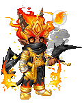
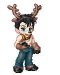
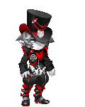
Posted my intro post. Yuhuh. Now, the attention-whoring! biggrin Oldest to newest, here's a bunch of pictures. Apologies for the large image sizes and stuff. sweatdrop 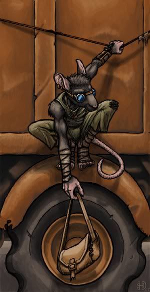 Quitch! A character of mine from #Vagrant. Quitch! A character of mine from #Vagrant.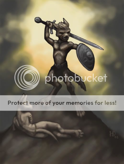 Kobolds! I love these little D&D critters. They're the weediest monsters out there, but make up for it with raw attitude. This is a shameless Frank Frazetta style-hack. xd Kobolds! I love these little D&D critters. They're the weediest monsters out there, but make up for it with raw attitude. This is a shameless Frank Frazetta style-hack. xd  Pariah, tiefling bard. Character portrait for Icewind Dale II. Pariah, tiefling bard. Character portrait for Icewind Dale II.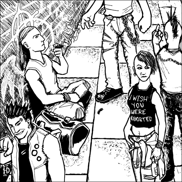 Street punks. Commissioned illustration for the Pretender RPG. Street punks. Commissioned illustration for the Pretender RPG.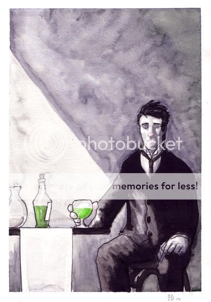 Louche. Playing around with watercolours. Louche. Playing around with watercolours. Current work-in-progress. Tengu-like critter, inspired by far too many hours spent playing Final Fantasy VII. sweatdrop Current work-in-progress. Tengu-like critter, inspired by far too many hours spent playing Final Fantasy VII. sweatdrop I have other artwork on devArt, Elfwood and yerf. WOO.
|
 |
|
|
|
|
|
|
|
|
|
|
|
|
|
Posted: Wed Sep 08, 2004 1:10 pm
Aye, Zahir, you have a good grasp on your medium, and a fairly good eye for anatomy as well. In a few of your images, particularly the street punks one, and the Tengu-like creature one, your legs/arms seem to fall a little short, and the fingers one one of the fellows in the street punks image are a bit on the chunky/sausagefinger side...
But you're really good! And I love the design of the character you show first. XD
|
|
|
|
|
|
|
|
|
|
|
|
|
|
|
|
|
|
Posted: Thu Sep 09, 2004 1:43 am
The Iconoclast Aye, Zahir, you have a good grasp on your medium, and a fairly good eye for anatomy as well. In a few of your images, particularly the street punks one, and the Tengu-like creature one, your legs/arms seem to fall a little short, and the fingers one one of the fellows in the street punks image are a bit on the chunky/sausagefinger side... But you're really good! And I love the design of the character you show first. XD Thank you. whee The street punks picture was a short-notice commission thing, and probably one of the more involved pictures I've done as far as number of figures and composition are involved - mostly I do single figures and character portraits and stuff. I really need to practice scenery and buildings and perspective and stuff. ninja
|
|
|
|
|
|
|
|
|
|
|
|
|
|
|
Posted: Thu Sep 09, 2004 2:02 am
The Iconoclast Aye, Zahir, you have a good grasp on your medium, and a fairly good eye for anatomy as well. In a few of your images, particularly the street punks one, and the Tengu-like creature one, your legs/arms seem to fall a little short, and the fingers one one of the fellows in the street punks image are a bit on the chunky/sausagefinger side... But you're really good! And I love the design of the character you show first. XD I agree with some of the body parts looking a little short. Your style is really sweet though... heart eek I love the hard line work combined with the hot computer coloring techniques. biggrin
|
|
|
|
|
|
|
|
|
|
|
|
|
|
|
|
Dr. Valentine Vice Captain
|
Posted: Sat Sep 11, 2004 5:32 pm
Very stylish stuff. I really like your character ideas and attention to detail in those pics. The perspective could use some work though; especially apparent in the streetpunks pic..
|
|
|
|
|
|
|
|
|
|
|
|
|
|
|
Posted: Sat Sep 11, 2004 6:54 pm
MANILOVEDAT BIRDY
THE BLACK AND ORANGE ISJUST PERFECTYUH
ANDTHEONE ABOVE THAT
ISCREEPINMEOUT
IN A GOODWAY (:
|
|
|
|
|
|
|
|
|
|
|
|
|
|
|
|
|
|
Posted: Sat Sep 11, 2004 8:23 pm
Wow. Love the digital works, very nice soft edges all around.
Proportions are a bit off here and there, but looks like you're trying to work that into a style, more than not knowing it.
|
|
|
|
|
|
|
|
|
|
|
|
|
|
|
Posted: Sat Sep 11, 2004 9:55 pm
the water colours are making me slightly hot and bothered, I'm in love with that one. crying
|
|
|
|
|
|
|
|
|
|
|
|
|
|
|
|
|
|
Posted: Sun Sep 12, 2004 9:33 pm
Very nice work! In additon to your style and character design I also really like the fact you have enough patience for good backgrounds (I suck at that). I won't repeat the crits that have already been stated. Aside from those I really don't see any propblems. Indeed, I'll be keeping an eye open for more. 3nodding
*reads weja's sig* !! Piggyback! *leap*
|
|
|
|
|
|
|
|
|
|
|
|
|
|
|
Posted: Sun Sep 12, 2004 9:35 pm
Dante-Sayre Very nice work! In additon to your style and character design I also really like the fact you have enough patience for good backgrounds (I suck at that). I won't repeat the crits that've already been stated. Aside from those I really don't see any problems. Indeed, I'll be keeping an eye open for more. 3nodding *reads weja's sig* !! Piggyback! *leap*
|
|
|
|
|
|
|
|
|
|
|
|
|
|
|
|
|
|
Posted: Sun Sep 12, 2004 9:37 pm
very nice... I shouldnt' be posting things past midnight on lack of sleep. >.< I thought I was editing my post but I was quoting it. Erm.. delete anyone? *glances around for mod*
|
|
|
|
|
|
|
|
|
|
|
|
|
|
|
Posted: Tue Sep 14, 2004 3:08 am
12th Wow. Love the digital works, very nice soft edges all around. Proportions are a bit off here and there, but looks like you're trying to work that into a style, more than not knowing it. I tend to sway back-and-forth between cartoony/anime sort of styles and somewhat more realistic sort of stuff. Basically, whatever kind of thing I've been looking at recently and have decided is a style that I like, I try to imitate and assimilate the bits I like into my own work. Hence the Frank Frazetta stylings for the kobolds picture, or the somewhat moody lighting for the Pariah piece (which started out like the character portraits for Icewind Dale II, but got a bit more detailed as I worked on it). 3nodding As for the proportions, recently a lot of the stuff I've been drawing has been of the cartoon/anime variety, so my proportion-sense is a bit skewed still. sweatdrop
|
|
|
|
|
|
|
|
|
|
|
|
|
|
|
|
|
|
Posted: Tue Sep 14, 2004 3:22 am
Shooners the water colours are making me slightly hot and bothered, I'm in love with that one. crying Watercolours, eh? Let's see what else I can find in my directories...  Chatty dragon. One of my first proper watercolour attempts, once I'd spent a while splatting pigment on paper to remind myself how paints are different from pixels. Tailchaser dragon. A sort of follow-up to the chatty dragon. Ow, the cute. eek The following were done while I was on vacation last Easter, away from my precious precious Wacom tablet. Spearman. After spending a few months away from the watercolours I flubbed an attempt to use all sorts of colours, so decided to start with the basics - sepia tones, light and dark, very limited palette. Watchman. Watercolour and sepia pencil. The sepia pencil was horrible and smudgy and crumbly and not terribly easy to work with. I really need to get some sepia ink or something. Torro. Minotaur thingy. Fairly self-explanatory. Dark Tower. Just a wee bit influenced by the Lord of the Rings movies. ninja These two were painted when I was on a pirate kick. Yarr. One-eyed Jack, the pirate chief,
was a terrible, fearsome ocean thief.
He wore a peg upon one leg,
he wore a hook and a dirty look!
One-eyed Jack, the pirate chief
a terrible, fearsome ocean thief!Not all pirates can afford a full-fledged parrot when they're just starting out on a life of buccaneering and bootlegging. whee
|
|
|
|
|
|
|
|
|
|
|
|
|
|
|
Posted: Tue Sep 14, 2004 3:27 am
Dante-Sayre Very nice work! In additon to your style and character design I also really like the fact you have enough patience for good backgrounds (I suck at that). I won't repeat the crits that have already been stated. Aside from those I really don't see any propblems. Indeed, I'll be keeping an eye open for more. 3nodding The backgrounds aren't as common as they really ought to be - mostly I just scribble the lazy "character standing around looking cool in the middle of a white void" thing. sweatdrop But, if you like backgrounds, here's another: Arkady Kamchatka, paladin of the socialist ideal. He's another #Vagrant character, though one I've not actually got round to playing. I'm quite pleased with the sort of mingling of Eastern Orthodox ikon and soviet propaganda poster imagery in the background. 3nodding
|
|
|
|
|
|
|
|
|
|
|
|
|
|
|
|
|
|
Posted: Tue Sep 14, 2004 5:27 am
That picture is ._.
Wow.
I usually find images that use anthropomorphic characters boring, but no, no, you did a damn fine job.
|
|
|
|
|
|
|
|
|
|
|
|
|
|
|
|
|
|