|
|
|
|
|
|
|
 Posted: Mon Jun 05, 2006 9:31 am Posted: Mon Jun 05, 2006 9:31 am
Hi! heart
I'm curious what everybody thinks.
Which one do you like best? ninja

OR

Please coment i love to hear what other people think! ^^
I also love critisism! ^^ ninja
|
 |
|
|
|
|
|
|
|
|
|
|
|
|
|
Posted: Mon Jun 05, 2006 2:04 pm
not my style, but the 1st one looks better in my opinion.
|
|
|
|
|
|
|
|
|
|
|
|
|
|
|
|
|
|
Posted: Sat Jun 10, 2006 11:29 am
I like the first one best, because in the second one, the girls hair starts too suddenly. Maybe you could make it fade in. They are both very good though.
|
|
|
|
|
|
|
|
|
|
|
|
|
|
|
Posted: Tue Jun 13, 2006 2:46 pm
I personally don't like neither, but if I had to choose, it'll be the first one.
|
|
|
|
|
|
|
|
|
|
|
|
|
|
|
|
|
|
Posted: Wed Jun 14, 2006 10:05 am
Forever_Sakura I personally don't like neither, but if I had to choose, it'll be the first one. Can i ask why you don't like them? Critisism is always good.
|
|
|
|
|
|
|
|
|
|
|
|
|
|
|
Posted: Wed Jun 14, 2006 9:56 pm
I really don't like either of them. They seem...under designed.
When I look at the first one, I don't know what to look at first. I'm not going to even try and read the text. I think everyone else likes this one because it has more red; its more visually simulating.
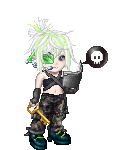
From a design point of view the seond one is better. The focus is obviously on the girl; although the red circle thing doesn't seem to have a point. Is it some kind of logo?
When I usally have two graphics like this, I'll sometimes try to combine them in to one. I would start with the second and add simular blood splatered effect on it for more color. Its up to you, I just think it needs more color. I think it'll make a big difference.
Is this just for fun?
|
|
|
|
|
|
|
|
|
|
|
|
|
|
|
|
|
|
Posted: Fri Jun 16, 2006 10:00 pm
brokenyoyo I really don't like either of them. They seem...under designed. When I look at the first one, I don't know what to look at first. I'm not going to even try and read the text. I think everyone else likes this one because it has more red; its more visually simulating. From a design point of view the seond one is better. The focus is obviously on the girl; although the red circle thing doesn't seem to have a point. Is it some kind of logo? When I usally have two graphics like this, I'll sometimes try to combine them in to one. I would start with the second and add simular blood splatered effect on it for more color. Its up to you, I just think it needs more color. I think it'll make a big difference. Is this just for fun? okay the first one really does need some work now i see what I need to fix Thanks! The red circle is my logo Which also needs work I know. It's the first brush i ever made. The theme is suposed ot be kinda creepy and that's the effect i put on it to be black and white. The only reson the logo is red is because i did n't want it to blend in. Also they didn't turn out the best eather of them here. You usualy can read the text and that is the focus on the first one. I do notice that the text must be changed. ALso in the second one there is blood but i made it black & white also for effect i guess that didn't work out eather? This is fun for me but I also want to one day make a career out of it. I know i've got a long wayt to go and seeing as i only started this year at christmass I think i'm okay. I really love the fact that you told me what was wrong! Thanks so much! Please tell me what you think of my ideas? ~Aly
|
|
|
|
|
|
|
|
|
|
|
|
|
|
|
Posted: Fri Jun 16, 2006 11:11 pm
x.Abandoned.Sin.x okay the first one really does need some work now i see what I need to fix Thanks! The red circle is my logo Which also needs work I know. It's the first brush i ever made. The theme is suposed ot be kinda creepy and that's the effect i put on it to be black and white. The only reson the logo is red is because i did n't want it to blend in. Also they didn't turn out the best eather of them here. You usualy can read the text and that is the focus on the first one. I do notice that the text must be changed. ALso in the second one there is blood but i made it black & white also for effect i guess that didn't work out eather? This is fun for me but I also want to one day make a career out of it. I know i've got a long wayt to go and seeing as i only started this year at christmass I think i'm okay. I really love the fact that you told me what was wrong! Thanks so much! Please tell me what you think of my ideas? ~Aly I'm not that experienced either. Its only been recently that I've been learning more about graphic design. I too, am doing this for pure enjoyment. I'm not sure if thats what I want to do with my life, but it doesn't sound like a bad idea. The whole creepy/grunge effect isn't used a lot in mainstream design, and for good reason--its complicated; theres often too much to work with. But don't let that turn you off; if you can master the complex things, everything else will be a little easier. I tend to stick to semi-simple stuff, myself. A word or advice though: don't me afriad of doing simple things once in awhile. Hmm. Looking back at the second one, I think I see the blood splats. I still say you should make them red. Its still up to you though. Its your design; you'll make mistakes that I've made. We all learn the same lessons. And lastly: Your Welcome. You'll make an even better designer one day. ^^
|
|
|
|
|
|
|
|
|
|
|
|
|
|
|
|
|
|
Posted: Sat Jun 17, 2006 4:36 pm
brokenyoyo x.Abandoned.Sin.x okay the first one really does need some work now i see what I need to fix Thanks! The red circle is my logo Which also needs work I know. It's the first brush i ever made. The theme is suposed ot be kinda creepy and that's the effect i put on it to be black and white. The only reson the logo is red is because i did n't want it to blend in. Also they didn't turn out the best eather of them here. You usualy can read the text and that is the focus on the first one. I do notice that the text must be changed. ALso in the second one there is blood but i made it black & white also for effect i guess that didn't work out eather? This is fun for me but I also want to one day make a career out of it. I know i've got a long wayt to go and seeing as i only started this year at christmass I think i'm okay. I really love the fact that you told me what was wrong! Thanks so much! Please tell me what you think of my ideas? ~Aly I'm not that experienced either. Its only been recently that I've been learning more about graphic design. I too, am doing this for pure enjoyment. I'm not sure if thats what I want to do with my life, but it doesn't sound like a bad idea. The whole creepy/grunge effect isn't used a lot in mainstream design, and for good reason--its complicated; theres often too much to work with. But don't let that turn you off; if you can master the complex things, everything else will be a little easier. I tend to stick to semi-simple stuff, myself. A word or advice though: don't me afriad of doing simple things once in awhile. Hmm. Looking back at the second one, I think I see the blood splats. I still say you should make them red. Its still up to you though. Its your design; you'll make mistakes that I've made. We all learn the same lessons. And lastly: Your Welcome. You'll make an even better designer one day. ^^ Okay! Thanks so much for your input & advice! ^^
|
|
|
|
|
|
|
|
|
|
|
|
|
|
|
Posted: Wed Jun 21, 2006 6:43 pm
If the lettering the first one was a bit more readable I think it would be better.
The second one the face is a bit to far in the picture and a bit to big.
Otherwise they are pretty good.
|
|
|
|
|
|
|
|
|
|
|
|
|
|
|
|
|
|
Posted: Mon Jun 26, 2006 1:52 am
The first 1 would be good if it was twice the size and the text was like bolded just to make it that more readable.
I would imagine seeing the the first on a wall somewhere so blow it up a bit.
I don't really like the second. I don't think the girl goes with the rest of the art.
|
|
|
|
|
|
|
|
|
|
|
|
|
|
|
Posted: Thu Jun 29, 2006 2:29 pm
I actually like the second one bigger, your eyes zoom to the girl and then to the art on the left. In the first one, I can't read the text. Perhaps if you were to show them at the same size, I could make a better comparison.
|
|
|
|
|
|
|
|
|
|
|
|
|
|
|
|
|
|
Posted: Thu Jul 13, 2006 6:05 pm
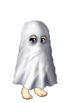
i've decided i don't like the first one ether it's accaly really dark. & it's personal so i'll post a different one in it's place & the girl is a ghost. She was murdered long ago and that's teh murder scene in the background. She's right up to the window if you see the bullet marks. That's also why it's black & white.
|
|
|
|
|
|
|
|
|
|
|
|
|
|
|
Posted: Thu Jul 20, 2006 11:16 am
Warning: very Dark nature. I made a new one. I think you guys will like this one better. Here.  kk the story too. Here you have a ghost, she has become malicious & has taken your life because you have not visited her grave for several years. The last thing you see is her face, the last thing you hear are her thoughts as you slip into the darkness of your own death. Where you will be with her forever haunted forever by her side. Where you in dieing will also be forgotten like she was by you. Your fate awaits you... I really hope this isn't too dark for Gaia. sweatdrop Anyway enjoy & feedback is much apreciated. (er..excuse my spelling)
|
|
|
|
|
|
|
|
|
|
|
|
|
|
|
|
|
|
Posted: Wed Aug 30, 2006 6:49 am
I like the first one, although it is hard to read what it's saying. On the second one, the black hair draws too much attention. Therefore it's harder to pay attention to the rest of the picture. Unity is key> biggrin
|
|
|
|
|
|
|
|
|
|
|
|
|
|