|
|
|
|
|
|
|
 Posted: Sat May 27, 2006 10:04 am Posted: Sat May 27, 2006 10:04 am
There's all sorts of art fluttering around the place.
Feel free to post it! Discuss, get feedback, ask for advice, whatever. Try out a new technique or ask whether or not you should try watercolor (the answer is yes). This is all about the artist and their work.
I ask that you please don't stretch the pages. If you think it will, provide a link.
|
 |
|
|
|
|
|
|
|
|
|
|
|
|
|
Posted: Sat May 27, 2006 10:13 am
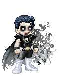
I'm starting off with one of my own. I'm working on a side project for myself and I've come up with what I think to be a nifty character design. But alas, I'm in a fuzz about the color schemes. I've got three working right now and I'm leaning towards the last one. Could be a fourth or fifth that I haven't even thought of. Ideas welcome.design 1design 2design 3
|
|
|
|
|
|
|
|
|
|
|
|
|
|
|
|
|
|
Posted: Sat May 27, 2006 10:22 am
Of the three offered I like the first one best. At first it threw me because I was looking for a 'typical' red/black look for that drawing when you finally colored it...but I prefer the cooler colors instead. And definitely don't tint the hair tendrils. That just reminds me too much of Penance from Generation X.
|
|
|
|
|
|
|
|
|
|
|
|
|
|
|
Posted: Sat May 27, 2006 10:24 am
|
|
|
|
|
|
|
|
|
|
|
|
|
Posted: Sat May 27, 2006 10:26 am
I was debating making more of a trend to cooler colors. In the end I like the last one because it's so simple compared to the others. I should probably play around with blues more.
|
|
|
|
|
|
|
|
|
|
|
|
|
|
|
Posted: Sat May 27, 2006 1:10 pm
I prefer the first one as well. Great work!
|
|
|
|
|
|
|
|
|
|
|
|
|
|
|
|
|
|
Posted: Sat May 27, 2006 7:35 pm
I kinda like the second one, actually.
|
|
|
|
|
|
|
|
|
|
|
|
|
|
|
Posted: Sat May 27, 2006 8:09 pm
I've been doing a lot of random mythos and macabre creatures lately and here's a page of them. I really don't think them out they just appear out of the lines I start with.Horror?
|
|
|
|
|
|
|
|
|
|
|
|
|
|
|
|
|
|
Posted: Sun May 28, 2006 8:30 pm
Rex Mason I've been doing a lot of random mythos and macabre creatures lately and here's a page of them. I really don't think them out they just appear out of the lines I start with.Horror?
...
FI-YAH!
|
|
|
|
|
|
|
|
|
|
|
|
|
|
|
Posted: Mon May 29, 2006 2:32 pm
Yeah, I was thinking of those weird firery Tiki-mask demons that are in some rpgs.
|
|
|
|
|
|
|
|
|
|
|
|
|
|
|
|
|
|
Posted: Mon May 29, 2006 4:19 pm
I'm more a fan of this little guy down here. He looks swollen and puss-filled. One of the reasons zombies are so scary isn't because they're the undead, it's the medical aspect. The rotting, the falling flesh, oozing sores, etc. Try doing this guy with different arms. Long brittle limbs are what I see, but I'll bet there tons of stuff you could do. It will increase the creepy factor ten fold. 3nodding

|
|
|
|
|
|
|
|
|
|
|
|
|
|
|
Posted: Mon May 29, 2006 10:52 pm
Alright, refined color schemes.
scheme 1
scheme 2
scheme 3
The last one best reflects what I'll be doing with the hair. No, hair color is not negotiable.
|
|
|
|
|
|
|
|
|
|
|
|
|
|
|
|
|
|
Posted: Mon May 29, 2006 10:58 pm
I like number one better. sweatdrop
|
|
|
|
|
|
|
|
|
|
|
|
|
|
|
Posted: Mon May 29, 2006 11:00 pm
Just added a number three that's much more heavy all the overall blue. 3nodding
|
|
|
|
|
|
|
|
|
|
|
|
|
|
|
|
|
|
Posted: Mon May 29, 2006 11:02 pm
I like number three better. sweatdrop
|
|
|
|
|
|
|
|
|
|
|
|
|
|