|
|
|
|
|
|
|
|
|
 Posted: Mon May 15, 2006 5:30 pm Posted: Mon May 15, 2006 5:30 pm
This is in the Picture Post
but I don't feel I got the feedback
I was lOoking for heart
FULL (no scanner sweatdrop )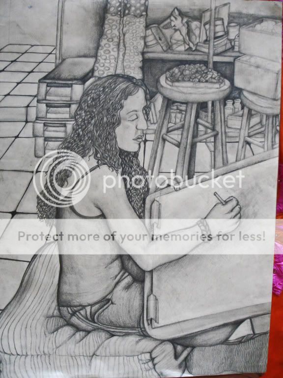 Two details... Two details...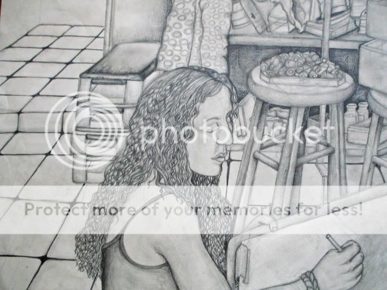 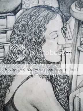
|
 |
|
|
|
|
|
|
|
|
|
|
|
|
|
Posted: Mon May 15, 2006 5:40 pm
geebus. you've got some really nice pencil work going on here. i can possibly make a few suggestions. personally, i think her eyes should be more open rather than drawing with her eyes closed. i think you could add more shading to the face; you've got such wonderful shading everywhere else. really, i think this is a very awesome drawing. how big is it? nice job with the hair; hair always kills me. nicely done!
|
|
|
|
|
|
|
|
|
|
|
|
|
|
|
|
|
|
Posted: Mon May 15, 2006 5:43 pm
Ahhh~. the detail is very nice. self portrait, i'm guessing? however, there's somethings that you can probably work on. the persepective is a little strange, especially the girl and the sketchboard. second, there isn't a focus. the backgroud is just a little distracting. try using different depth of tone in the background. and lastly, add some definite highlights. it's probably becuase of the digital phot that i don't see any right now, because it looks like you do have some, just not very clear. just incase you don't, i'll say that should add some, just in the figure becaseu that's the main focus there. hope this helps. heart
|
|
|
|
|
|
|
|
|
|
|
|
|
|
|
Posted: Mon May 15, 2006 6:30 pm
kirio26 geebus. you've got some really nice pencil work going on here. i can possibly make a few suggestions. personally, i think her eyes should be more open rather than drawing with her eyes closed. i think you could add more shading to the face; you've got such wonderful shading everywhere else. really, i think this is a very awesome drawing. how big is it? nice job with the hair; hair always kills me. nicely done! Thanks
Yes,you are so right about her eyes
oppz..kinda closed there.. redface
*the shading did get changed with it
being to big to scann and since I HAVE no scanner...
I had to make the image a littke easier to see
...it is....about..10''X20''(estimate.*edits later*)
ninja
yeah I was having alot of fun with the hair actually
heart Thanks again for the suggestions
|
|
|
|
|
|
|
|
|
|
|
|
|
|
|
|
|
|
Posted: Mon May 15, 2006 6:35 pm
Dirty_sox3 Ahhh~. the detail is very nice. self portrait, i'm guessing? however, there's somethings that you can probably work on. the persepective is a little strange, especially the girl and the sketchboard. second, there isn't a focus. the backgroud is just a little distracting. try using different depth of tone in the background. and lastly, add some definite highlights. it's probably becuase of the digital phot that i don't see any right now, because it looks like you do have some, just not very clear. just incase you don't, i'll say that should add some, just in the figure becaseu that's the main focus there. hope this helps. heart Thanks,No not a self portrait.
A girl in my class,she was busy drawing someone els
on a stool infront of her..so yeah..
yea I did end up working alOT on the background
YES it does help.(LOTS)..
in PP I was mostly getting
"nice" or "pretty" & so on..
wich isn't terrible to hear..i guess I was just looking for more..
TYTY
|
|
|
|
|
|
|
|
|
|
|
|
|
|
|
Posted: Mon May 15, 2006 7:11 pm
yeah, i know what you mean. all the comments i get on there are like "you are the best!" or "i wish i can draw like you" or stuff like that. i've only recieved one helpful comment on there. kind of sad, but what can you do. you know, you have a lot of potentials. i did see your art (the shoes) in the pp forum and invited you here because of that. hope this is a better place for you to get comments.
|
|
|
|
|
|
|
|
|
|
|
|
|
|
|
|
|
|
Posted: Mon May 15, 2006 7:22 pm
Something that has not yet been mentioned is that this picture is dark. I think that if there was more variety in the shading and less detail in the background, it would help bring the focus to the girl.
For example: her hair is pretty monotone. There's just not enough shading there to show us depth. If, say, you were to substitute all the wonderful curly lines with shading that suggested the curls, I think it would help. biggrin
Does this make sense?
|
|
|
|
|
|
|
|
|
|
|
|
|
|
|
Posted: Mon May 15, 2006 7:35 pm
Dirty_sox3 yeah, i know what you mean. all the comments i get on there are like "you are the best!" or "i wish i can draw like you" or stuff like that. i've only recieved one helpful comment on there. kind of sad, but what can you do. you know, you have a lot of potentials. i did see your art (the shoes) in the pp forum and invited you here because of that. hope this is a better place for you to get comments. yeahh.. me tOoo
I was trying to resize this watercolor...
owell...I'll try again when i'am feeling less sleepyU_U
haha...PP forum I noticed is more inviting/popular to
cute anime drawings..
wich IAM NOT against..It's just nice for a change sometimes or variety..
I guess ....Although I have gotten acouple helpfull comments.. heart
|
|
|
|
|
|
|
|
|
|
|
|
|
|
|
|
|
|
Posted: Mon May 15, 2006 7:38 pm
euclids_triangle Something that has not yet been mentioned is that this picture is dark. I think that if there was more variety in the shading and less detail in the background, it would help bring the focus to the girl. For example: her hair is pretty monotone. There's just not enough shading there to show us depth. If, say, you were to substitute all the wonderful curly lines with shading that suggested the curls, I think it would help. biggrin Does this make sense? I see what you mean
All three pictures are differnt lighting..
one is dark...and one is light and the other..I don't know
I'll go back and see about that(the original)
Thanks lOtz!~!
|
|
|
|
|
|
|
|
|
|
|
|
|
|
|
Posted: Tue May 16, 2006 1:03 pm
I don't agree, I think the hair and background is great. I like this kind of fokus cause it's more like reality then a photograph in a way. Got me thinking of the theori about the usage of lenses to create realistic oil paintings back in the days...the artists moving the lens made paintings like this, just like we move our eyes when we're watching this girl drawing. Here's my critique, illustrating it with a picture so you'll see what I mean. ms paint heheAt first I just checked the floor, perfect. ^_^ Then I think you should'nt have that hard liplines. And the eye could be more parted, and her left (our right) cheek is to high and pointy. The part just below the eye really go in, then below that ut stands out. The tumb should be more pointy and the pen should be thicker.
|
|
|
|
|
|
|
|
|
|
|
|
|
|
|
|
|
|
Posted: Tue May 16, 2006 1:18 pm
ChemieChan I don't agree, I think the hair and background is great. I like this kind of fokus cause it's more like reality then a photograph in a way. Got me thinking of the theori about the usage of lenses to create realistic oil paintings back in the days...the ones moving the lens made paintings like this just like we move our eyes when we're watching this girl drawing. Here's my critique, illustration it with a picture so you'll see what I mean. ms paint heheAt first I just checked the floor, perfect. ^_^ Then I think you should'nt have that much lipliner. Then the eye could be more parted and the left (our right) cheek is to high and pointy. The part below the eye really go in then out. Then the tumb should be more pointy and the pen should be thicker.
Oh Thank you I'am glad you like the hair & background!
Thanks for the "visual critique"
helped alot...OH...umm it's not lipliner i guess...
it's just how I drew her lips redface
Since I dont have the source anymore..
So I can't say anything about the eye being alittle to the side..
The girl I was drawing DOES have high cheekbones..but don't think
pointy was part of the plan.I was actually advised to maybe just
erase the cheek on the side*scared*
I was always kinda iffy about the shape of her face...
but owell.
YES ohhh..you'r right THE giant hand is taking over her pencil. domokun ..
*fixes* xp
Thanks lotz again heart
|
|
|
|
|
|
|
|
|
|
|
|
|
|
|
Posted: Tue May 16, 2006 1:24 pm
yes yes, hair can be a pain. i think you did a good job with it. did i mention that the angle of the lip is a little strange? also, i don't think you should fix this picture too much. save it as the way it is, and just keep the things we suggested in mind for your next drawing. then after you've done more, you can go back and compare and see how much you've grown since then.
|
|
|
|
|
|
|
|
|
|
|
|
|
|
|
|
|
|
Posted: Tue May 16, 2006 5:16 pm
Dirty_sox3 Ahhh~. the detail is very nice. self portrait, i'm guessing? however, there's somethings that you can probably work on. the persepective is a little strange, especially the girl and the sketchboard. second, there isn't a focus. the backgroud is just a little distracting. try using different depth of tone in the background. and lastly, add some definite highlights. it's probably becuase of the digital phot that i don't see any right now, because it looks like you do have some, just not very clear. just incase you don't, i'll say that should add some, just in the figure becaseu that's the main focus there. hope this helps. heart I concur. About the face, it seems that the top is slightly off with the lips, as if the lips were pointing in a different direction. Don't ask how to fix it- I don't know how to draw lips! sweatdrop I love the texture of the hair! I have hair like that (though with bigger waves) and I know how hard it is to draw. heart
|
|
|
|
|
|
|
|
|
|
|
|
|
|
|
Posted: Tue May 16, 2006 8:34 pm
tatertot101010 Dirty_sox3 Ahhh~. the detail is very nice. self portrait, i'm guessing? however, there's somethings that you can probably work on. the persepective is a little strange, especially the girl and the sketchboard. second, there isn't a focus. the backgroud is just a little distracting. try using different depth of tone in the background. and lastly, add some definite highlights. it's probably becuase of the digital phot that i don't see any right now, because it looks like you do have some, just not very clear. just incase you don't, i'll say that should add some, just in the figure becaseu that's the main focus there. hope this helps. heart I concur. About the face, it seems that the top is slightly off with the lips, as if the lips were pointing in a different direction. Don't ask how to fix it- I don't know how to draw lips! sweatdrop I love the texture of the hair! I have hair like that (though with bigger waves) and I know how hard it is to draw. heart oh!Thanks
yeah I will watch out for lips next time
heart
Thanks *about the hair* heart
|
|
|
|
|
|
|
|
|
|
|
|
|
|
|
|
|
|
Posted: Wed May 17, 2006 12:43 am
Yeah I thought lipliner sounded strange so I edit my post while you where answering. xd I'm glad if I could be of any help. smile
|
|
|
|
|
|
|
|
|
|
|
|
|
|
|
|
|
|