|
|
|
|
|
|
|
|
|
 Posted: Mon May 08, 2006 6:46 pm Posted: Mon May 08, 2006 6:46 pm
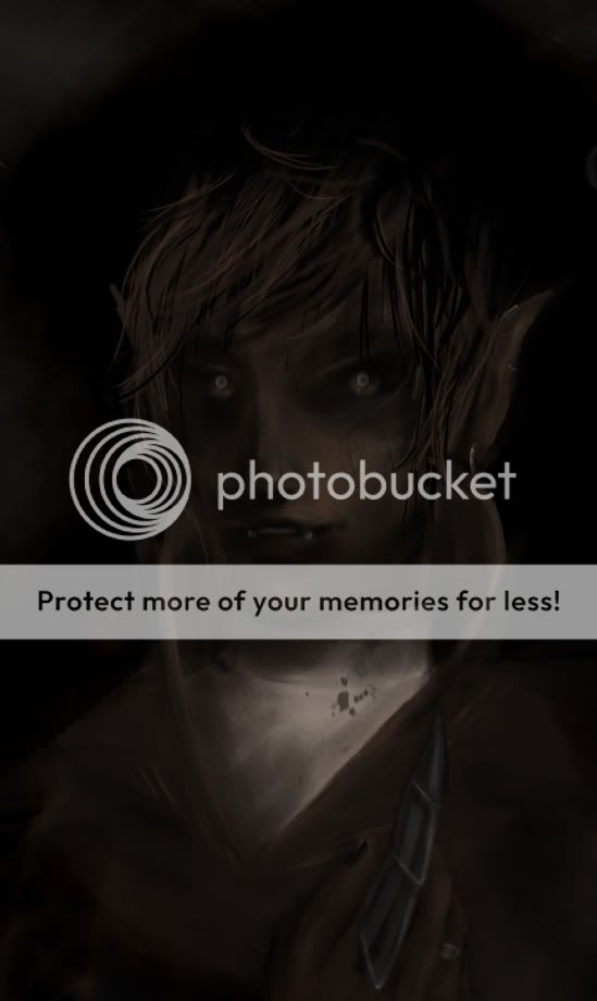
I forgot I was a member here >_>;; It's been awhile. Yuss... This is totally boring, a little too dark, and quite large, but-- it's recent, and I thought I'd share n_n So tell me what needs working on, please! 
|
 |
 |
|
|
|
|
|
|
|
|
|
|
|
|
 Posted: Mon May 08, 2006 6:54 pm Posted: Mon May 08, 2006 6:54 pm
damn, my monitor is so dark. gonk
from what i can see, the MYSTERIOUS atmosphere is nice and i love the nose especially. however, the sharpness of the hair and earring coupled with the blur on everything else makes this look kind of unfinished to me. i dunno if that's the look you were going for. D:
|
 |
 |
|
|
|
|
|
|
|
|
|
|
|
|
|
|
|
 Posted: Tue May 09, 2006 10:52 am Posted: Tue May 09, 2006 10:52 am
I don't think it's boring at all.
It is dark, and it'd be prettier if it was lighter but I really like the way you've drawn this.
Ilove the nose and teeth ;O
|
 |
 |
|
|
|
|
|
|
|
|
|
|
|
|
 Posted: Tue May 09, 2006 12:03 pm Posted: Tue May 09, 2006 12:03 pm
Doctor MEAN! damn, my monitor is so dark. gonk from what i can see, the MYSTERIOUS atmosphere is nice and i love the nose especially. however, the sharpness of the hair and earring coupled with the blur on everything else makes this look kind of unfinished to me. i dunno if that's the look you were going for. D: Oh, that's very helpful. I'm not sure how to make the face sharper, though. I'll go work on it now.
|
 |
 |
|
|
|
|
|
|
|
|
|
|
|
|
|
|
|
 Posted: Tue May 09, 2006 12:55 pm Posted: Tue May 09, 2006 12:55 pm
All I can see is a brownish triangle-shape near the bottom of the image. The rest is black.
Yes, my monitor is terrible.
|
 |
 |
|
|
|
|
|
|
|
|
|
|
|
|
 Posted: Tue May 09, 2006 4:50 pm Posted: Tue May 09, 2006 4:50 pm
Doctor MEAN! damn, my monitor is so dark. gonk from what i can see, the MYSTERIOUS atmosphere is nice and i love the nose especially. however, the sharpness of the hair and earring coupled with the blur on everything else makes this look kind of unfinished to me. i dunno if that's the look you were going for. D: OHJESUS! My monitor was so dark that I could only see a section of his little neck do-hickie! I like it overall, the bottom I think could have more though, either that or make it fade out more. The grey just looks unfinished.
|
 |
 |
|
|
|
|
|
|
|
|
|
|
|
|
|
|
|
 Posted: Tue May 09, 2006 6:02 pm Posted: Tue May 09, 2006 6:02 pm
Gizmoid Doctor MEAN! damn, my monitor is so dark. gonk from what i can see, the MYSTERIOUS atmosphere is nice and i love the nose especially. however, the sharpness of the hair and earring coupled with the blur on everything else makes this look kind of unfinished to me. i dunno if that's the look you were going for. D: OHJESUS! My monitor was so dark that I could only see a section of his little neck do-hickie! I like it overall, the bottom I think could have more though, either that or make it fade out more. The grey just looks unfinished. Hmm... I'm experimenting with textures right now; that should help it out a bit.
|
 |
 |
|
|
|
|
|
|
|
|
|
|
|
|
 Posted: Wed May 10, 2006 4:57 am Posted: Wed May 10, 2006 4:57 am
i'm sort of feeling with Mina on the hair. To many obvious tablet strokes that dont really look like strands. I dont like it when people draw hair by piling a binch of linestrokes on a surface...i tend to think it helps if you render the body of the hair first, and then texturize with the stokes after. And? i guess pay attention to their shape, even corse har does not look blunt on the end of the strand.
|
 |
 |
|
|
|
|
|
|
|
|
|
 |
|
|
|
|
|
|

