It's not bad, but I'm not going to lie, it needs a good bit of work.
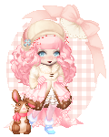
The coloring itself is fairly good, actually, especially the eyes and skin.
And I'm quite fond of the eyes, myself, and the way you colored the blush on the cheeks. c:
The hair, though, is off; the way light reflects of hair is odd and hard to portray because of the way it bounces off each individual strand.
The way I usually handle reflected light, especially on the crown of the head, is more of a scribble along the curve of the head.
And then adding in individual "strands" that are lighter and darker than the base color simply by using strokes that follow the way the hair lays gives it a nice, natural kind of effect, I've found.
Don't mind my hair critiquing too much; it takes a while, I'm still in the trial-and-error phase, myself.
The next big thing I notice is placement of the features; the mouth is sitting really low on the face and the nose is stretched out a lot.
Oddly enough, though, your eyes are sitting in the right place. c:
The mouth should sit about halfway between the eyes and bottom of face, and the nose would sit just above that; another little tip, for when you have to draw in eyebrows, they follow the curve of the nose, not the eyes.
The collar bone doesn't extend all the way out to the shoulders; usually, you stop the line for the collar bone below where the ears sit, give or take a little, though the shadow can extend out a bit more than the line.
Alright, I think I'm done, I hope I don't sound too harsh and that my comments help a bit. ^^; Good luck on your quest for improvement. c: