|
|
| Comments? |
| Agree |
|
40% |
[ 9 ] |
| Disagree |
|
50% |
[ 11 ] |
| Maybe... (post?) |
|
9% |
[ 2 ] |
|
| Total Votes : 22 |
|
|
|
|
|
|
|
|
 Posted: Tue Nov 23, 2010 8:31 am Posted: Tue Nov 23, 2010 8:31 am
Note; I am not saying redo the familiar completely, just like... the thickness of the lines.
For some reason, some of the familiar lines (to me anyways) seem like they're kind of unnatural compared to the Soquili itself. Example:

For the both of them, the size of the lines of Prince and Emille are about the same, and they look natural together. Ack. Not exactly sure how to explain natural except that the fact that their lines match more.
And the example of the opposite:
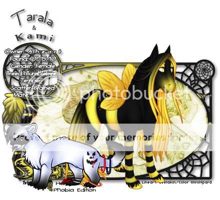
For Tarala and Kami, Kami seems to stick out a lot more compared Tarala, which seems like it's the thickness. Don't get me wrong, however. It could just be in Tarala and Kami's cert, but if you have other familiars where the thickness of the lineart look different, please post them (:
Bottom line: Re-trace some of the familiar lines? Note I do say some because it's only some that are thicker than others (:
Edit; The templates pointed out is true too XD!
|
 |
|
|
|
|
|
|
|
|
|
|
|
|
|
Posted: Tue Nov 23, 2010 8:33 am
It also could be because Kami's lines are just black... But also not sure XD *hasn't seen enough familiars myself to really judge)
|
|
|
|
|
|
|
|
|
|
|
|
|
|
|
|
|
|
Posted: Tue Nov 23, 2010 8:36 am
Some of the templates vary in the familiars as well. xD
|
|
|
|
|
|
|
|
|
|
|
|
|
|
|
Posted: Tue Nov 23, 2010 3:11 pm
The thing you have to remember about the familiars is that many were added over time. The ones with the "thicker lines" are much older when Soquili used to have the appearance of "thick lines" to match. Now the lines are being well blended with the pelts of the Soquili by the colorists. So it's really up to how well the colorist works around this "defect."
I currently own two familiars myself.
As you can see, the "thicker line" familiar was done by the SAME lineartist the Soquili have. But the others were done by staff when demand and suggestions were made.
Between 2005-2006, the "thicker line" Soquili were visible. Here's an example:
Now Soquili artists have learned to color those lines similar to the pelt. It's just that the same isn't being applied to the familiars. I've never really seen the "thicker lines" as an issue until you have a striking example with your Kami. I personally don't want to give the staff more work to re-do something when it's honestly coloring style and how to work around those lines.
|
|
|
|
|
|
|
|
|
|
|
|
|
|
|
|
|
|
Posted: Tue Nov 23, 2010 11:02 pm
Completely understandable about the too much work think (: not like i'm in a rush or anything, but it could be like... a work in progress or something C:
|
|
|
|
|
|
|
|
|
|
|
|
|
|
|
Posted: Wed Nov 24, 2010 12:46 am
As silly as this might sound I kind of like the thicker lines. They have a old school look to them which kind of makes them special. I have always like the older soquili and familiars just because of the retro feel they seem to have (x
|
|
|
|
|
|
|
|
|
|
|
|
|
|
|
|
|
|
Posted: Wed Nov 24, 2010 1:28 pm
I really don't think it's the 'Thickness' of the lines that needs to be changed, I think it would just help if the matched the pelt color more. Black stand out more then a well blended color and looks more 'unnatural' then a blended color. IMO the lines are just fine the way they are.
|
|
|
|
|
|
|
|
|
|
|
|
|
|
|
Posted: Wed Nov 24, 2010 2:11 pm
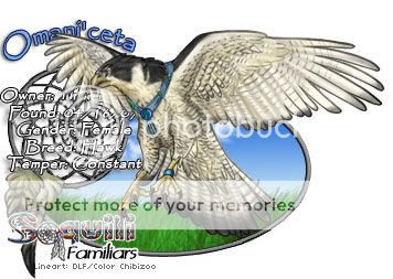
I think its just a case of the familiar colorist, new to the shop, didn't color the lines in like they are supposed to, and maybe didnt shrink it enough, either. For example, here's the same species of familiar 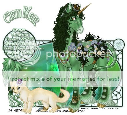 When compared to yours, they look a lot different. Example:
|
|
|
|
|
|
|
|
|
|
|
|
|
|
|
|
|
|
Posted: Wed Nov 24, 2010 2:27 pm
Ohh... Oki dokie xD Gotcha~ I really wasn't sure o.o Thanks Mind~
So would I be able to ask the colorist of Kami to recert and possibly color the lines o.o? Or is that bad...?
|
|
|
|
|
|
|
|
|
|
|
|
|
|
|
Posted: Wed Nov 24, 2010 2:33 pm
Im thinking since your familiar was a free prize, its basically, you get what you see, as all the familiars were up for view before being rolled. To ask someone to go in and edit/recolor something *free* is kind of pretentious.
Otherwise, if it were a custom, you would get just that, a custom thats right until you are happy with it.
|
|
|
|
|
|
|
|
|
|
|
|
|
|
|
|
|
|
Posted: Wed Nov 24, 2010 9:34 pm
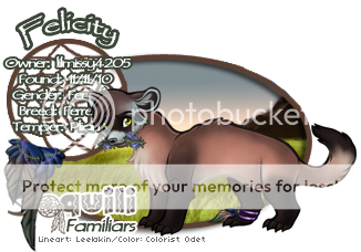
Yes this is something we are currently dealing with. There will be a chart so everyone can see the size of the familiars in relation to soquili. It was a case of a new colorist that was unsure about how to size the owl. Mindsend is correct that the ferret above should have the lines colored so they don't look as thick. Perhaps the colorist was going for a spooky look so thought the lines should be left black?
|
|
|
|
|
|
|
|
|
|
|
|
|
|
|
|
|
|