Welcome to Gaia! ::

Reply Art Fags
The latest from Soti

Quick Reply

Enter both words below, separated by a space:

Can't read the text? Click here

Submit

Sotalean

Shameless Lover

PostPosted: Thu Jan 12, 2006 12:49 pm


This is a commision that I did for Poufy Werewolf here. She won an art auction and ended up with two couples with full background. *dies* I should stop uping the anty for autobuys... Anywho!
This is a bit smaller then the actual image so feel free to follow the link if you want to see it up close.
http://www.deviantart.com/view/27584268/
User Image

The background isn't what it could be.. I'm still learning when it comes to backgrounds. This would be my fourth attempt at a serious one.
PostPosted: Thu Jan 12, 2006 2:46 pm


think with backgorounds you often have to go at them with as much attention and refining as you did with the chracters themselves...otherwise they dont really seem to fit together.
The characters themselves seem really juxtaposed. I know it was a commission, but the image comes across as unnatural to me.


i love the detailing on the dress.

Page Boy


ficklefiend

PostPosted: Thu Jan 12, 2006 5:45 pm


That is why CG backgrounds suck to do and why so many people leave them white. They need work, in a traditional media picture you seem to be able to get away with simple backgrounds which give an impression of what is behind the people or whatever, but for digital art this just doesn't seem to work for anything more detailed than an horizon line.

The detail you have done is good, I like the weeping willow and all the little branches poking through the hedge.
However, I don't think the perspective is quite right with some of the background elements, the hedge doesn't seem to slope parallel to the ground and the cobbles don't look like they have the same lightsource as the pavement.
PostPosted: Thu Jan 12, 2006 6:36 pm


Page Boy
think with backgorounds you often have to go at them with as much attention and refining as you did with the chracters themselves...otherwise they dont really seem to fit together.
The characters themselves seem really juxtaposed. I know it was a commission, but the image comes across as unnatural to me.


i love the detailing on the dress.

yeah.. I'm still learning to make my characters more natural. Yeah.. the characters don't compliment eachother very well but there's only so much I can do under the limitations of a commision. *shrugs* When they give you a modern dude and an elf that wears robes... it will just never really work.
I tried making it fit a bit better by downgrading some of the features of a modern world that way it could almost be a world unto itself instead of here or there. Make any sense? ... O.o

ficklefiend
That is why CG backgrounds suck to do and why so many people leave them white. They need work, in a traditional media picture you seem to be able to get away with simple backgrounds which give an impression of what is behind the people or whatever, but for digital art this just doesn't seem to work for anything more detailed than an horizon line.

The detail you have done is good, I like the weeping willow and all the little branches poking through the hedge.
However, I don't think the perspective is quite right with some of the background elements, the hedge doesn't seem to slope parallel to the ground and the cobbles don't look like they have the same lightsource as the pavement.

Yeah I know.. I'm used to doing traditional backgrounds and now it's really getting in the way of me making things.. right on the computer. Next time I'll try outline the highlights of the background. XD

Sotalean

Shameless Lover


Gardenhead

PostPosted: Thu Jan 12, 2006 7:28 pm


It looks similar to what happens when the planes of a 4x5 camera are whacked. The torse of the guy is pointed almost directly at us while his legs are facing the direction of the vanishing point of the sidewalk. I think its really important to get the sense of direction and space clearer when you start sketching. I do like where its going though.

The waist up is definitely pointing right at us though, its weird.
PostPosted: Thu Jan 12, 2006 8:32 pm


IT might be depending on how you take the image I guess.. I saw it as the girl was slightly turning his body toward her.. it's like being caught just before a movement... *shrugs*
I might not have gotten that across though.

Sotalean

Shameless Lover


crazy spork i am

PostPosted: Thu Jan 12, 2006 8:55 pm


cg backgrounds aren't as difficult as they tend to be. it's true that you do have to approach it a bit differently than with traditional stuff...but isn't that the case when using different media in general?

i do think the perspective is a bit off...if you're using photoshop you can use the line tool on another layer to help with your perspective by making your own perspective grid.
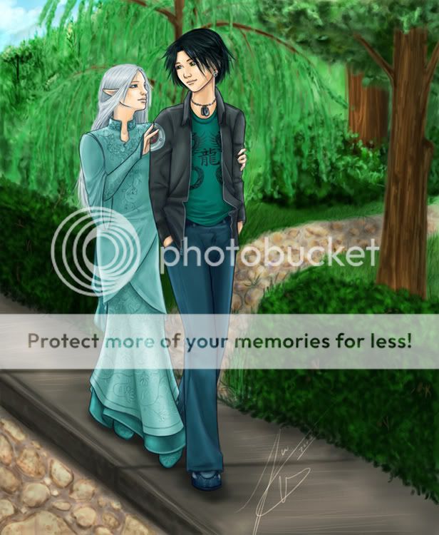
i think on the whole it's alright, but there are areas that are a bit off (like the perspective bit). but i also think compositionally-wise, it's a bit boring. you could always try experimenting with the canvas size, making it bigger or smaller so you're not limited to the typical vertical size of an 8.5x11 piece of paper. it'd help in the long run to make your composition look more visually pleasing, and it also helps in making your backgrounds look better too. i can imagine the canvas being extended a bit more horizontally to the right so you can add more background elements.
i think another thing too would be to add elements in the foreground. especially since this is a couple picture, having foreground and background elements kinda helps 'envelope' them so it makes it feel like they're enclosed in some sort of atmosphere...making it feel more intimate and close. foreground elements doesn't have to be necessarily detailed either, maybe a few interesting simple shapes...like blades of grass or a few branches or even some overall noise or flower petals would help. and again, if you're using photoshop you can make it look less static by using the filter --> blur tools. like if you had the background on a separate layer from the couple, you could do a fake depth of field by using gaussian blur, in addition you could probably desaturate the colors so they're not so bright. or even copying the background layer, and then desaturating that one, and then using a layer mask with a gradient to blend between the saturated background and the desaturated one. and to take it even further you could make a vignette to help surround the two characters more.

another thing you could do to show movement would be again using the blur tool. you could copy the layer of the girl, and add the zoom blur to that one, and then mask off the areas in where you don't want it to show (or areas in where she wouldn't look like she's 'moving').

-tanchou series 01

an example i have. this photo was taken and then altered digitally using photoshop. the depth of field was faked by doing the gaussian blur thing, in addition to desaturating the colors (since i had taken this during the day). the focal point has the strongest contrast, not to mention if you were to do a similar background, you could easily lay down some lines using the line tool and then simply go to town with the background.

i guess on the whole i would say it's not so bad. but i think using some of the photoshop tools (or with similar tools if you're using a different program) to help with the overall feel would really make it pop.
PostPosted: Fri Jan 13, 2006 3:35 am


Crazy spork......if you ever....you know, wanted to explain how to use masks to me...i think i would love it.

My biggest complaint with my digital photography is that i have little to no control over the depth of feild, and i would really enjoy being able to change that.


[edit] Sota- i completely understand the limitations of being comissioned, so when i made the remark about the image seeming unnatural, i know it wasn't your fault...i just said it anyway. XD

Page Boy

Reply
Art Fags

 
Manage Your Items
Other Stuff
Get GCash
Offers
Get Items
More Items
Where Everyone Hangs Out
Other Community Areas
Virtual Spaces
Fun Stuff
Gaia's Games
Mini-Games
Play with GCash
Play with Platinum