|
|
|
|
|
|
|
|
|
 Posted: Fri Mar 05, 2010 5:42 pm Posted: Fri Mar 05, 2010 5:42 pm
look at this crap 4laugh xXx
|
 |
|
|
|
|
|
|
|
|
|
|
|
|
|
Posted: Sun Mar 07, 2010 1:27 pm
Hm... It's hard to say with these pictures.
What tools do you use for line and colour? I would suggest using better paper than your class note paper. Try to get a bristol. It's like a thin cardboard that takes pencil, ink, marker, or whatever well. Whatever you used is bleeding a lot and makes things look less clean and controlled.
|
|
|
|
|
|
Errol McGillivray Captain
|
|
|
|
|
|
|
|
|
|
|
|
Posted: Sun Mar 07, 2010 1:41 pm
Errol McGillivray Hm... It's hard to say with these pictures. What tools do you use for line and colour? I would suggest using better paper than your class note paper. Try to get a bristol. It's like a thin cardboard that takes pencil, ink, marker, or whatever well. Whatever you used is bleeding a lot and makes things look less clean and controlled. well besides doom it was a pencil outline and i want over it with sharpie markers the doom one was just pen
|
|
|
|
|
|
|
|
|
|
|
|
|
|
|
Posted: Wed Mar 10, 2010 11:55 am
Here is another one i made this one for my friend 
|
|
|
|
|
|
|
|
|
|
|
|
|
|
|
|
|
|
Posted: Mon Apr 05, 2010 8:44 pm
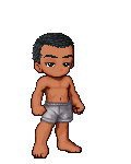
X ok this is my first try at a body i hope its good air another graffiti pic Amy this was a request from a friend it was intended to be a chibi
|
|
|
|
|
|
|
|
|
|
|
|
|
|
|
Posted: Mon Apr 05, 2010 9:21 pm
I'll be commenting on the chibi pic =)
I like the nice, solid colors. I see that you've done some shading on the skin, perhaps try some variation of the shading thickness - it'd look more natural.
Try some white paint on certain parts (e.g devil's tailtip, wings, breast, boots, etc) for some highlights!
|
|
|
|
|
|
|
|
|
|
|
|
|
|
|
|
|
|
Posted: Mon Apr 05, 2010 10:40 pm
Lea Florens I'll be commenting on the chibi pic =) I like the nice, solid colors. I see that you've done some shading on the skin, perhaps try some variation of the shading thickness - it'd look more natural. Try some white paint on certain parts (e.g devil's tailtip, wings, breast, boots, etc) for some highlights! ty 4laugh i would do something like that but all i got is a pencil, pen, and sharpie markers sweatdrop
|
|
|
|
|
|
|
|
|
|
|
|
|
|
|
Posted: Thu Apr 08, 2010 6:37 pm
In the first picture, the guy's torso is way too long. You could probably even cut it in half. In the second, I know crap about graffiti, so I'll just talk about the person. It looks like you were going for a super epic jump. When someone's jumping then their limbs are going to be spread out, like the Air Jordan logo. It doesn't have to be exactlly like that, but that's the idea. It doesn't look as dynamic as it could because his body is so compact. Composition tip of the night: Diagonals in composition are used to convey movement. Right now the figure is mostly vertical. Most vertical things are not usually known for their mobility. Trees, pillars, and light poles are all pretty stable objects. Making his limbs, or possibly his torso, more diagnal, that would also help show movement.
|
|
|
|
|
|
|
|
|
|
|
|
|
|
|
|
|
|
Posted: Thu Apr 08, 2010 6:40 pm
The picture of the man holding the sword:
-Watch your proportions. Feet should be the length of the forearm. The forearm should be the length of the head. Basically, all body parts should be compared to the size of the head.
-The jaws extend all the way to the back of the characters neck. In reality, the jaw connects to the bottom of the ears.
My advice is to look at yourself and people around you and draw people and draw alot of them. Draw fabric, furniture, objects, animals, plants. You'd be suprised by how much it will help.
|
|
|
|
|
|
|
|
|
|
|
|
|
|
|
Posted: Fri Apr 09, 2010 12:24 pm
thank you for the crits ill keep it in mind new art work did all of this for the art freebie forum AmyAdnariumAnastasiaLisa
|
|
|
|
|
|
|
|
|
|
|
|
|
|
|
|
|
|
Posted: Thu Apr 15, 2010 5:52 pm
Kingjust i new graffiti piece
|
|
|
|
|
|
|
|
|
|
|
|
|
|
|
Posted: Sun Apr 25, 2010 12:33 pm
|
|
|
|
|
|
|
|
|
|
|
|
|
Posted: Sun May 02, 2010 2:28 pm
|
|
|
|
|
|
|
|
|
|
Posted: Fri May 07, 2010 1:22 pm
In the eyes: The real eye looks flat. Obviously you were going for dimension since you added the shadows but the contours, and the way you drew them, detracts from that. It doesn't look fleshy. Eyelids are covering the eye ball, which is round. The transition from the inner corner tear thingy (I forgot the name) to the rest of the lid helps. It doesn't just go out into a straight point, the inner corner kind of pinches inward. more how you drew the outer corner. The outer corner is the pointer one, because the eyelid corners meet. Also, there should be more shading to the eyelids because they are fleshy and stick out quite a bit from the eye lid. This in turn makes the lashes look almost like they're growing from under the eyelids. It would help to study the profile of the eye. You may need a friend or photo.
|
|
|
|
|
|
|
|
|
|
|
|
|
|
|
|
|
|
Posted: Fri May 28, 2010 10:32 pm
apiyo In the eyes: The real eye looks flat. Obviously you were going for dimension since you added the shadows but the contours, and the way you drew them, detracts from that. It doesn't look fleshy. Eyelids are covering the eye ball, which is round. The transition from the inner corner tear thingy (I forgot the name) to the rest of the lid helps. It doesn't just go out into a straight point, the inner corner kind of pinches inward. more how you drew the outer corner. The outer corner is the pointer one, because the eyelid corners meet. Also, there should be more shading to the eyelids because they are fleshy and stick out quite a bit from the eye lid. This in turn makes the lashes look almost like they're growing from under the eyelids. It would help to study the profile of the eye. You may need a friend or photo. k thanx for the crits
|
|
|
|
|
|
|
|
|
|
|
|
|
|
|
|
|
|