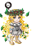
The light source isn't very clear in this picture. On her face, it's like the light is coming sorta from the top-right... on her arm, from the left and up a bit... on various other parts, from the bottom-right.
Suppose you wanted to go with having the light from the top-left, which would match the arm nearest to us, her legs, and sorta her apron...
Uh... here, I ruined the picture in MS Paint to explain myself quicker:

The red circles are places where where I changed the shading/lighting a bit.
At that green area... Well, take a look at how you drew that bump in the apron. Then you proceeded to make the areas around the bump light and the bump itself dark. If it's bumping up, then it should be what's getting the light, not the dips beside it.
Keep in mind that if the light is coming from above, then the lower parts of things should be shaded (i.e. they aren't getting light because the light hits the upper parts). For example, at her elbow and arm where I did my quick re-shading. I didn't mess with the face, but you might want to change some lighting there, too. I forgot to show it, but you should have the light kinda display her legs' shapes. The area inbetween the legs should be darker because the dress would fall into that little gap due to gravity. Don't make the shape of the bottom of her legs evident, though - the dress is cover it, not tightly wrapped around it, so you wouldn't notice what's beneath the surface area.
As for her legs, I don't think they make sense. At best, that behind leg might be a bit higher than where I assumed it was going, but I think her knee would have to bend backwards for the thigh to connect to where it oughta be... unless I guessed wrong with the front leg; it would make better sense if that one is lower. However, if it was lower, would her dress/apron be raised that high? Maybe if she was falling, but her hair suggests she's on solid ground. Or if she has something under her dress (like a bunch of layers of skirt or something), then it might make sense.
I'm no expert on shoulders, myself, so I dunno what to say about that.
I like the picture overall. The hand, teacup, hair, and frills especially - I think they're very well done. I'm not so sure abou the ear, and the mouth maybe doesn't match that jaw entirely. I'd put some white behind the pupils, but it's fine if it's your style not to do so. I'd maybe have some more hair right at the upper base of her ear... like... I think people normally have hair there. I know I just criticized the picture a lot, but I really do like it overall.
edit: Oh, and welcome to the guild.