|
|
|
|
|
|
|
|
|
 Posted: Mon Jan 04, 2010 1:25 pm Posted: Mon Jan 04, 2010 1:25 pm
*RECYCLE* Figured I'd post this up here since I'm not getting any solid critique anywhere else.  Tear it up pa-lease. Original Thread 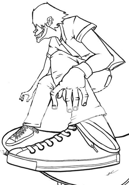 I'm proud of this. Crush my little heart, please.
|
 |
|
|
|
|
|
|
|
|
|
|
|
|
|
Posted: Thu Jan 07, 2010 5:50 pm
First of all, love the clean lines and the exaggerated perspective. The overall triangle of the composition is great. I also really dig the stylization of the face and hands.
Little nitpick- the fingers on the far hand seem to be missing a joint and the knuckles on the near hand look a little odd. If the fingers are not clenched into a fist, knuckles generally don't have definition on the side the finger's coming out of. If you pose your own hand and take a look, you might find the greatest amount of definition on the side going away from the fingers. Because of the way the bones lead from the wrist to the fingers, there is really no reason for any strong horizontal indentations. So my suggestion is simply to take out or reduce those lines above each finger and perhaps consider a more vertically aligned mark to indicate the size of the knuckles.
Even smaller nitpick- His far shoe is not the same as his near shoe (the square panel on the front, there is not even a hint of the lines in the rubber side, and the shape of the toe of the shoe is less round)
Bigger nitpick-
The foot nearest us does not seem to have weight rested on the board. If he's got his foot brought up so that he can do some sort of trick with the board it's no problem. But if his weight is supposed to be resting on both feet, I think either his toes should be raised (because they are not resting on anything, so the greatest amount of weight would be distributed on his heel); the board should be 'flat' under his foot (which would require you to change the far foot as well); or his whole foot should be tilted to be 'flat' with the board.
Technically it could be fine as is, it just throws him wildly off balance to have that one leg raised and resting his whole weight on a limb not placed directly in line below his head. Which is not a sin, I'm just not sure if it's what you were going for.
Anyway I kinda hated to critique it because I like it so much despite those little oddities.
It really is very cool just as is and works well all together.
|
|
|
|
|
|
|
|
|
|
|
|
|
|
|
|
|
|
Posted: Thu Jan 07, 2010 7:55 pm
Thanks, man. You're the first one to give me an in-depth critique on it.
You're right about the knuckles, there. Hands usually look off when I try to draw them bony like that. Wasn't sure why until now.
Also right on the shoe. One of those "Didn't notice it until far after scan, maybe they won't call me on it" type things.
To be honest, I knew the near foot was off from what I was going for when I penciled it. I figured I could successfully play it off as him about to do a trick. (Maybe a Nollie or something). So yeah, I'mma just hope that's a viable excuse.
I hope you (and everyone else) always tear apart my art apart. a** pats feel great, but they just make me want to wallow in what I've done. If people knock me down, I go back to the sketchbook and try not to ******** up as bad.
So, thanks again.
|
|
|
|
|
|
|
|
|
|
|
|
|
|
|
Posted: Fri Jan 08, 2010 6:14 pm
Hey, my pleasure. I really like talking with artists at about my level since I feel like I can help with just an objective set of eyes.
Like I said it's possible for his foot to be like that, it just throws the balance kind of funny. If you wanna try wildly off-balance for the fun of it in the future, I would also suggest skewing the angle, so instead of this nice "balanced" triangle shape, where it seems like all the weight should be solidly resting on the broad base, it might be interesting to tilt it and emphasize the motion and unbalance of it. Then you could get a really sweet dynamic action thing goin on.
In fact... Try tilting the image so his back is parallel with the right edge of the page? It's digital so it should take you four seconds and it might be interesting to play with.
|
|
|
|
|
|
|
|
|
|
|
|
|
|
|
|
|
|
Posted: Sat Jan 09, 2010 11:09 am
I think I'm pickin' up what you're putting down. I'll keep that in mind.
I tried the tilt thing. I dun really know how I feel about it, though.
|
|
|
|
|
|
|
|
|
|
|
|
|
|
|
Posted: Mon Jan 25, 2010 8:01 am
Might scooch his jaw over slightly to the left so that the round part is right in the center? And if you're calling this finished I would recommend pushing the contrast higher with your pencil shading since right now it's pretty light and doesn't seem finished, especially considering the decidedly non-light and airy content of the picture.
Other than that... I guess you could play with some more dynamic lineart, varying line widths and laying down heavier lines certain places. I'm really not sure where to tell you to push this one further because your style is nice and soft and organic despite being angular and stylized at times. So whichever the way the wind da blow for you I suppose.
And I can dig not liking the tilt on the last one. It never hurts to try looking at something several different ways though. smile
|
|
|
|
|
|
|
|
|
|
|
|
|
|
|
|
|
|
Posted: Fri Feb 05, 2010 5:36 am
pretty nice s**t egg badeye covered alot, but what really bugs me (its a nitpick aswel), but the folds in the pants underneath the knee really should not be there. especially in that pose the pants knee area should be slick (lol can't find the right word) 
|
|
|
|
|
|
|
|
|
|
|
|
|
|
|
Posted: Sun May 09, 2010 10:04 am
Hey, thanks guys. Great advice. Sorry it took so long to get back to you.
|
|
|
|
|
|
|
|
|
|
|
|
|
|
|
|
|
|
|