I'd like to make sure you understand i'm meaning vibrant, saturated color. So like when you get the paint directly from the tube, it's 100% saturation until you mix it with white, black, or a complimentary color. The opposite of a completely vibrant color is gray.
So when you're picking your colors in (photoshop? Painter?):
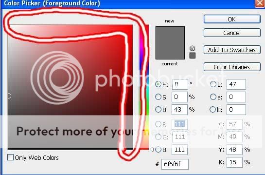
Anything in that circled area is going to have very full saturation, whereas the stuff to the left is more neutral.
This is completely optional, but try using the color dropper tool on an actual photograph of trees that look about how you want yours to (as far as color, light) I did a google search and found
this one. That's really damn green, right? Really vibrant? Just choose the most bright, most vibrant green areas and then open the color pallet and look at where they are. Chances are even some of the most vibrant places will be more towards the middle than you might think.
So what i'm trying to encourage you to do is avoid the 100% saturation, because at the moment all of your colors are very vibrant and it is going to knock down the impact of the image.
If you look at this image the majority is in shadow and of a fairly neutral vibrancy, especially in the background. That patch of grass where the light is hitting, however, seems so much more vibrant because of it. So you get more impact when you use a large range of vibrancy and values (value means black to white, it's what you think of when you think shading).
As for not painting every individual tree, why not make a block of the leafy color up top and one block of the trunk color below and then sort of scribble in pseudo details? Of course you'd want anything in the background to be lighter in value (closer to white) and less vibrant (closer to gray) than anything in the foreground. It creates an illusion of distance.


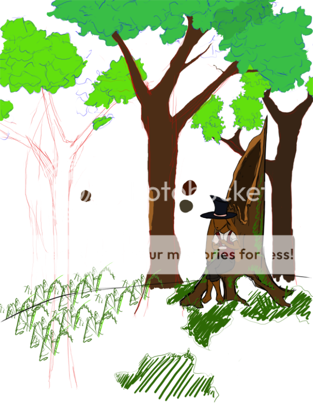 image is actually 4x larger.