|
|
|
|
|
|
|

Here Comes the Muffin Man Vice Captain
|
 Posted: Sun Oct 25, 2009 3:19 pm Posted: Sun Oct 25, 2009 3:19 pm
01. lickitung -- Kikibeau
02. kangaskhan -- catastroph-c
03. vileplume -- Sophie is a Ninja
04. Scyther -- Riyo Ongaku
05. Jynx -- Jamais Changeant
06. Mr. Mime -- -Le Chien Chat-
07. Weepinbell -- the only shark goth
08. flaafy -- Taostyness
09. Lapras -- Pugnacious Banana
10. Porygon -- general_amlex
11. beedrill -- Ice Cold Faerie
12. gardevoir -- IMMA SMARTERER
13. sandslash -- Killer Kiwi Fruit
14. murkrow -- Lady_Khacung
15. Jigglypuff -- Mizz Jane Doe
16. taurous -- Crescent the grumpy bunny
17. Venonat -- R e t r o Luna
18. Omastar -- Cyan Azzura Ri
19. Seaking -- Shawana_Chou
20. polywhirl -- lovest harding
21. Golem -- ~Emo_Cottonball~
22. Magmar -- Twilightbreathe
everyone with a strike has made entriies
|
|
|
|
|
|
|
|
|
|
|
|
|
|
|
Posted: Sun Oct 25, 2009 3:19 pm
136.5 Lady_Khacung murkrow is a dark flying pokemon. It loves shiny things and bling and all that jazz but is also associated with bad luck and despair.  diino: 6/8/9/6.5/9.5=33 Lin: Lady 6, 7.5, 9, 6.5, 6 = 35.5/50 This is nicely done technically, it's matched well and purple and gold always look great together. But I'm a little lost on theme. It does match pretty well with your description, but I've got the Pokemon Wiki open as I judge, and I don't see any physical connection to Murkrow here. Unless I'm completely wrong, Murkrow is blue with some red. I think you could have pulled off the bling-loving and bad luck/despair theme elements just as well with the correct colors. Autio: 7.7.9.6.8 = 37 This is a really nice interpretation of the Pokemon and goes well with your description. The only things that are really bothering me are the texture clash and the blocky gold distribution. Trepador: 6/ 6/ 8/ 6.5/ 4.5/ - 31/50 I see how the purple/black is supposed to represent murkrow, and I get how the gold is too, but I think the execution could use a little work. I think using some more jewelry-like accesories would have made the "bling-bling" theme fit better.
|
|
|
|
|
|
Here Comes the Muffin Man Vice Captain
|
|
|
|
|
|
|
|
|
|
Here Comes the Muffin Man Vice Captain
|
Posted: Sun Oct 25, 2009 3:27 pm
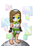
138.5 jjillane  (This is IMMA SMARTERER. I changed my username.) Lin: 6.5, 7.5, 8, 6, 8.5 = 36.5/50 This is nice, I like that you went for a combination of quasi-cosplay and AT-style matching/layering/etc. It's definitely reminiscent of Gardevoir, so good job there. I do wish you had included some green at the bottom though. Doesn't Gardevoir have like a green stripe running down its front? Again, I'm just going by the Pokemon Wiki. That would have helped with green distribution while still staying true to the theme. Diino: 6/5.5/6.5/5.5/6.5=30 Autio: 7.6.8.6.8 = 35 Good representation of the Pokemon, but avatar-wise this feels lacking. Waist up is awesome, but below the waist is just... uninteresting. Trepador: 8/10 8/10 7/10 6.5/10 7.5/10 - 37/50 I think this is a really cute representation of Gardevoir. I could tell who it was right away. It's cute, but I think some green around the feet would help a lot, and maybe a dash more of pink.
|
|
|
|
|
|
|
|
|
|
|
|
|
|
|
Posted: Sun Oct 25, 2009 3:28 pm
154//200 Lin: 7.5, 8, 7, 6.5, 9 = 38/50 This is good, I LOVE the spikes on the arms/hands. It's perfect, I actually recognized Scyther in this right away. I do think you could have worked a little more on the head and torso; just because you're representing a character you don't have to stop at simple. (When you're not doing a cosplay) I'm also a little confused as to why you included black, since there's none on Scyther. White skin might also have helped. But overall, nice job. diino: 7/5.5/7/6/6.5=32 Autio:8.9.9.6.9 = 41 This is great. Not only does it show off the Pokemon, it's an adorable avatar. Good color distribution, great matching, a home run in my opinion. Trepador: 9/10 9/10 8/10 8/10 9/10 - 43/50 I could easily recognize where the inspiration on this one came from, and I love it. I think you did a great job of "matching" scyther's punk-ish, hard look, and with a minimal amount of clothes. This is an avatar where simplicity works in your favor.
|
|
|
|
|
|
Here Comes the Muffin Man Vice Captain
|
|
|
|
|
|
|
|
|
|
Here Comes the Muffin Man Vice Captain
|
Posted: Sun Oct 25, 2009 3:29 pm
148.5//200 Cyan Azzura Ri 
Sorry I didn't get it in before the original deadline, I completely forgot.
The avatar is based on Omastar's main colors, and their water attacks.
Since Gaia doesn't really have any rock items that would look good with that color scheme.Lin: 8, 8, 8.5, 7, 8.5 = 40/50 I like that you represented Omastar without trying to cosplay it. (Which would have been really hard, lol) I think it would have been better if you had used a duller yellow, since Omastar's shell is is more tan-ish than yellow. Layering is also a little messy, but props for not being afraid to do layering. Oh, and I really like the face. C; diino: 8/8.5/6/5.5/7.5=35.5 You are one of two whom gets comments from me this round. and i say this: havent seen many avatars with a good face so far this contest, so good job with that! also, this has potential to be a good avi but the layering is far to cluttered for my taste. Autio: 7.6.7.7.7 = 34 Let me start by saying the face is freakin' perfect. Now, I wish you'd have done more of a tan-ish color [though I know that's a pain in the butt] than the bright yellow, it doesn't seem to fit. Distribution is a little lacking, but it's a solid avatar. Trepador: 8/10 7/10 7/10 8/10 9/10 - 39/50 I really, really like this one. It's a cute representation of Omastar, however I think a duller yellow, while being more difficult, would have made the avatar better. Also, the face is absolutely great!
|
|
|
|
|
|
|
|
|
|
|
|
|
|
|
Posted: Sun Oct 25, 2009 3:30 pm
112.5//200 the only shark goth okay, i think i got something good. I just hope it doesn't get me eliminated.  diino: 3/2.5 /3 /3 /2.5 =14 The second out of the two people i will be commenting this round. I absolutely disagree with the other judges. It looks like you tried to make a cosplay instead of drawing inspiration from one part of it. and at that you didint do a very good job, you could have improved it so much more, and its a step down from what you did last round. I honestly thought this would be the losing entry. If you make it to the next round i suggest you step it the ******** up ! also shades are off, and its a clutter ********. Im sorry if my criticism sounds rude however i do not apologize for saying the lot of it. Lin: 6.5, 6, 5, 6, 9 = 32.5/50 Haha, the eyes, they're perfect. XD Okay, well I really like how hard you worked on this, I know you posted a lot of WIPs. The end result definitely does represent Weepinbell pretty well. I do wish you had given a little more thought to the technical aspects of the avatar though, like flow and matching. I think it would help to remove the butterflies and the flying money, and to try and match the greens a little better to tie it all together. Autio: 8.6.5.6.8 = 33 I like the progression of colors, and I know you worked really hard on this. The head item is perfect, and the whole thing has a nice plant-like feeling. I think it would have been better overall without all the background items, though. Trepador: 7/10 5/10 5/10 7/10 9/10 - 34/50 I can see where the Weepinbell came in. I like the way you tried to portray it with the avatar, however, there are a few things I I think are working against you. You should make the skin yellow, so it matches the bell color on weepinbell. Also, I like the idea of using something to represent razor-leaf, but in all reailty, it just look a little cluttered. I think it's a great cosplay of a rather (in my opinion) difficult to do pokemon.
|
|
|
|
|
|
Here Comes the Muffin Man Vice Captain
|
|
|
|
|
|
|
|
|
|
Here Comes the Muffin Man Vice Captain
|
Posted: Sat Oct 31, 2009 1:33 pm
NOT INCLUDING DIINO: 157.5 Killer Kiwi Fruit Sandslash  Lin: 7.5, 8, 7, 6, 9 = 37.5 Nice, it's pretty obvious which Pokemon you were going for. The color scheme is great for Sandslash, and the hair is just perfect as it echoes the brown spiky things on Sandslash's back. The background/foreground items actually work in this, both theme-wise and pretty well visually as well. What I don't like is that the browns aren't very well matched, and the flower on the head seems random. But overall a nice job. Autio: 8.8.7.7.9 = 39 This is a great interpretation, fits well with both the visual and the personality descriptions. Nice work. Your browns are a bit off and the white distribution is lacking, but overall this is really nice. diino:9/8.5/7/7/7.5= 39 Gin: 9, 8, 8, 7, 9 = 41 Trepador: 8/10 8/10 7/10 8/10 9/10 - 40/50 I like how this avatar is simplitstic and yet there are little things pulling it together. The sand and slash are a nice touch, and I think the flower in the hair actually adds to the avatar.
|
|
|
|
|
|
|
|
|
|
|
|
|
|
|
Posted: Sat Oct 31, 2009 1:34 pm
135/200 lovest harding Poliwhirl  Lin: 6, 7, 7.5, 5, 8.5 = 34 At first glance, you do pick up that this is a Poliwhirl, (Because you used that shirt very well and the blue you chose is rather pretty perfect) but then you keep looking at it and you realize that it doesn't have a whole lot going for it other than theme. It's pretty painfully simple, and the blacks aren't even matched that well. Also, why is the skin tone left showing? Adding a white or blue skin dye would have helped in both theme and color distribution. Autio:6.7.7.4.9 = 33 This is almost too simple, but at the same time it's just appealing, plus you did get a very simple Pokemon. Great use of the shirt. I find myself wishing for either blue or white skin, though, and you probably could have done more with the layering. Gin: 7, 7, 7, 7, 9 = 37 Trepador: 7/10 6/10 6/10 4/10 8/10 - 31/50 I can see where this would be poliwhirl, but I think you could've made the skin blue as well as the hair, since you're doing a more cosplay-style avatar than inspiration-style. Still, it has a certain cuteness to it.
|
|
|
|
|
|
Here Comes the Muffin Man Vice Captain
|
|
|
|
|
|
|
|
|
|
Here Comes the Muffin Man Vice Captain
|
Posted: Sat Oct 31, 2009 1:36 pm
133.5 Crescent the grumpy bunny Taurous  The lusty is there for the effect of a snorting bull. I know he should have three tails, but no third presented itself. Lets just say its placed in such a way that it cant be seen... Any how enjoy Lin: 6.5, 7, 5, 5, 8 = 31.5 Again, definitely a Tauros, but as an AT avatar it's not that fantastic. I should stress the point, not just for you but for a lot of contestants, that a theme-heavy round does NOT mean you sacrifice significantly in matching, distribution, etc. Like Autio said, there are a bunch of different brown shades, and the gray could be better distributed. (Though it is matched well, actually) I do like the head and the multiple tails. Autio: 7.6.4.5.8 = 30 This really works as the Pokemon type, but avatar-wise it's a little lacking. Your browns are all different shades and there really is no skin balance to speak of. Gin: 8, 8, 8, 8, 9 = 41 Trepador: 7/10 5/10 5/10 5/10 9/10 - 31/50 I really like how you paid attention to the details such as the three tails and snorting, however, on a whole, it doesn't really work as a cosplay. I like how you paid attention to the fact that his body has different colors of fur, but I think you should've used the skin color for those areas, instead of having two because of the pants. I admire your attempt, but it needs more polishing.
|
|
|
|
|
|
|
|
|
|
|
|
|
|
|
Posted: Sat Oct 31, 2009 4:33 pm
170//200 -Le Chien Chat- Mr. Mime  : D I hope you like it. :3 It took a long time, but... I had decided to go with some of the colors, while keeping it looking 'somewhat' like a mime. XD Lin: 8, 9, 9, 9, 7 = 42 This is an entry that kind of goes in the opposite way as the last two, lol. It's pretty amazing technically, the layering is exquisite and the only technical flaws I can pinpoint off the top of my head right now are that you need a bit more red at the feet, and that the hair doesn't quite match the other reds. Theme is kinda fuzzy here though. It does remind me of A mime, but not so much MR. Mime. Mostly, I just REALLY miss the blue on him. If you had included that, the theme would be much, much clearer. Autio: 6.7.9.9.8 = 39 Avatar creeps me out almost as much as the Pokemon does. xD think it's the face. I like the attention to the shape in the shoulder-ish area, and it's very well matched and balanced. You integrated the gold from the bolero well, so it doesn't look tacked on. Gin: 9, 9, 9, 9, 9 = 45 Trepador: 10 10/10 9/10 9/10 7/10 - 44/50 Very well done. Once I saw it was Mr. Mime, I instantly get where you were comnig from. The face makes it work very well. However, it is just a little too "regal" to be Mr. Mime, imho.
|
|
|
|
|
|
Here Comes the Muffin Man Vice Captain
|
|
|
|
|
|
|
|
|
|
Here Comes the Muffin Man Vice Captain
|
Posted: Sat Oct 31, 2009 4:34 pm
129.5//200 Jamais Changeant Jynx  Facts: Jynx is a female-only species with no male counterpart. - so I obvoiusly had to make a female Jynx have the power to control ice and snow. Jynx tend to prefer icy climates, such as caves in snowy mountains. - so I gave her a snowy/arctic feel Jynx is the only known Pokémon that learns Lovely Kiss (besides Smoochum I'm told...but that's an earlier evolution and didn't exist when I played!). Lovely Kiss causes the target to fall asleep. - I imagine that having everyone fall asleep at your kiss would make you sad so she has the hole in her chest and tears in her eyes. The spirits represent those she's put to sleep. Lin: 8, 7, 7.5, 7, 5 = 32.5 I pretty much echo Autio's comments, she said it all well. You're really creative with your interpretation, but it relies too much on the description. If you were creating your own character, this would be great, but for Jynx I'm not sure since this doesn't physically resemble her at all. This wasn't a cosplay round, but still, I would have loved to see maybe Jynx's colors integrated into this. Layering is also a bit messy. Autio: 6.7.6.7.5 = 31 I kind of like that you've completely departed from the actual appearance and gone more for the symbolism, not to mention this is just a lovely avatar, but at the same time it's not at all apparent what this is without your description. Gin: 8, 6, 7, 7, 7 = 35 Trepador: 7/10 6/10 6/10 7/10 5/10 - 31/50 It's a cute avatar, without the spirits behind it, but I do not see Jinx in it at all. if it wasn't for the description, I would have no idea what pokemon it's supposed to represent.
|
|
|
|
|
|
|
|
|
|
|
|
|
|
|
Posted: Sat Oct 31, 2009 4:36 pm
163.5//200 Shawana_Chou Seaking I went for an inspired transition look between Goldeen and Seaking(Since Goldeen is more female and Seaking is more male.). It's supposed to be feminine looking, but still have boy like appearance as well, while still portraying a sea creature.  REFS. SEAKINGGOLDEENLin: 8, 9, 7, 7.5, 7 = 38.5 Very lovely, but weren't you not supposed to draw inspiration from other evolutions of your Pokemon? I just say that as a technicality, as I don't mind that element of this, but Diino said you should only use the specific evolution you were assigned. Other than that, it is very pretty, and it does remind you of Seaking even with all of the other colors added. The horn makes it kind of top heavy, but I do like the horn theme-wise. Autio: 8.8.7.7.7 = 37 This is a beautiful avatar, and I can definitely see the Pokemon in the color choices and flowing watery elements. You took a chance on this and, in my opinion, it worked very well for you. Gin: 9, 8, 8, 8, 9 = 42 Trepador: 9/10 9/10 8/10 10/10 10/10 - 46/50 I absolutely love this avatar! I could easily tell what pokemon it was supposed to be, and I think the colors really just make it pop for me. It does well to portray the ergalness Seaking represents. You did a wonderful job!
|
|
|
|
|
|
Here Comes the Muffin Man Vice Captain
|
|
|
|
|
|
|
|
|
|
Here Comes the Muffin Man Vice Captain
|
Posted: Sat Oct 31, 2009 4:37 pm
129.5 Twilightbreathe Magmar  Lin: 6, 6.5, 5, 5, 9 = 31.5 As the other judges do, I see Magmar in this, but it's probably just because he's the first Pokemon you would associate with an avatar that is centered so much on fire. Matching of reds and yellows aren't great. Also, the tail, though I see why you included it, stands out too much because it's so dark and doesn't really match anything. So just try for a better balance of theme and technical execution next time. Autio: 6.6.5.6.9 = 32 This just... feels... like Magmar. It's got a good shape going on for what it's trying to be. Your matching, layering, and distribution, on the other hand, are just not quite there. The reds sort of match, the yellows/golds not really at all, and the orange seems to be confined to the bangs and flames. Gin: 7, 7, 6, 7, 9 = 36 Trepador: 6/10 5/10 5/10 5/10 9/10 - 30/50 I can see how this is supposed to be magmar, but I think the matching and execution aren't that great. The shape given to it by the flames really does make me see magmar, but the matching and distribution are awkward, especially the leg-area.
|
|
|
|
|
|
|
|
|
|
|
|
|
|
|
Posted: Sat Oct 31, 2009 4:39 pm
101 Mizz Jane Doe Jigglypuff  Lin: 5, 5, 4.5, 4, 5.5 = 24 If you're going to just include one element of a character in an avatar, in this case, color - you have to do it fantastically well. Unfortunately, although this does indeed have a lot of pink and Jigglypuff's blue eyes, it falls flat. The matching, layering, distribution, etc. are all shaky. Why in the world did you use that skirt with brown on it? Better-matched pinks, and cat ears and a microphone or music notes as have been suggested would help this a lot. Autio: 6.6.4.4.5 = 25 Other than being pink, this doesn't really say Jigglypuff to me. Could have actually used blue eyes and maybe some cat-like ears, too. Your shades are all over the place. I know pink is hard, but you could have done better. Gin: 6, 5, 6, 6, 6 = 29 Trepador: 5/10 5/10 5/10 4/10 4/10 - 23/50 It seems as though you searched pink in tektek and put on whatever came up. I don't see Jigglypuff in this at all. If you were going for a more literal translation of Jigglypuff, it would've helped to match the pinks better and make the avatar more rotund. A microphone would be a cute addition as well.
|
|
|
|
|
|
Here Comes the Muffin Man Vice Captain
|
|
|
|
|
|
|
|
|
|
Here Comes the Muffin Man Vice Captain
|
Posted: Sat Oct 31, 2009 4:40 pm
155 Pugnacious Banana Lapras  the armour things are supposed to represent the shell on lapras's back. Lin: 7, 8, 8.5, 7.5, 8 = 39 This is nice, Pug, you've been doing really well lately! I adore the blue of this, it represents Lapras well and is also nicely matched. I also really like that you included that tan-ish color to represent Lapras' underside. I agree with Autio that the gold addition is iffy, but I see that there was gold on some of the blue items that you used so you just ran with that, and all things considered you pulled it off well. Autio: 6.8.8.7.8 = 37 This is really pretty, and I do see the Pokemon in it. Not sure about the gold addition, but it's well balanced and fits in fairly well. Gin: 8, 8, 8, 7, 9 = 40 Trepador: 7/10 8/10 8/10 8/10 8/10 - 39/40 I think this avatar is a pretty good representation of Lapras. I can see how the tans/gold are supposed to represent the armor, and it's very well balanced.
|
|
|
|
|
|
|
|
|
|
|
|
|
|
|
|
|
|