|
|
|
|
|
|
|
 Posted: Wed Oct 14, 2009 7:15 pm Posted: Wed Oct 14, 2009 7:15 pm
yup, here's where you can get a rating from the person who's below you.
Pretty simple, just rate the person who last posted.
You can rate however you want, but I think we know everyone loves suggestions (:
|
 |
|
|
|
|
|
|
|
|
|
|
|
|
|
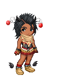
Posted: Wed Oct 14, 2009 7:34 pm
Good color distribution, but the eye creeps me out,
xD
8/10.
I think it needs a little white in the middle.
May I suggest blade's white belt?
|
|
|
|
|
|
|
|
|
|
|
|
|
|
|
|
|
|
Posted: Wed Oct 14, 2009 8:39 pm
9.5/10
The gray part on the facey kinda bothers me.
|
|
|
|
|
|
|
|
|
|
|
|
|
|
|
Posted: Wed Oct 14, 2009 9:46 pm
The top is really spiffy, but the bottom needs more of both kinds of blue and white.
And it slightly bothers me that your wearing a set
8.3/10
:]
|
|
|
|
|
|
|
|
|
|
|
|
|
|
|
|
|
|
Posted: Wed Oct 14, 2009 9:55 pm
Very interesting color scheme! Definitely not something that is not done often.
8/10 (:
Maybe even out the color distribution a little more?
|
|
|
|
|
|
|
|
|
|
|
|
|
|
|
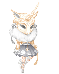
Posted: Thu Oct 15, 2009 11:14 am
5/10- A bit simple for my tastes. I'm not sure what theme you're going for either.
A blind princess?
|
|
|
|
|
|
|
|
|
|
|
|
|
|
|
|
|
|
Posted: Thu Oct 15, 2009 11:59 am
8.1/10
not bad, to be honest though, I am realy sick of black red and white. xp
But, you have a monocle, so its all good. Monocles make the world go round.
|
|
|
|
|
|
|
|
|
|
|
|
|
|
|
Posted: Thu Oct 15, 2009 4:36 pm
Hmmhmmhmm.
8.7/10
It bothers me that the gold on the Herme's Moon and the Egyptian headband are different shades and so close together. Also, the Bani's are a bit too white.
But I've always love green/black/gold color schemes, so... x3
|
|
|
|
|
|
|
|
|
|
|
|
|
|
|
|
|
|
Posted: Thu Oct 15, 2009 10:56 pm
8/10
I love the color scheme for this Halloween avatar. Nice to see something unique. I um.. hate the stockings on it though. I'm sure that's just a personally loved item, but I want to pull them off and tear them to shreds. D:< Also, the blue in the inari beads get lost at the feet, and it's really needed. Maybe there's another shoe that would match with a lower rise so those would be exposed?
I'm curious to see how people feel about my umbrella. whee
|
|
|
|
|
|
|
|
|
|
|
|
|
|
|
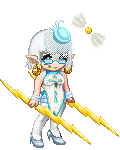
Posted: Fri Oct 16, 2009 8:00 am
9.2/10
I love your avitar, the colors all work great together, but I am not a big fan of the umbrella.
But, awesome avitar.
|
|
|
|
|
|
|
|
|
|
|
|
|
|
|
|
|
|
Posted: Fri Oct 16, 2009 10:35 am
I love the class and charm your avi has :]
I think it needs green on the bottom though
and its a set >>
8.5/10
|
|
|
|
|
|
|
|
|
|
|
|
|
|
|
Posted: Fri Oct 16, 2009 5:21 pm
9.8/10
I love love love the green and red hints, but there's a tiny little thing off, I can't quite put my finger on it, though. SO close to perfect, though.
x3
Bottle;;
Actually, I have never used these stockings before this. So, not exactly loved. More like I bought them when they were soooo expensive, then they rotted away when I didn't wear them because they suddenly became a "norm". xD'
|
|
|
|
|
|
|
|
|
|
|
|
|
|
|
|
|
|
Posted: Fri Oct 16, 2009 8:44 pm
7//10
I love the colors and almost everything about it.
There's a few things thats throwing it off.
1. The Candy Bucket. I think it's just the eyes, idk. Maybe its because ive never been too fond of items in the hand.
2. Again, the Stockings. The stockings throw it off because theres no other white anywhere in the avi. they might work if you add suttle hints of white here and there.
3. And Lastly, The Necklace. It's so out of place and the colors don't match anything. I suggest you remove it (did that sound mean? I'm sorry. . .)
|
|
|
|
|
|
|
|
|
|
|
|
|
|
|
Posted: Fri Oct 16, 2009 8:51 pm
7/10
Good color distribution, but it seems a little plain.
Maybe throw in another color to spice it up?
|
|
|
|
|
|
|
|
|
|
|
|
|
|
|
|
|
|
Posted: Fri Oct 16, 2009 9:39 pm
or as emerald would say
BAM IT UP
>>
I love love this avi :]
I wish there could be a creamy color on the bottom somewhere though
and... blue eyes?
8.9/10
|
|
|
|
|
|
|
|
|
|
|
|
|
|