|
|
|
|
|
|
|
|
|
 Posted: Wed Sep 16, 2009 11:18 am Posted: Wed Sep 16, 2009 11:18 am
Hey everyone. I am doing this for a buddy of mine. It's almost finished. Just need to work on the roof, clean it up a bit, then add some lighting. Just wanna get a few comments on what you guys think so far. Any suggestions on improvements? Throw it my way. Thanks. =) 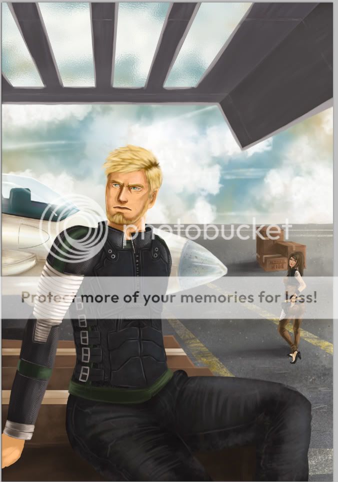
|
 |
|
|
|
|
|
|
|
|
|
|
|
|
|
Posted: Thu Sep 17, 2009 9:53 am
I think that a good critique is very valuable! However other people get offended sometimes when you tell them how a work of theirs could be better, so I want to stress that anything I say that could be improved, doesn't mean. The better the art, the harder a critique it needs!
Disclaimers aside....
My favorite aspect is the textures. Especially the ground. You put alot of care into painting it and, it shows. Those yellow lines are beautiful! The ground goes into space too which is hard to do, and well done.
The clouds are nice, but they are very even across the whole background. One rule that I and GP use is 'create differences.' So I like how the clouds are drawn, but feel that one side could be lighter, or darker, or have more mass or whatever, but not be so even.
Another area to create differences is across the ceiling as it goes into space. Things in the same place in space should be similar; things in different areas of space should be different. You may want to make the part of the ceiling in the foreground different from the part in background. You could do this with a difference in value or color, or texture.
The next thing that I look at is color. In the ground there are a variety of different colors used. Parts are redder, parts greened, parts yellower. It's not just even gray. However, in other areas the colors are more 'local.' What I mean by this is that his hair is the same color evenly across his head. This flattens it out. One way to find neat colors is to run brushes of very vibrant colors over in low opacity and find new colors to work in. I'd never use the same color evenly across any object like you see with his hair, because it flattens it and makes it feel less realistic. This is a minor point though.
The boxes in the distance are also painted really well. I think that they are just about perfect. You use a variety of edges (hard and soft), you designed the patter of shapes well. They are executed very very well!
Another random observation is that the cropping of his hand feels strange to me. I'm almost always opposed to cropping figures unless there is a very good reason. When I look at his figure and all of the lovely details in his clothing, my eye goes down his arm, then hits a dead end, where his hand is missing for no reason. If you wanted you could change the angle of his hand so that it was in the composition with his fingers fanned out on the box.
Finally I like the relationship between the figures. She's all like "I got that junk up in this trunk.' And he's all sour grapes. An emotional relationship between figures is something that many artists omit, but it adds alot.
Overall I think that this drawing is a great achievement and that you should be very happy with it! <3
|
|
|
|
|
|
|
|
|
|
|
|
|
|
|
|
|
|
Posted: Fri Sep 18, 2009 9:09 am
I still love those boxes! <3
|
|
|
|
|
|
|
|
|
|
|
|
|
|
|
Posted: Sat Sep 19, 2009 11:17 am
Thanks for the input Good! I finished it a couple of days ago. I wish I would have seen your reply before I finished it. sweatdrop You brought up really good points. I'll keep those in mind on my next illustration. Thanks. 3nodding Here is the finished version. 
|
|
|
|
|
|
|
|
|
|
|
|
|
|
|
|
|
|
Posted: Sat Sep 19, 2009 12:34 pm
I think it looks great! <3
|
|
|
|
|
|
|
|
|
|
|
|
|
|
|
Posted: Sun Sep 20, 2009 9:00 pm
|
|
|
|
|
|
|
|
|
|
|
|
|
Posted: Tue Sep 22, 2009 4:37 pm
looks very nice .. his right shoulder (our right) kinda seems to dissapear unhuman like ;D. i think it should stick out a little more.
and it might also be an idea to blend the objects in the back with the overal background color. a great example of what i mean is when you look at pictures of mountains. it always seems as if they blend away into the background and that gives a good sense of depth.
|
|
|
|
|
|
|
|
|
|
|
|
|
|
|
Posted: Wed Sep 23, 2009 8:41 pm
Nice input Goshujin. 3nodding I thought about blending the BG together.. but I was scared of thing becoming monochromatic. I'll test my limits next time. =)
|
|
|
|
|
|
|
|
|
|
|
|
|
|
|
|
|
|
|