|
|
|
|
|
|
|
|
|
 Posted: Wed Jun 24, 2009 7:35 pm Posted: Wed Jun 24, 2009 7:35 pm
|
|
|
|
|
|
|
|
|
|
Posted: Wed Jun 24, 2009 7:37 pm
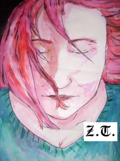
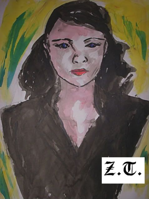
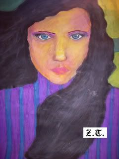
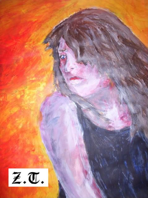
Sorry I don't have a scanner all these paintings were photographed, hence some of the unusual brightness on the last piece.
|
 |
|
|
|
|
|
|
|
|
|
|
|
|
|
|
|
|
Posted: Sat Jun 27, 2009 10:28 am
I'd say, I love you mixture of colors, and faces are nice
On the other note, I would say a need for volume is needed, the contrast of shadows is not there. to put it simply, it kind of looks a bit flat ^^;
|
|
|
|
|
|
|
|
|
|
|
|
|
|
|
Posted: Sun Jun 28, 2009 2:43 am
They are very good pictures in my opinion, the only thing letting them down is some of the detail and the lines.
I'm not great at this but i'll try to point out what I see, I'll just be commenting on the 1st picture as that is where I can see the faults the most:
First I think that the ear is too far concealed even if the head is tilted to the side slightly the head looks very straight but the ear is covered by the head too much. THe obvious solution is to show more of the ear or show the angle of the head more clearly (I don't know how though)
Next, the clavicle bones do not look right, they should be symmetrical and possibly show more visible length, a bit of shading around them may help too.
I don't know if this is the actual way that the eye lashes are, but they seem thin and lack fullness. Try looking in the mirror with one eye closed and see how the lashes collide, the natural curve on eyelashes should make them look fuller. If you meant for the drawing to look like that i'm sorry but its just my opinion.
Hope I helped a bit smile
|
|
|
|
|
|
|
|
|
|
|
|
|
|
|
|
|
|
Posted: Sat Jul 04, 2009 3:16 pm
i think ur pictures r beautiful but u should add a little bit more to the photos to make it unique. eek
|
|
|
|
|
|
|
|
|
|
|
|
|
|
|
Posted: Wed Jul 08, 2009 7:03 am
thanks for the lovely helpful comments everyone! mrgreen
|
|
|
|
|
|
|
|
|
|
|
|
|
|
|
|
|
|
|