|
|
|
|
|
|
|
|
|
 Posted: Sat Jun 20, 2009 12:34 pm Posted: Sat Jun 20, 2009 12:34 pm
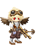
Hi, I just finished my latest photomanipulation project for my Graphic Designs class. The assignment was to manipulate a premade portrait into a peice of art that can stand on it's own. Thus Steampunk Harvey was born!
Here I've posted the original portrait from which I worked and my finished product. Please do tell me what your thoughts are so that I can improve. Even harsh critisism is greatly appreciated.
I greatly thank you for your precious time,
-Madame Plum
|
 |
|
|
|
|
|
|
|
|
|
|
|
|
|
Posted: Sat Jun 20, 2009 6:01 pm
Still no reply's? How disheartening....
|
|
|
|
|
|
|
|
|
|
|
|
|
|
|
|
|
|
Posted: Sun Jun 21, 2009 1:37 pm
Wow, it is truly fantastic! You would have thought that the goggles were there all along. The only thing about it which immediately bugs me is that the ear almost merges with the background due to the similar colour of both; I don't know if you planned it that way, I just find it irksome. The creature on his shoulder should cast a shadow on him too, but it occurs to me that it may simply be in the background. :S Things which are further away are often slightly paler than usual; also since they're quite dark they do have a slight tendency to draw the audiences attention perhaps a bit too soon.
However, all in all I find it to be a spectacular piece. I saw it in the guild artwork thread earlier and I was quite impressed, I'm very fond of the orange hues you've used.
Don't be disheartened, I just don't think anyone has popped in for a look is all. If no one is here then it cannot receive critique, yes?
|
|
|
|
|
|
|
|
|
|
|
|
|
|
|
Posted: Sun Jun 21, 2009 4:53 pm
I suppose you're right. :3
Thank you so much for your crituque, I hadn't noticed his ear blending into the background, thank you for brining it to my attention!
Also, the robot behind his shoulder was something I just stuck behind him so help even out the portrait as it seemed off center without it.
It hadn't occured to me that it would actually compete with the image.
0.0;;
It's easy to remedy, so no worries, but it is something that I do need to fix before submitting it to my professor....
As for the color palette, I simply thought it would be a fresher take on the sepia hues so clasically associated with the victorian age.
I'm so glad you like it!
^~^
-Madame Plum
|
|
|
|
|
|
|
|
|
|
|
|
|
|
|
|
|
|
Posted: Mon Jun 22, 2009 3:40 am
Ah, fair enough. It is harder to notice stuff like that in your own work. Yes, it would be rather off centre, wouldn't it? Of course you don't want that.
I does look very good even if you don't change anything though, just so you know. The orange does look marvellous, it gives the picture more character. ^_^
I'm glad I could help.
|
|
|
|
|
|
|
|
|
|
|
|
|
|
|
Posted: Mon Jul 13, 2009 10:46 pm
Very Nice!! if i should say so myself i have done same type of manipulation to a photo of my self if i could upload it i would,
but alas I Cannot Sad FAce
|
|
|
|
|
|
Quotable Conversationalist
|
|
|
|
|
|
|
|
|
|
|
|
|